
Terminalcoffee discussion
Random Queries
>
Does font/typeface matter to you?
 I don't really when I'm picking up a book, but there are times I wish I had. Easy font size and readability makes a big difference in the enjoyment.
 I accidentally checked out a large print book once and the print gave me a headache. I'm not sure why.
You may be used to holding a book a certain distance, and your eyes had to try to adjust to larger print.
I accidentally checked out a large print book once and the print gave me a headache. I'm not sure why.
You may be used to holding a book a certain distance, and your eyes had to try to adjust to larger print.
 The answer is Kindle. You choose your typeface.
 i don't think about it until i read a book where to typeface and styles are really different and then i realize how much this actually does matter
 Kevin "El Liso Grande" wrote: "i don't think about it until i read a book where to typeface and styles are really different and then i realize how much this actually does matter"
Like Kevin, I only notice the typeface and style when it's bad. I bought an edition of Sabatini's Captain Blood last year that I could barely read because of the odd font and the blank line between each paragraph. Self-published books are particularly bad for this.
 Yes, font matters. I prefer a font with serifs when I'm reading a book. Too small isn't good, I like to feel like I'm making progress through a book, and a bigger font means you get to turn the page more often.
I am very fond of Garamond.
I like to feel I'm making progress too, I don't like small fonts or large fonts, I like fonts that are just right!
if a book is written in comic sans i just can't take it seriously
 Kevin "El Liso Grande" wrote: "if a book is written in comic sans i just can't take it seriously"
But it is easier on the eyes...IMO
Wilma wrote: "Barney sounds somewhat like Goldylocks right now."Identity crisis?
I prefer a font with serifs when I'm reading a book.Am I the only one who doesn't know what a serif is?
RandomAnthony wrote: "I prefer a font with serifs when I'm reading a book.Am I the only one who doesn't know what a serif is?"
Yes, and you will just have to live with it :-)
 Alecia wrote: "I have no idea either RA."
Me either, but I was muscling up the big man in the paint.
 Mod
Mod
 Hahahahahahahaha!!! We're all so helpful!
Wow, Jonathon and Jackie are thinking alike.
Hahahahahahahaha!!! We're all so helpful!
Wow, Jonathon and Jackie are thinking alike.
 Oh heck, in the time it took me to find the image, two other serif aficionados posted the same thing. Drat!
Thanks for clearing that up for us Jackie and LG :)
And Jonathan, Alecia. He can't help it if he's slow with the Googling. ;)
Yes, thanks to you too Jonathan! ::whispers::slow poke...
Mod
Oh heck, in the time it took me to find the image, two other serif aficionados posted the same thing. Drat!
Thanks for clearing that up for us Jackie and LG :)
And Jonathan, Alecia. He can't help it if he's slow with the Googling. ;)
Yes, thanks to you too Jonathan! ::whispers::slow poke...
Mod

Typeface is hugely important to me when reading a book. I pay attention to it, it makes a difference to my eyes, I look at the copyright page to see if they mention what font it is and I appreciate it if they do. An ugly font puts me in a bad mood.
I prefer a less bulbous font. Garamond is good, Bembo is good, Goudy Old Style. I agree w/Kevin - some fonts you can't take seriously, like Comic Sans.
Mod
Mod
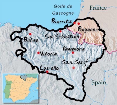
Lobstergirl wrote: "I think San Serif is a town in Spain."Sounds Catalonian.
Mod
Mod
Sounds Catalonian."
I think it's right across the border from Sans Serif.
Mod
Sure, in 4th grade.
There really is nothing like a Gill Sans with a nice Cabernet.
Lobstergirl wrote: "I think it's right across the border from Sans Serif."Yes, Sans Serif is on the French coast near Sans Doute.
But San Serif turns out to be in the Basque country.
 I've been to Bayonne and it doesn't look (or smell) anything like Spain or France.
Mod
I've been to Bayonne and it doesn't look (or smell) anything like Spain or France.
Mod
Yes, Sans Serif is on the French coast near Sans Doute.
But San Serif turns out to be in the Basque country.
"
Well I'll be ding donged.
Yes, I think J. L. Borges wrote a guidebook to the town.
Mod
http://www.wickedlocal.com/cambridge/......"
He also designed Georgia and Tahoma. I'm not crazy about either of them.
Lobstergirl wrote: "BunWat wrote: "Did you know that a font designer won one of the MacArthur genius grants this year? The guy has designed 60 font families, including Verdana.http://www.wickedlocal.com/cambridge/..."
I agree, Lobstergirl. I like the names more than the typefaces.
Ah Barb, Calibri is the new default font for all microsoft programmes.
For email, Calibri seems to work pretty well. For some reason, though, I don't think I would want to read a book in that typeface. Books seem to look nicest in the traditional (avec) serif fonts. I agree with Jackie that Garamond is very easy on the eyes. For my own writing, in ms-word, I always use Courier, which looks like an old typewriter typeface. It works well if you're printing out your text and editing on paper.
I think we may have a beer called Wicked Local.


Do you pay attention to font/typeface? Are most ok to you? What do you think?