
Georgette Heyer Fans discussion
Really Useful Stuff
>
Interview with Jennifer Koestler...
date newest »
 Great article!
Love the collection of Grand Sophy covers linked to in the article! I like almost all of them.
 Mod
Mod
Love the collection of Grand Sophy covers linked to in the article! I like almost all of them."
I agree. Enjoyable interview. But I can't see the collection of Grand Sophy covers? Could you copy the direct link here?
Sure, the link was hidden in the middle of the article, I should have thought about that - Sorry!To Grand Sophy, Arabella and Frederica past covers
They show a nice selection of all three titles.
 As usual, I like the Pan covers the best! At least the artists read the books. The new Sourcebook ones presumably are an attempt to appeal to a younger generation, but they got the dogs all wrong. Where is Ulysses' flyaway ear? And the Baluchstan hound looks like a golden retriever!
True about the dogs, I don't even know who those two on Arabella and Frederica are! Tina looks the most accurate, as Sophy's sweet faced Italian Greyhound friend.
As usual, I like the Pan covers the best! At least the artists read the books. The new Sourcebook ones presumably are an attempt to appeal to a younger generation, but they got the dogs all wrong. Where is Ulysses' flyaway ear? And the Baluchstan hound looks like a golden retriever!
True about the dogs, I don't even know who those two on Arabella and Frederica are! Tina looks the most accurate, as Sophy's sweet faced Italian Greyhound friend. My fav Sophy cover is the Jove, showing her on Salamanca, racing off without being too concerned with the man chasing her on his horse. Lush and conveys her lack of concern with others who disapprove or and try to censure her.
I agree about Arabella's Pan covers - beautiful, and they have the most connection with the actual story.
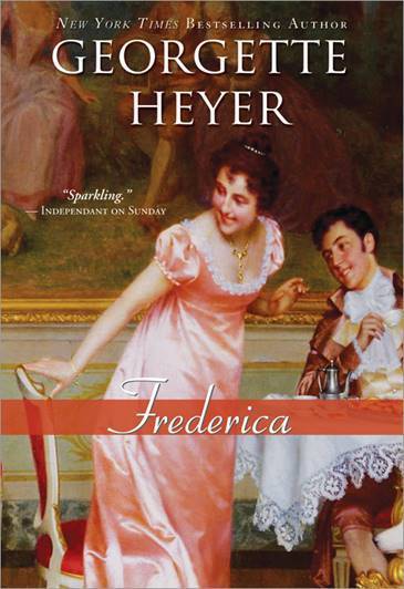
For Frederica, I love the Bodley Head covers, and the Pan with the balloon in the background.
 I saw the new Frederica cover in the < ahref="https://www.basbleu.com/cgi-bin/hazel... Bleu catalog. I am not a huge fan of the new covers. The only one that would say "historical fiction" to me is Frederica. Yes I judge books by the cover. Lady in pretty dress = historical fiction. I liked the 2009 Sourcebook covers with Edwardian era paintings but the paintings seldom depicted anything relative to the story.
 PoohBear,
I don’t like these new covers either! They are not an improvement in any regard!
I’m so glad that the titles that I own in hard-copy are the pretty Sourcebooks editions.
A raspberry for these new covers.
I just hope they've done a better proofreading job this time around.
 Abigail wrote: "I just hope they've done a better proofreading job this time around."
I was thinking that! But some of the proofreading errors go back to the 1970s. :(
It's true, and then the errors grow errors and the corrupt text metastasizes.
 I have to say the new covers aren’t all that appealing to me. But if they help enlarge Georgette Heyer’s fanbase, it’s all good.
I agree Tadiana, the covers might not be the best, and more editions being published do introduce Georgette Heyer to more readers.
I have to say the new covers aren’t all that appealing to me. But if they help enlarge Georgette Heyer’s fanbase, it’s all good.
I agree Tadiana, the covers might not be the best, and more editions being published do introduce Georgette Heyer to more readers. For those new readers who do not have someone that recommends GH to them, this is a gift.
Mod
To Grand Sophy, Arabella and Frederica past covers
They show a nice selection of all three titles."
I have seen that link I just don't see those covers (the collection) :-( I don't understand why. Perhaps I have forgotten about some other blocker on my web browser (I have turned off those I remember). I will try on another computer. Otherwise, I will have to live without it ;-)
I'm just happy to see covers that are designed for her books. I'm pretty sure GH would have hated them. One of the GH biographies mentioned she hated the Pan covers. But I was really surprised to see what I thought was Charity Girl It was a different author but it looked exactly the same - right down to the size of the book.
 Mod
Mod
To Grand Sophy, Arabella and Frederica past covers
They show a nice selection of all three titles."
I still can't see them! But I get redirected to the EU version of the page, so maybe they aren't on there.
Mod
It will be because you're in the EU, Mela - I can't see them either. We're getting a special EU version of the page.
 Thanks for the link to the article, Carol. I might grow to like those new covers--I remember, very well, the Agatha Christie covers from the 70s, which often featured significant objects from the story, such as a playing card, revolver, or whatnot. Did not realize they are called "Easter eggs."
 I created a Pinterest board for my favorite GH covers. I think there are some gems from all periods. I think the Jove covers capture something of the emotional content of the books, which makes them stand out (e.g., the Grand Sophy cover that Critterbee mentioned). I forget the name of the artist at the moment, but he is well-known.
 Here’s one of the new covers (for those who couldn’t see them): https://www.basbleu.com/cgi-bin/hazel...
 Thank you Teresa and Carol for the link. The new covers are very different but I agree that if they bring Heyer to new readers, it's all good.
 I generally like the choices they have made for the selection of books to be republished and the order they're releasing them in, although IMO my fav Venetia should be a bit higher up the order LOL.
It's great to see those old covers too.
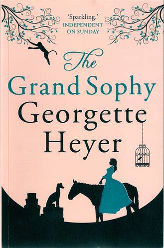
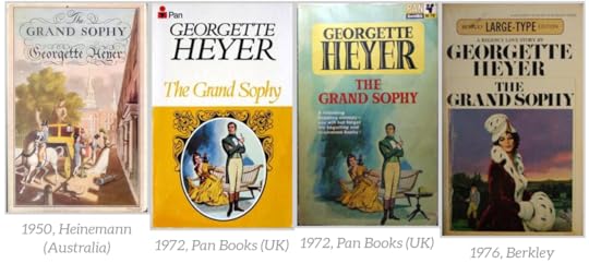
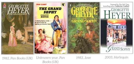
The Grand Sophy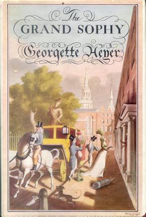
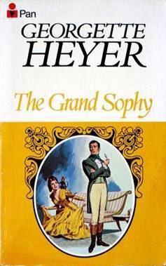

**1950 Heinemann**-***1972 Pan Books***-**1972 Pan Books**
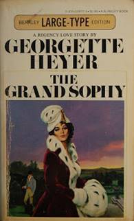
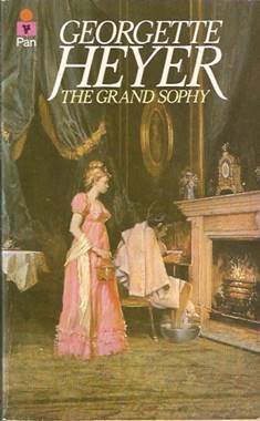
**1976 Berkley**-***1982 Pan Books***-** Year? Pan Books**


***1983 Jove***-***2003 Harlequin***-***2009 Sourcebooks***

***2013 Arrow***-***2018 Sourcebooks***
Older images, in case the new one above do not show for you:
(view spoiler)
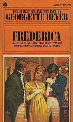
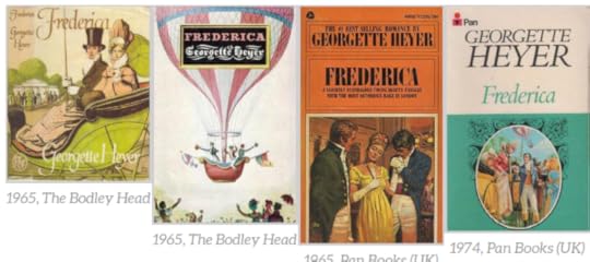
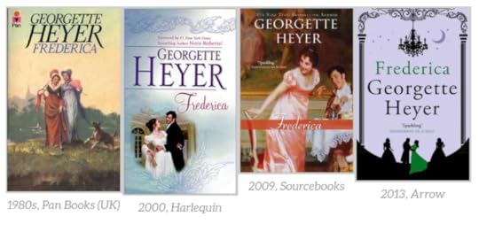
 Frederica
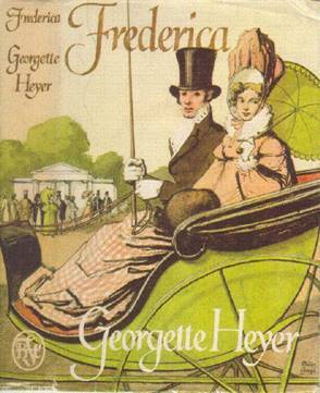
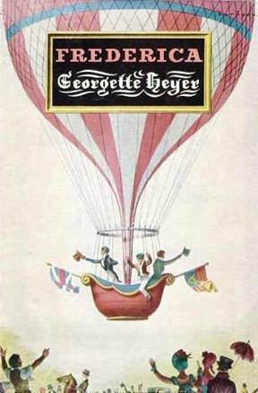
*1965 The Bodley Head*-*1965 The Bodley Head*-*1965 Pan Books*
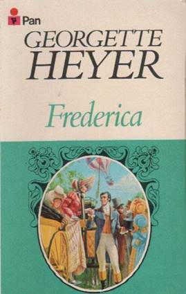


**1974 Pan Books**-***1980s Pan Books***-**2000 Harlequin**
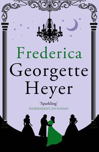

*2009 Sourcebooks***-***2013 Arrow***-***2018 Sourcebooks*
Older images, in case the new one above do not show for you:
(view spoiler)
 Arabella
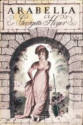
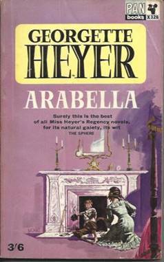
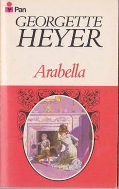
**1949 Heinemann**-**1964 Pan Books**-**1969 Pan Books**

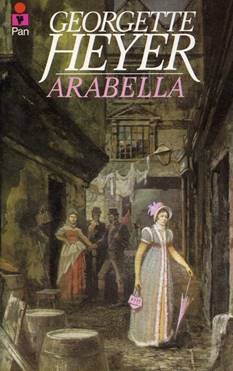

***1972 Berkley****-****1980 Pan Books****-****1982 Jove***

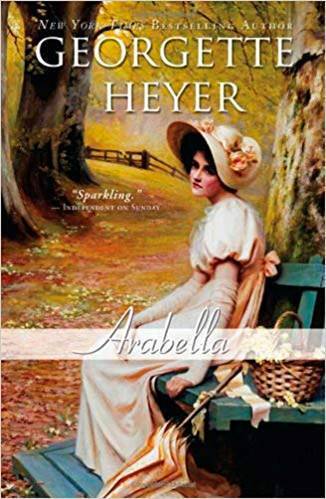

*2003 Harlequin***-**2009 Sourcebooks**-***2018 Sourcebooks*
Older images, in case the new one above do not show for you:
(view spoiler)

 Surprisingly, I'm rather fond of the Harlequin covers. I do like the Sourcebooks covers but, as others have mentioned, they tend to be rather random ("Oh, here's a nice painting of Regency-era ladies; let's use it!").
Tadiana ✩Night Owl☽ wrote: "Surprisingly, I'm rather fond of the Harlequin covers. I do like the Sourcebooks covers but, as others have mentioned, they tend to be rather random ("Oh, here's a nice painting of Regency-era ladi..."
Surprisingly, I'm rather fond of the Harlequin covers. I do like the Sourcebooks covers but, as others have mentioned, they tend to be rather random ("Oh, here's a nice painting of Regency-era ladies; let's use it!").
Tadiana ✩Night Owl☽ wrote: "Surprisingly, I'm rather fond of the Harlequin covers. I do like the Sourcebooks covers but, as others have mentioned, they tend to be rather random ("Oh, here's a nice painting of Regency-era ladi..."Or here's a Georgian era man - lets put it on a Regency cover! (The Quiet Gentleman)
Agreed, especially when the hair coloring and attitude doesn't match! When did Sophy look so meek and melancholy as that Sourcebooks edition has her looking? Who is Arabella picnicking with?Those pics look blurry, let me see if I can make them better.
Thank you, Critterbee, for posting them all - so much easier to see them side by side!
I always thought these were attractive covers, at least they attempted to portray something of the plot and characters:

I also like the Heinemann covers above, and I think the new covers aren’t bad, if they catch a new reader’s eye and gets Heyer a wider audience, I’m all for it! I agree about the Sourcebooks Sophy cover, though - I have that one and chuckle every time I see the cover -that is so un-Sophylike! Unless she’s looking down to reload her pistol...
But I don’t think Sophy would be seen dead in that horrible bonnet - looks like it has oranges on it! The dog looks kind of like the way Tina is described!
Susan in NC wrote: "But I don’t think Sophy would be seen dead in that horrible bonnet - looks like it has oranges on it!!"Indeed, they DO look like oranges! Sophy, having all of her dresses made in Paris, would never balance those globular fruits upon her bonnet!
❇Critterbee wrote: "Susan in NC wrote: "But I don’t think Sophy would be seen dead in that horrible bonnet - looks like it has oranges on it!!"Indeed, they DO look like oranges! Sophy, having all of her dresses made..."
Thank you!
I've never liked the 2009 Source books covers. Probably my least favs. They seem a little random and also the style of the paintings doesn't appeal to me - overly mushy and sentimental IMO.
Mod
It will be because you're in the EU, Mela - I can't see them either. We're getting a s..."
Good to know that.
Mod
Thank you ❇Critterbee, you are great!
Mela wrote: "❇Critterbee wrote: "Arabella"Thank you ❇Critterbee, you are great!"
:)
Jan130 wrote: "I've never liked the 2009 Source books covers. Probably my least favs. They seem a little random and also the style of the paintings doesn't appeal to me - overly mushy and sentimental IMO."Mushy, random and sometimes sentimental, thank you, that sums it up very nicely! I like them, but they often don’t make sense relating to the plot.
Critterbee,Thank you for preparing/curating the exhibit of some covers for some favorite titles!
 I love the interview and I am impressed that they seemed to have published her responses in full. I haven’t seen any new re-issues of Heyer’s books over here, but although I don’t particularly like he new covers shown in the article - if they get a new audience for her books, it will be worth it!
 ❇Critterbee wrote: "The Grand Sophy
**1950 Heinemann**-***1972 Pan Books***-**1972 Pan Books**
**1976 Berkley**-***1982 Pan Books***-** Year? Pan Books**
I have Arrow versions of some of Heyer's books, TGS among them - published in the 1980s. Will take some pictures tonight and post. They aren't shown on your list above. I also have both 1972 Pan (UK) versions - they were my aunts' and pretty tattered when I got them so I bought the Random house edition when I was in high school.
Nice! It is always nice to see different covers. The ones posted above are taken directly from the USA Today story.
Mod
Mod
Just what I thought - they look very Edwardian, too, and nothing to do with the actual books. Any one of them could stand in for any of the others.
Mod
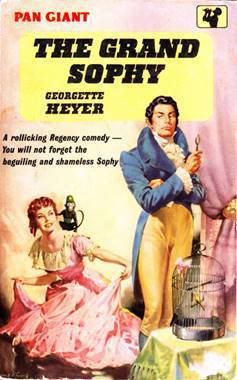
Interesting that Pan obviously demanded some tweaks in their cover illustration for this - the earliest version of Sophy goading Charles with the monkey on her shoulder has clearly been revised to give her the right hair colour and a more stylish dress!
The illustrator of the 2013 Arrows clearly has no idea about Regency dress - and Sophy looks as though she's sitting on a mule rather than a spirited steed that everybody admires.
These Old Shades and Devil's Cub have been released by Sourcebooks with the "new" covers:https://www.therippedbodicela.com/boo...
https://www.therippedbodicela.com/boo...
Sheila (in LA) wrote: "These Old Shades and Devil's Cub have been released by Sourcebooks with the "new" covers:https://www.therippedbodicela.com/boo...
https://www.therippedbodicela.com/boo..."
Very nice!
I like the mask on the DC cover!
 I think both book covers are a little light-weight for these two stories.
 Hmm they are hardly going to jump out at new readers on the bookshelves!
Jenny wrote: "I think both book covers are a little light-weight for these two stories."
Hmm they are hardly going to jump out at new readers on the bookshelves!
Jenny wrote: "I think both book covers are a little light-weight for these two stories."That's what I was thinking. Pretty covers but a little too pretty for the stories. TOS is slightly better, giving a sense of the time period anyway.

Georgette Heyer Fans
Books mentioned in this topic
Black Sheep (other topics)Charity Girl (other topics)

https://happyeverafter.usatoday.com/2...
& the book covers look to be a big improvement!