
Book Cover Reviews discussion
Cover Reviews
>
Burglary on the Side
date newest »
 Mod
Mod
On making the cover small, add the HTML "width and/or “height” tag. Go here to study how to do it:
https://www.goodreads.com/topic/show/...
Hmmm… mine attempts aren’t working well either. Safest to to make the actual image smaller and link to that.
Thoughts/answers to your questions:
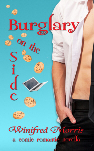
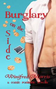
1. The model with partial face looks like 20s to me, not 34. The chin-only would be a safer bet if you want thim to be in his 30s. But he doesn’t look much a lawyer to me, even with the (faky) tie. On the other hand, 6-pack abs will probably sell more than a pinstripe suit! Unless you can find a guy in a suit that’s open and showing his abs! :)
2. The heart cookie background confused me at first (I thought they were teeth!), and probably more importantly, they create a difficult background for setting off the title; the current title treatment really gets lost in those cookies.
3. If you’re not going to have a woman, then I guess the cookies act as the female character. So you’ve got to play them up. Which means the last two options. Of those, the one with the most strength is the green background. But with that one, you still have some contrast problems with the text and the background image.
Enough to play with?
Others chime in as well.
 I am really confused by all of them. Sorry.
Why is this called Burglary on the Side if he is a lawyer? None of the covers look like they match the title to me. Bakery items, lawyers, laptops? None of those deal with Burglary and my brain is just desperately trying to imagine how is it possible for that abed man to be a criminal.
 No, he's not the burglar. Next time I'll include a blurb, but clearly I need to rethink this. Thanks for your comments. Lots of food for thought.
 I like the idea of the tie-drew my attention. Faves: the one on the top left and the one with the green background and the cookies. To C.B.'s point, what's the cookie connection?
Okay, here are a couple of new attempts. I've also posted these on Support for Indie Authors, but I'm curious what you think. I’m including the blurb this time so you’ll know what the book is about since there seemed to be some confusion about the way the title relates to the cover. And maybe it doesn't. That's another issue, but I'm hoping it will work if the blurb is there too.
I like the idea of the tie-drew my attention. Faves: the one on the top left and the one with the green background and the cookies. To C.B.'s point, what's the cookie connection?
Okay, here are a couple of new attempts. I've also posted these on Support for Indie Authors, but I'm curious what you think. I’m including the blurb this time so you’ll know what the book is about since there seemed to be some confusion about the way the title relates to the cover. And maybe it doesn't. That's another issue, but I'm hoping it will work if the blurb is there too.The blurb: Emma is a nerdy graduate student who likes to imagine herself a secret hero in the long tradition of nerdy secret heroes—making the world a better place. Not only does she try to do this in the usual ways, but she helps ex-spouses who were treated unfairly in the divorce by burgling their former spouses. Then through one of these burglaries, she comes into possession of a laptop that brings her into the world of political intrigue, including scary thugs and a kidnapping. It also brings her into the high-rise condo of a sexy lawyer who seems to see the secret hero in her. Or is he only using her for his own political gain?
Am I getting any closer? Any comments will be appreciated.
Mod
* You've got the love interest, but where's the hero (heroine)? Are the cookies her? Are you sure you don't want to show the main character?
* Sorry, but really hard to read the main title. You have three different orientations going on! And the colors are hard to read, too. Red against black, red against blue... all are tough.
* If you're going with the tie, REALLY go with the tie. Show it. But make it look real. (***Is there any way you can do/afford a custom photo shoot? That way you can get everything exactly as you need it: pinstripe suit, abs, heroine, the whole works.)
Thanks, Harald. As you know, I've resisted using men's chests on my covers, but a number of people in the Support for Indies group preferred the bare chest, so no tie, more chest wins. And I'm afraid I don't want to show the woman. I feel it would be very difficult to find one that fit. But I agree there are problems with the fonts. I've been playing with them. I'll let you know when or if I find some I think work.
 Hi Winifred,
Since it has comedy and romance, the book has to be colourful, but the blue background-red font-white shirt isn't too pleasing to the eye. Since it's a romantic comedy, could you try using a peach or light pink background? Also, the letters are everywhere, and the font is not readable. You could use a more readable handwritten font. This might be helpful - https://fontlibrary.org/en/search?cat...


Any comments will be appreciated.