
Support for Indie Authors discussion
Archived Workshop No New Posts
>
Questions regarding first book
date newest »
 Hey, your cover looks great! I think your author name is a little on the faint/small side. If I were to make any changes, it would be to put your name across the bottom in huge letters. Remember that people seeing your book as a thumbnail would not be able to see your name.
 I used this copyright sample page which you can copy and paste the language and fill in your own details. I thought it made my copyright page look really professional to use the one with a medium amount of verbage. http://www.thebookdesigner.com/2010/0...
 I like your cover. I also have three books out and find funds are limited. It you ever get in a pinch, check out fiverr.com. They designed my book cover based on what I wanted for $15. It's also a YA fantasy. You can find it on Amazon if you want to take a look. "I Can Hear You" by Hannah Davenport. I used Bobooks. Aslo, I had someone format for amazon and smashwords, $5 each. It's great for us on a limited budget.
 Hi Bryant. The cover looks great! I love the art style. As for the copyright page, one thing to keep in mind is that not all readers will be the same size, have the same font and margins set, etc, so what looks like one page there could change. Credits usually go there, along with any disclaimers, but you might want to make the dedication its own page. No one should kick up a fuss, especially since Amazon will default the book to the first page of the actual story.
 I agree that your name is too small and dark. Otherwise, I think it's nice.
 I would definitely make the author name easier to read on the cover. Other than that, I think the cover looks fantastic.
I would make the dedication its own page, though. But as others have mentioned, that might change depending on what device someone's reading on and what their settings might be.
Best of luck!
 Thanks for all the feedback. The girl who designed the cover actually told me I should make my name bigger but I said I didn't want it to detract from the title. Guess I should have listened to her! That is something I might still be able to fix.
I didn't realize Amazon set the reader to Chapter One so that's also good to know.
 I think it's nice! The fingers are a little bit off but the face is what you notice and it's nicely done. I agree about enlarging your name; in a smaller image it will disappear. Good luck!
I felt embarrassed when my cover came back from the designer and my name looked ridiculously huge. I was like, "but I'm nobody. Would anyone really care to see my name that big?" The more I get into publishing, the more I see that cover designers know what they're doing and a prominent author name actually does make a book look nice and professional. I do love the image you chose. Good luck with your launch day :)
I brightened my name and enlarged the text. Visible now at 1 1/2 -inch heigh thumbnail so I guess that should be okay?
I think it's nice! The fingers are a little bit off but the face is what you notice and it's nicely done. I agree about enlarging your name; in a smaller image it will disappear. Good luck!
I felt embarrassed when my cover came back from the designer and my name looked ridiculously huge. I was like, "but I'm nobody. Would anyone really care to see my name that big?" The more I get into publishing, the more I see that cover designers know what they're doing and a prominent author name actually does make a book look nice and professional. I do love the image you chose. Good luck with your launch day :)
I brightened my name and enlarged the text. Visible now at 1 1/2 -inch heigh thumbnail so I guess that should be okay?Thanks a lot for the input!
 I love the cover as well. It's so bright and cheery! I wouldn't change a thing.
And Hannah suggested Fiverr.com if needed in the future. Just as aside note--I joined a webinar the other day about writing children's books and one of the great benefits was learning about Fiverr.com and being taken (virtually) into their website. They are amazing and at a low cost. So, thanks for bringing that up, Hannah.
Marie wrote: "Hey, your cover looks great! I think your author name is a little on the faint/small side. If I were to make any changes, it would be to put your name across the bottom in huge letters. Remember th..."This is actually the site I used to learn what content I needed!
 Ace cover, I'd click on the thumbnail and read the blurb for sure :)
 I like it. But I really can't see the author name. Perhaps just a wee bit brighter. Good luck to you! Remember, folks do judge a book by its cover
 I second what many people said. LOVE the cover, the image and the choice of font, but the author name is almost invisible.
 You said you changed it. Is there anywhere we can see the changes?
Posting images in these forums is trickier than average. Made the font slightly larger and a fair bit brighter. Could read it as a thumbnail at this size. Here is the new one: 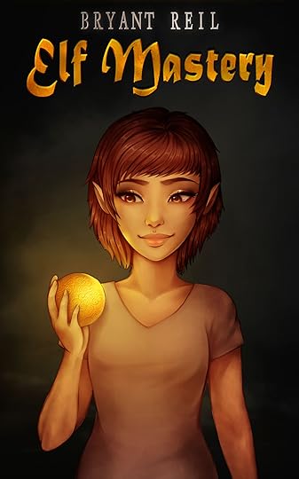 Speaking of blurbs, I wanted one that was fairly short. How does this sound:
Like most elves, Kyla's first year away from home presents certain challenges: meeting new people, finding a suitable field of study, and learning to yo-yo. Unlike most elves, Kyla runs afoul of Erebus, the god of darkness, who plans to bathe the world in eternal night. With her world threatened, Kyla must leave her carefree adolescence behind and master her fears if she hopes to save the Earth and the people she loves within it.
 Love, love, love the new cover. As for the blurb, I'm the worst at blurbs but I will say reading what you have here makes me want to run off and download your book. Great job.
Great cover! There's something that stands out though: it feels too weighted to the top since the text is confined to the empty space above her head. Maybe it's just me, but my eyes keep going up instead of fully sinking into the whole cover. Perhaps play with the location of either the title, your name, or both. Maybe it would look more balanced, maybe it wouldn't look better at all. Right now it looks like the text is intentionally staying out of the way of the art. Then again, if you drop your name to the bottom, with the size it is now, it could look like her belt. Adjusting the size could resolve that. It could just be me though. I don't think anyone else has mentioned it.
Love, love, love the new cover. As for the blurb, I'm the worst at blurbs but I will say reading what you have here makes me want to run off and download your book. Great job.
Great cover! There's something that stands out though: it feels too weighted to the top since the text is confined to the empty space above her head. Maybe it's just me, but my eyes keep going up instead of fully sinking into the whole cover. Perhaps play with the location of either the title, your name, or both. Maybe it would look more balanced, maybe it wouldn't look better at all. Right now it looks like the text is intentionally staying out of the way of the art. Then again, if you drop your name to the bottom, with the size it is now, it could look like her belt. Adjusting the size could resolve that. It could just be me though. I don't think anyone else has mentioned it.
 The art is perfect, but I also feeling everything written crowded on the top. The last version of your name has a nice silvery tint that goes well with the golden letters, but it's too much hidden.
I understand the feeling of trying to avoid the 'tainting' of the graphics, but in case of a cover that happens. I think you should put your name somewhere at the bottom. At least you hide the crook of the arm and you can expect more sales in India... :)
We tried the bottom first but the problem we had was that the text running across different backgrounds (her arm, waist, and the black background) made it trickier to read, or else we had to make it really small to fit on her waist. I can mess around with it a bit more though.
 Lovely cover art! My only comment is to echo what Quoleena and Zoltán mentioned. Perhaps try putting the author's name at the bottom? To me, it looks a bit cramped at the top. The title could be moved down a smidge, but that's a very minor point.
 The blurb [#17] sounds fine to me.
Bryant wrote: "We tried the bottom first but the problem we had was that the text running across different backgrounds (her arm, waist, and the black background) made it trickier to read, or else we had to make i..."Text covering the art is to be expected. In this case, you might have to alter the text effects to make it stand out over the arms, since right now you have it colored to stand against a dark background. You can also tweak the size of the text until it lies precisely where/how you want it.
ie, use different coloring and text effects over those different areas so the end result is text that appears to be the exact same color. This may not make sense. I know what I'm trying to say, but reading it back seems wonky.
Now that its brighter it seems a lot better, and if I keep it this size it does stay on the shirt background. Then the extra black space above the title made me feel like I should move the title up a bit, so not sure how that worked out. Bryant wrote: "Now that its brighter it seems a lot better, and if I keep it this size it does stay on the shirt background. Then the extra black space above the title made me feel like I should move the title up..."
If I'm not being too forward, I'd like to give it a go simply to show you what I mean. Files are sacred though, so no worries if you'd rather not!
Mind you the way it was before is very reminiscent of my copy of 'Howl's Moving Castle' by Dianna Wynne Jones.
Quoleena wrote: "Bryant wrote: "Now that its brighter it seems a lot better, and if I keep it this size it does stay on the shirt background. Then the extra black space above the title made me feel like I should mo..."Personally I don't mind but I left the artist ownership of the picture (I just took distribution rights for the book and promotional materials.) So it might not be appropriate to send out. I take it this result wasn't what you meant, however.
Gotcha! It's subjective, so ultimately if you love it then that's golden. I'm just thinking of playing with the size of the text to fill in the space a bit. Feel free to ignore me. I'm not even a graphic artist :)
Personally, I like the look of the name at the bottom. Where the title goes at the top is up to you. Everyone would tweak it differently. For me, I'd drop it, because I get an eye jump from the highlight on her bangs to the gold of the title, and if the title was lower, it would feel more integrated and balanced. But that's just me. Others will feel differently. And readers won't have any idea what the options were. Both I and my co-author have been working artists and professional graphic designers at different times in our lives (she still is -- me, not so much) and we hardly ever agree on anything when it comes to covers.
So make yourself happy.
Frankly, I like it just as you have it now. I was a landscape artist, so my opinion as a graphic artist might be a little suspect, but I do have an eye for art, and that helps. If the cover is the only holdup, I'd go with it. You can always tweak it later if you really have to.
The last version looks much better IMHO. Two additions:For my taste, the original position of the title was better, but as Owen has pointed it out, we are into personal taste territory here...
About your name: If you add a slight shadow to your text, you have overlap between areas with contrasting shades. In this case, a slight black shade would allow you to:
- Increase the size of your name a bit.
- Revert back to the silver shade.
 i love how it looks. it actually looks rather (to me) professional. really well done on it.
I like post 16, name at the top; keeps me focused on the middle.
i love how it looks. it actually looks rather (to me) professional. really well done on it.
I like post 16, name at the top; keeps me focused on the middle. For the blurb, I would like a sentence or 2 about the world. You mention a yo-yo . . . is it a modern world with a parallel elf universe or is it an ancient yo-yo, since they go way back? It feels like Ariel in The Little Mermaid movie coming upon the world above the sea. :-) I think I'm looking for a bit more depth in the world.
 I like the author name at the bottom better.
 I also prefer the name at the bottom. For me, the illustration looks slightly incomplete with the elf's body emerging from the bottom. Placing the name down there frames it and finishes it off nicely.
 it helps that you put out both the cover and blurb for critique at the same time b/c they support each other.
the predominant theme in the cover and blurb is playfulness: the elf is cute, there aren't any threatening images and "yo-yo" in the blurb again indicates a playful tone. the dark background lends some mystery but it isn't much different from other fantasy covers. consequently, its audience seems to be younger teens: middle school. from the blurb it seems to be a coming of age character-based story. so then the world background isn't necessary unless there's something unique about it's magical system. then again, you might not want to clutter up a well-focused blurb.
however, the title might need to be a little more active and unique. you could try this search for comparison: http://www.amazon.com/s/ref=lp_17466_...
perhaps use the MC's name in the title. off the top of my head, maybe:
Kyla vs the God of Darkness
Kyla vs Erebus
Kyla Against the Dark
Elf Kyla vs the God of Darkness
The Elvin Warrior: Kyla
(okay, not that great.)
 I much prefer the author name at the bottom. The cover is great!
Thanks everyone! I have a friend helping me with the design (she's much better at Photoshop) and have passed along the feedback. I told her that I'm going to credit her as the designer so I will accept whatever she deems best. I think we'll probably end up with the name at the bottom and she will play with the sizes/position of the title. As for the blurb I will add a line or two setting the scene. Hopefully I can get the book listed tomorrow; I'm just waiting for the artist to send me back the signed distribution contract!
I much prefer the author name at the bottom. The cover is great!
Thanks everyone! I have a friend helping me with the design (she's much better at Photoshop) and have passed along the feedback. I told her that I'm going to credit her as the designer so I will accept whatever she deems best. I think we'll probably end up with the name at the bottom and she will play with the sizes/position of the title. As for the blurb I will add a line or two setting the scene. Hopefully I can get the book listed tomorrow; I'm just waiting for the artist to send me back the signed distribution contract!
 I love the art, and the font you're using, but I think the problem is you haven't applied the rule of thirds to the layout. Have a look at the blog on coverdesignstudio.com, Book Covers and Layout Part 1. It illustrates very clearly how images and text should be arranged, so your text should be one third and your image two thirds. Hope that's helpful.
 3rd version looks perfect. to me :-)
Great job!
Blurb; keep to very small paragraphs. Attention spans are very limited these days. We're getting more and more lulled into visuals, so big amounts of text are off-putting.
To help avoid the Amazon KDP machine chewing up my formatting I used this very helpful (free) guide:
http://www.amazon.co.uk/Building-Your...
All the very best of luck xx
Well we ended up doing a side-by-side comparison and there were advantages/disadvantages to both, and I liked both, so I put it to a vote on my Facebook and 'name at the top' won. Committed to it now. Format is very similar to my copy of 'Howl's Moving Castle' so at least I know I didn't make a monstrous error. So far it's just the ebook release, so I can change still change it, but for now the name is at the top.
 Bryant wrote: "Now that its brighter it seems a lot better, and if I keep it this size it does stay on the shirt background. Then the extra black space above the title made me feel like I should move the title up..."
The name is more visable, which is great but I had another idea that I think might work but wouldn't cover the image.
If you cropped the image so the bottom was right below the below that would open up the top for larger text while still allowing the picture to have a pleasing composition.
The would allow more room to mess with the title and author up on the top, if you wanted to try and keep the image of the elf clean.
Joshua wrote: "Bryant wrote: "Now that its brighter it seems a lot better, and if I keep it this size it does stay on the shirt background. Then the extra black space above the title made me feel like I should mo..."Yeah someone on my Facebook had suggested that too. I might try it. Right now it's just an ebook so I can change it.


I had a cover made, and I absolutely love it though it wasn't professionally done (Funds are limited, but I love the work that I got). I do think it would be helpful to get some 3rd party input. I doubt I will make any changes unless people unanimously hate it, but thought it would be wise to get some feedback on here in case there's a major issue I can't see. Target audience is YA Fantasy, and the theme of the book involves light/darkness, which we tried to portray in the picture.
Here is the cover:
I also am trying to figure out the copyright page. I combined it with the dedications and credits page, as I think it's more convenient for ereaders to not have to swipe through too many opening pages. I tried to keep it nice and minimal, but not sure how professional it looks.
Thanks for any feedback!