Poll

The Nightlife London is calling. Cast your vote for the cover!
Short Blurb:
Vampires, werewolves and fallen angels face down Albanian mafia and old vendettas in the dark, gritty, strip clubs and back alleys of Nightlife London. A violently sexy tale of vampires Aaron and Michelle on the hunt for Michael Jamison, the man who stole her blood. They find help from Russian mercenaries, werewolves, natural hunters adept at taking down rogue vampires.
CHAPTER 1 excerpt: https://www.goodreads.com/story/show/...

Multiple cover choices provided by Ida Jansson: http://www.amygdaladesign.net/
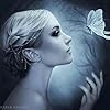
Cover #2
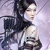
Cover #3
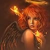
Cover #1
Poll added by: Travis
This Poll is About
Comments Showing 1-50 of 62 (62 new)
message 1:
by
A.D.
(new)
Dec 14, 2013 06:57AM
 3 definitely best! :D
reply
|
flag
 Mod
Mod
I like 3! I like them all. But probably 2 and 3 are my favorites.
This is actually symbolic of a scene where Katya, a Russian mercenary, goes ballistic in combat, topless.
:)
 Cover #2 reaches out and grabs you!
It's a killer.
 I voted for #2. The woman seems as if she's on the hunt, and I like 'Big Ben' in the background.
 Gosh, this is a toss up.
 I opted for #3 because there's something about it I love, but #2 is awesome also. You could go either way.
 I really like #2. The colors on #2 just look better to me than on the other 2.
 #2 is my fave, but they are all good. The blood on the upper body needs a tweak on #2 IMO because it looks like it was dropped on a flat cover rather than spattered on a bod and clothes. If it was me, I wouldn't have completely airbrushed out the woman's chest either. Nothing pervy, it just seem obvious "they" are missing. Or is she androgynous? Great work. Looking forward to the read.
 I love 2, full body shot and I love the colors and the way she is standing there with the gun and the knife
 I love 2 the best. Gives me the best vibe. The other two are kind of meh for me.
 #2 because the colors pop and you can see the weapons clearly.
 Travis, I'm so conservative (we've talked about our differing genres), so my first instinct was Cover #1, but then I thought about what you are trying to acchieve and switched to Cover #3--more mysterious and gory....no? Best,Sarah
 These are all gorgeous, but #2 is my favorite. Love the look of the girl, sexy and badass. Not to mention, it best fits the title for me. Thank you for the poll hon :)

 I like the positioning if number two best...but the blood on the jeans and her chest looks flat (to me). Of the three I go for number #3
 When I saw your title, I thought your cover should include Big Ben. That's why I chose cover #2.
 Number 2 all the way. It'ssuch an amazing cover and a beauitful piece of art.
 Number 2 deffo, but wish it was the blonde from the earlier book cover!

 Definitely cover 2. The full body image is sexy but strong, suggesting a woman who is not to be messed with. The full moon in the background connects the character to, "otherness," a realm beyond nature, where desires are realised in terms of instincts of the flesh!

 I love #3, Travis, those eyes and the knife means business.
 They're all amazing but I love #3 the most!
 I like #1. It just draws my eye to it!
 Hands down, it's #2 for me! Sexy, beautiful, smart and in control is what this cover says to me. Women can relate to her strengths and men will be intrigued.
 Cover 2 -nods- it's the most expressive imo >^.^<
 They're all good options, but I think #2 best captures the essence of the story as conveyed in the short blurb. "Violently sexy".


 A woman on the prowl is number 2. I assume werewolves and vampires prowl.


 My eyes were automatically drawn to cover #2.
 I liked them all but #1 is my choice. Awesome designs!
 I think #2 best fits the description of your story!

 I like 2 best - it is bright and attractive = less 'dark and sinister' - and the girl looks more welcoming


 I had to go with #3. #2 is nice but I have seen it before.
 #2 has my vote. It pulls you in with an expectation and promise of some thrilling action.
 All of the covers are works of art but number 1 is awesome. The eyes pull you in and reach at your heart. What are the feelings behind that dark gaze? What happened in her life, what is burning so deep inside her soul that it only shows in that intense gaze of those beautiful eyes?
 I picked #3 as it is in keeping with the branding of your other books with the expression on the face. Personally I like #2 better but it doesn't map to the other book covers as well - she looks more badass and less sexy compared to the other covers. Changing hair color if she's the same woman as previous books is going to be hard for many fans unless it's explained in the book.
Mod
I picked #3 as it is in keeping with the branding of your other books with the expression on the face. Personally I like #2 better but it doesn't map to the other book covers as well - she looks more badass and less sexy compared to the other covers. Changing hair color if she's the same woman as previous books is going to be hard for many fans unless it's explained in the book.
Mod
This particular cover art was designed for one of the new characters introduced in London. So, its not intended to be Michelle, the blond, or Anastasia, the dark-haired woman from Nightlife Vegas.
I will probably continue this theme, featuring new faces now and then on the Nightlife covers, when its a new character featured in the series.
:)

 I like #2 best BUT I think #1 works best as a small icon (think Goodreads or Amazon).
 #2 Is an immediate eye catcher. Full cover, sexy, but yet shows she is a kick-ass heroine. I would buy this book based on this cover alone. I love strong, kick-ass heroines and all my book buddies do, as well. This is the cover I would pick up to look at before the other two.

 I believe 3 conveys where it is very well and that in itself is intriguing to at least give it a try! And then when readers crack open the sample--they'll buy it!!
 ~ Stephy