
Poll
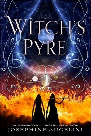
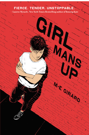
Goodreads YA Cover Contest - September 2016. Vote for your favorite!


Poll added by: Catherine
Comments Showing 1-31 of 31 (31 new)
date newest »
newest »
 My vote goes to the Forgetting. This month's choices are better than other months. I also like the colors of the Witch's Pyre but I think the title isn't large or bold enough to see it from the background. Girls Man Up is nice in its simplicity but it doesn't pull me in like the Forgetting. The Light Fantastic is hard to read the title and is distracting, my least favorite.
 After several months of unappealing covers, this month's selections make for a real competition-covers distinctive & evocative of the books they represent. I don't like the cover for The Light Fantastic, but the other four are excellent. It was not an easy choice, but I am voting for Witch's Pyre.
 The Forgetting cover is unforgettable.
 I like the overall presentation of Witch's Pyre the most, but based on title alone, I would have gone with "And the Trees Crept In."

 I vote for "And the Trees Crept In" because it peaked my curiosity. I did like the colors of the "Witch's Pyre" but I didn't particularly want to read about witches...
 Ooooh, this is tough. I'd probably say 'Witch's Pyre' has the whole atmosphere going on - the colours are vivid and visually, the most appealing.
A close second would be 'Girl Mans Up' because it's strikingly simple and reminds me of a graphic novel.
 That was difficult. I did not read what the books were about before voting and tried to judge the covers solely on their looks. 'Witch's Prye' is beautiful, if a bit traditional. 'The forgetting' got better the more often I looked at it and the little sentence intrigued me. 'Girl mans up' is a perfect complete package. Title and cover style just fit together seemlessly. 'The trees krept in' i think the cover would have been better without the girl in the centre ... it would have been spookier. 'The light fantastic' well didn't give me anything. Neither the title nor the cover would have made me pick up the book if i saw it in a shop.
 witches pyre is the most visually dramatic, foreshadowing violence and adventure. the font fits the design and does not detract. to me this wins hands down for design. as we are voting on the cover and not the content, which many readers fail to comprehend, my second choice is "trees crept in", tho i found the font does nothing but detract from the artwork. that needs correcting. "The forgetting" cover is forgettable - bland. I like the simplicity of the other two, but they appear to be budget books, as if the publisher could not afford a better visual artist.
 Two bad ass women, love this one but really wanted to go with
 "And the trees crept in"
 Any wrote: "This is finally a month where voting is tricky.
I love the colours of the Witch's Pyre, but I don't want to vote for it.
I like The Forgetting because the tree's blooms falling to the ground while..."
Any wrote: "This is finally a month where voting is tricky.
I love the colours of the Witch's Pyre, but I don't want to vote for it.
I like The Forgetting because the tree's blooms falling to the ground while..."
I find your premise that the only "real" lesbian is one who looks and acts like a man, offensive. There are many lesbians who like to wear dresses, can wear high heels and makeup if they choose to, are JUST as "real" as anyone else, and aren't being "straight." There is no single way lesbian women look or act. You managed to inject quite a bit of presumption into the cover art and title of this book.
I am torn between "Witches' Pyre" and "the Forgetting." Witches' Pyre is visually dramatic. I like the integration of fire, scrollwork and interpretations of moonlight. It looks like an interesting book, with strong women. The Forgetting bears unique artwork, as the title becomes the root system of the tree. I definitely would pick up Witches' Pyre to see what it is about, and probably the Forgetting too, though it doesn't draw me in so much. So I choose Witches' Pyre! The Light Fantastic gives me a headache to look at it, and there is nothing unique about And the Trees Crept In. It looks like a standard murder/suspense book. I don't like the premise of "Girl Mans Up."
 I'm not too sure what it is, but something in the cover of And the Trees Crept in really draws my attention. I think it is beautiful.
 Hands down for me, GIRL MAN'S UP. So bold! It's PERFECT!
 Paula!,
I wrote:
"the girl on the cover really does look like she is a lesbian coming to terms with her sexuality and manning up against all those in her life who want her to lead the life of a straight girl who wears high heels and pretty clothes and dates a guy."
I judged this book by its cover!!! I didn't set out to judge lesibans as a whole!!! The cover shows a "tom boy looking girl" who doesn't wear girly clothes. And this is what I commented on. She does look like a girl who is "Manning up" against those who don't want her to be the way she is. Wearing jeans and a t-shirt and a short "manly looking" haircut. I never said that lesbians don't wear dresses. That is not what my comment is about. I commented on this particular cover and how the visual of the cover fits with the title. Don't take everything sooooo seriously or soooo personally. I didn't comment on you or your sexuality or the way you dress. I suggest you get in touch with your own hangups and get over them.
Any wrote: "Paula!,I wrote:
"the girl on the cover really does look like she is a lesbian coming to terms with her sexuality and manning up against all those in her life who want her to lead the life of a st..."
I stand by my comments. Judging the book only by its cover, it shows a girl wearing a tshirt and jeans. There is no knowledge of what "people want her to do," nor does a girl need to "man up" to be a "real" lesbian. I reference your comment, "people want her to be a straight girl who wears heels and dresses." Real lesbians wear dresses and heels too.
 The Forgetting at first glance was my favorite and I also liked And The Trees Crept In.
 I vote for 'And The Trees Crept In.' Looks haunting, magical, ghostly. All things that attract me to the book straight away!
 I like th Witch's Pyre. It was the first thing that caught my eye.
NOT THIS ONE!
I like th Witch's Pyre. It was the first thing that caught my eye.
NOT THIS ONE! AND THIS ONE IS THE ONLY ONE I AM TALKING ABOUT.
This one is wearing a t-shirt and jeans and a short spikey haircut and the look on her face and her body language is one of defensiveness and anger. She is working through her stuff and is angry at those who want her to be different. She is "Manning up" (which tells the rest of the story!!!). Title choice is as important to picking your target audience as the look of the book. "Girl mans up" tells any half intelligent reader all they need to know about the content of this book. It's about a lesbian trying to stand her ground, despite opposition from those who would like her to "fit in" and especially not "be manly" (i.e. wear girly clothes and date the high school quarterback).
I have no interest in stereotyping anyone. My best friend was a lesbian who killed herself after her m2f transgender partner was diagnosed with pancreatic cancer and was lay dying in a hospice. The two were buried within 10 days of each other. I have a very close confidant who is a f2m transgender. I have many lesbian friends. I have rented my house to a lesbian couple. I live in a town that hosts one of the world's biggest gay and lesbian mardi gras and has an openly lesbian elected mayor (just re-elected last weekend!) and many openly gay ministers of parliament. I actually do not give 2 hoots about what other people do in their bedrooms as long as it doesn't involve unwilling participants of those unable to give consent (children and animals). I am here only to have fun participating in a cover judging. Something you are doing your utmost to destroy. Please keep your ideas about what else I might be judging to yourself. I am not judging lesbians. I have no reason to do so and no interest in it. I openly and outspokenly support the hopefully upcoming plebiscite on gay marriage in my country so I can vote a resounding "YES - let them be married".
Anyway, people do not come here to discuss stereotyping nor to judge others. We are here to say "I like this cover better than that cover."
I would think that my reasoning as to why I like a cover better than another at least shows I thought about the cover. Rather than some who come here and picks the cover with the prettiest colours. Which I also all respect. Because they are allowed to judge the cover by any means they see fit.
Leave me alone and let me do what I came here for. I do not want any fight with you. I stand by what I said. If you disagree, go tell your therapist. I have better things to do. Like read that book I voted for to find out just how stereotypically lesbian or otherwise she is and how lesbian hating or otherwise her family is and how she gets through all this.
Please also understand that not everyone judging the YA cover contest is a young adult - it's been decades since I was a YA. I have just clocked up 1015 read books.
Probably read a several hundred more books since I can't remember all of them and only started listing them at goodreads a few years ago. I read 139 books last year alone, which I noticed is more than three times the total number of books you have listed as read. So allow me to know what I know. The title of this book is very clear to any seasoned reader what the book is about. I am not pre-judging anyone or anything here. The only judgement I make here is about the cover of the books.
Okay all the covers this month are so cool and beautiful. It was really difficult to vote. But I choose The forgetting one as I really liked the analogy of tree and memories. That is somehow I also visualize mine. The memories that I have lost are the fallen leaves, the ones that come back are the dark green and bigger leaves, buds and new leaves are the new ones that I make as the life goes on and stem and roots symbolize the major events irrespective of their state of emotion.
 Witch's Pyre has pretty coloring. I voted for the Forgetting because of the tree and purple coloring - it's unique enough to work. I don't like the cover for Girl mans Up or The Light Fantastic. When the trees creep in is gorgeous except for the girl falling - makes it too melodramatic for me.
 Although I liked the cover of Forgetting a lot I picked the one for Girl mans up as my favourite!
Witch's Pyre was my favorite cover. However, I was surprised how each cover seemed to speak to me and I felt drawn to each cover.
Although I liked the cover of Forgetting a lot I picked the one for Girl mans up as my favourite!
Witch's Pyre was my favorite cover. However, I was surprised how each cover seemed to speak to me and I felt drawn to each cover.
 I had to use the process of elimination to figure this one out, it was so hard! But the Witch's Pyre was too overdone and smothered with decoration in my opinion and the Light Fantastic is off center and messing with my brain. The Forgetting was really, really cool, but what bothered me was flowers growing out of the roots. Girl Man Up didn't seem impressive to me; I know many who could do that and it was really straight forward by putting the protagonist on the cover. Maybe my reasoning is really weird, but The Trees Crept In is weirder and drew me in for that reason.
My vote goes to 'Witch's Pyre' cover. Colors are great and the stance of the witches is sassy, taking ownership of their ceremony.
I like The Forgetting Best! It's beautiful and it tugs at my mind and heart.
I had to use the process of elimination to figure this one out, it was so hard! But the Witch's Pyre was too overdone and smothered with decoration in my opinion and the Light Fantastic is off center and messing with my brain. The Forgetting was really, really cool, but what bothered me was flowers growing out of the roots. Girl Man Up didn't seem impressive to me; I know many who could do that and it was really straight forward by putting the protagonist on the cover. Maybe my reasoning is really weird, but The Trees Crept In is weirder and drew me in for that reason.
My vote goes to 'Witch's Pyre' cover. Colors are great and the stance of the witches is sassy, taking ownership of their ceremony.
I like The Forgetting Best! It's beautiful and it tugs at my mind and heart.
 All of these covers, except one, have been done to death and wouldn't catch my eye if I were browsing in a bookstore. The exception is Girl Mans Up. It looks fresh. It gives me a good idea of what to expect inside the pages. Definitely a winner!
 Girl Mans Up caught my eye first with the picture and then the title. I first thought of Joan Jett! Tough girls are cool, if the story is right.

















I love the colours of the Witch's Pyre, but I don't want to vote for it.
I like The Forgetting because the tree's blooms falling to the ground while the tree is getting green leaves indicates the passage of time. Good cover. But I won't vote for it either.
I did not like "the light fantastic" much.
"And the trees crept in" has a great cover and the book intrigues me enough to want to read the book.
But the winner is "Girl mans up" because the girl on the cover really does look like she is a lesbian coming to terms with her sexuality and manning up against all those in her life who want her to lead the life of a straight girl who wears high heels and pretty clothes and dates a guy.
I think this is the first month where all the books actually represent the title really well. But my vote goes to "girl mans up".