The fine print
 “Always read the fine print,” they say. Make sure you know what you’re buying or agreeing to. In this litigious society, nearly everything we buy has some kind of disclaimer attached to it. Sellers are required by law to disclose unpleasant details we’d rather not know … and, if we knew them, might cause us to think twice about agreeing to buy.
Inventive sellers of everything from pharmaceuticals to shady loans have devised ways to skirt the law. They provide the information, but in a format hostile to buyers … nearly impossible to read … in order to prevent them from understanding those required disclosures.
As technology has given us more ways to dispense information, fine print has kept pace. A majority of product liability statements are in all capital letters. You might ask, “Doesn’t that make it stand out?” No. All-caps is actually very hard to read. You think they don’t know that? Other tricks include low-contrast and distorted fonts. Printing the details in light gray on a slightly darker gray background, for example.
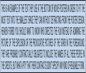
Did you know there are fonts specifically designed for movie posters? Look at the bottom of any movie poster or DVD label. In most cases, the names of the cast and crew are in narrow, cramped, tightly spaced, and vertically elongated letters. Some are completely illegible, even in strong light. But why would they try to hide information?
The studios are obligated by contract to include all the names, but the poster designer wants the attention on the large explosion photo or the provocative image of the star. So the movie poster fonts are used to smash all that dreary detail into the small space at the bottom. Good luck trying to find out who the Production Designer is. And if you finally got your Big Break with a supporting role in a major film, your relatives in Indianapolis will never learn that from the poster.
What can we learn from fine print? If you want your writing to be easy to read, do the opposite. Avoid all-caps, use reasonably sized and spaced fonts, and print with good contrast between text and background. It seems like common sense, but graphic artists (who see blocks of text as art objects) often focus more on a pretty page than on readability of the material. Low contrast print has been in vogue recently, and it’s particularly hard to read on websites and online ads.
Do you remember when the required disclaimers first crept into radio ads and they occurred at the end of the spot, spoken so fast you couldn’t understand a word? Yesterday I heard one that didn’t even try to sound human. The voice was like a chipmunk on speed. For anyone old enough to remember, imagine a 45 RPM record played at 78.
Ugh—the radio version of fine print.
Like TextCPR on Facebook!


