
Three Random Graphs: Recession Watch, Wisconsin Employment Decline, Global Temperatures
Industrial production is down. Wisconsin nonfarm payroll employment is down. Global Temperatures hit records in 2014, 2015.
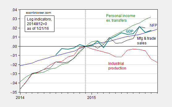
Figure 1: Log nonfarm payroll employment (blue), industrial production (red), personal income ex.-transfers in Ch.09$ (green), manufacturing and trade sales in Ch.09$ (black), and GDP in Ch.09$ (bold teal), all normalized to 2014M12 = 0, accessed 1/21/2016. Source: BLS, Federal Reserve Board, St. Louis Fed, and BEA via FRED, Macroeconomic Advisers January 20th release, and author’s calculations.
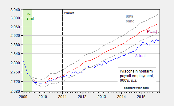
Figure 2: Wisconsin nonfarm payroll employment (blue), forecast from error correction model estimated over 1990M03-2009M06 (red), and 90% confidence band (gray lines), all on log scale. Dashed line at 2011M01 when Walker takes office, and light green denotes sample period. Source: BLS, author’s estimates.
The counterfactual forecast is based on a bivariate single equation error correction model involving national and Wisconsin nonfarm payroll employment, with one lag of first differences, and a contemporaneous first difference US NFP (hence, US NFP is weakly exogenous). Notice the sample used for estimation is up to 2009M06 (NBER defined trough), and the forecast tracks well until 2011M01.
Note that the gap between Governor Walker’s August 2013 recommittal to hit the 250,000 new private jobs target and measured employment is actually widening, from 87,200 in October to 95,400 in December.
Here’s what’s in the DWD release of 1/21.
“Under Governor Walker’s leadership, the number of employed Wisconsinites reached a record high in December 2015, meaning more people were employed in Wisconsin than ever before, “DWD Secretary Reggie Newson said. “Additionally, our state’s labor force participation rate grew to 68 percent, which is more than five percentage points higher than the national rate. As the Governor noted Tuesday during his State of the State address, the Wisconsin comeback is real.”
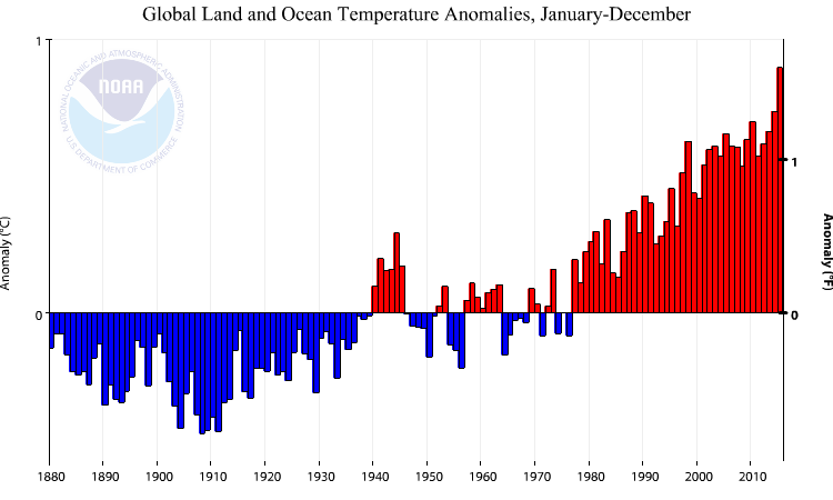
Figure 3: Global land/sea temperature anomaly, for 12 month periods. Source: NOAA.
From NOAA:
The January–December map of temperature anomalies shows that warmer-than-average temperatures occurred across the vast majority of the globe during 2015, combining to bring overall record warmth for 2015, at 0.90°C (1.62°F) above the 20th century average. This easily surpasses the previous record set just last year by 0.16°C (0.29°F). The global temperatures were strongly influenced by the strong El Niño conditions that developed during the year. The 2015 temperature also marks the largest margin by which an annual temperature record has been broken. Prior to this year, the largest margin occurred in 1998, when the annual temperature surpassed the record set in 1997 by 0.12°C (0.22°F). Incidentally, 1997 and 1998 were the last years in which a similarly strong El Niño was occurring. The annual temperature anomalies for 1997 and 1998 were 0.51°C (0.92°F) and 0.63°C (1.13°F), respectively, above the 20th century average, both much lower than the 2015 temperature.
In other words, it was hotter than the last El Niño years.


Menzie David Chinn's Blog


