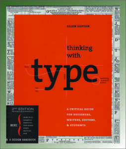
Lupton Presents Type in a Whole New Light
 Ellen Lupton. 2010. Thinking with Type: A Critical Guide for Designers, Writers, Editors, and Students. New York: Princeton Architectural Press.
Review by Stephen W. Hiemstra
Often when I talk to friends about my publishing, conversations are short. People get the idea of writing and authorship; they generally draw a blank when it comes to publishing. In particular, the idea that a book needs to be designed seems almost mystical. So my delight in finding a new title focused on identifying and using type (or fonts) has been hard to explain…It is kind of like asking a city kid where food comes from—well duh, it comes from the grocery store!
Ellen Lupton, author of Thinking with Type, has clearly traveled this route. She searched for a suitable textbook on using type for her class at the Maryland Institute College of Art, but resolved that she needed to write the book herself (7).
The first thing to notice about Thinking with Type is that the book is rather heavy (1.4 pounds) and a bit more square (7” x 8.5”) than the more typical paperback (9” x 6”). Thinking with Type has a lot of glossy photographs to illustrate the points being made. Needless to say, it is a visual delight.
The format of the book serves its purpose well. Lupton writes:
This book is about thinking with typography—in the end, the emphasis falls on “with”. Typography is a tool for doing things with: shaping content, giving language a physical body, enabling the social flow of messages (8).
If the medium is the message, as Marshall McLuhan famously remarked, then the primary medium of a book is type. Good books sport good design and the designer needs to know the role played by type. A good choice of type requires some knowledge of how it came to be, the associations it brings to bear, and the way it relates to the subject of the book. Are you interested yet?
Lupton organizes her presentation into three categories: letter, text, and grid (or spatial organization).
Letters. Early text was significantly influenced by the human body and calligraphy. Johannes Gutenberg, for example, published the first movable type in a Bible in which he attempted to emulate Bibles that were previously written exclusively by hand and included copious illustrations. Movable type caught on in Germany, but not in China where it was invented, because the Latin alphabet was phonetic and could be illustrated with relatively few letters, unlike Mandarin which pictured words rather than sounding them out. Mandarin had too many letter forms to be easily automated with those early printing presses (13).
Text. A text, Lupton reminds us, is: an ongoing sequence of words distinct from shorter headlines or captions (87). Debates about a book, which requires an author, as opposed to “text” are everywhere in the postmodern period when authors, like Jacques Derrida (91), question to the need for an authority figure in charge of producing a text. Lupton enters this debate, in part, by elegantly illustrating alternatives to simple text.
For example, is a webpage with many links embedded a book? Most people would say no. Why? Who, for example, is the author? Is it the programmer, the web-designer, the illustrator, or the copy writer? Clearly, questions relating to the formatting of text go way beyond the decision to right, left, or center justify.
Grid. Of the three sections (letters, text, and grid), grid is probably the least familiar. Lupton defines grid in this way:
A grid breaks space or time into regular units [all small caps]. A grid can be simple or complex, specific or generic, tightly defined or loosely interpreted. Typographical grids are all about control (151).
Here Lupton’s use of illustrations is amazing. The number of choices in organizing text is amazing because most of the options are not at all obvious. Those of us who use study bibles, for example, are used to seeing footnotes and other annotations down the center of the page, but this is seldom done anywhere else—most people are accustomed to footnotes at the bottom of the page.
Repeatedly, Lupton draws on magazine grid to illustrate novel grids that highlight different dimensions of the text. The influence of graphical artists on how we perceive text is striking and at times even subversive. Presentation matters and significantly influences text interpretation. Think , for example, of the use of red letters in some Bibles—the original Greek was all caps without any punctuation and no red letters!
Ellen Lupton’s Thinking with Type is a fun and informative book. For those of you who don’t care about publishing and have no interest in design might think of it as a conversation starter. It is that interesting.
https://en.wikipedia.org/wiki/The_medium_is_the_message
Of course, I gravitated to the Biblia Polyglotta (154-155) which in 1568 offered the reader the Bible in Hebrew, Latin, Aramaic, Syriac, and Greek. Today, a good program could organize such a text in minutes, but in 1568 all that was done by hand suggesting that proof-readers really did need some language skills.


