Publishing: Presentation Counts

If you are planning to self publish, formatting falls to the author, or to a third party who is hired to do the job. If you are comfortable with Microsoft Word, and reasonably computer savvy, then formatting is something you likely can do yourself.
We have all heard the old adage, “Don’t judge a book by its cover.” In the publishing world, experienced authors know that this advice is seldom followed.
When I published the first book in my Corporeal Pull Series, I attempted to create my own book cover. I didn’t have any real photo-editing software, but I downloaded several free programs and used paint to come up with this cover.
I did get a few things right: the proportions and file dimensions are correct. The title and my name are visible, even when the cover is viewed as a thumbnail, and I didn’t violate anybody’s copyrighted images to create it.
I also made a lot of rookie mistakes. There is nothing about this cover that suggests a specific genre. There are no real clues that tell about the book’s plot aside from some symbolism that you would need to read the book to discover. The featured image is centered in the composition.
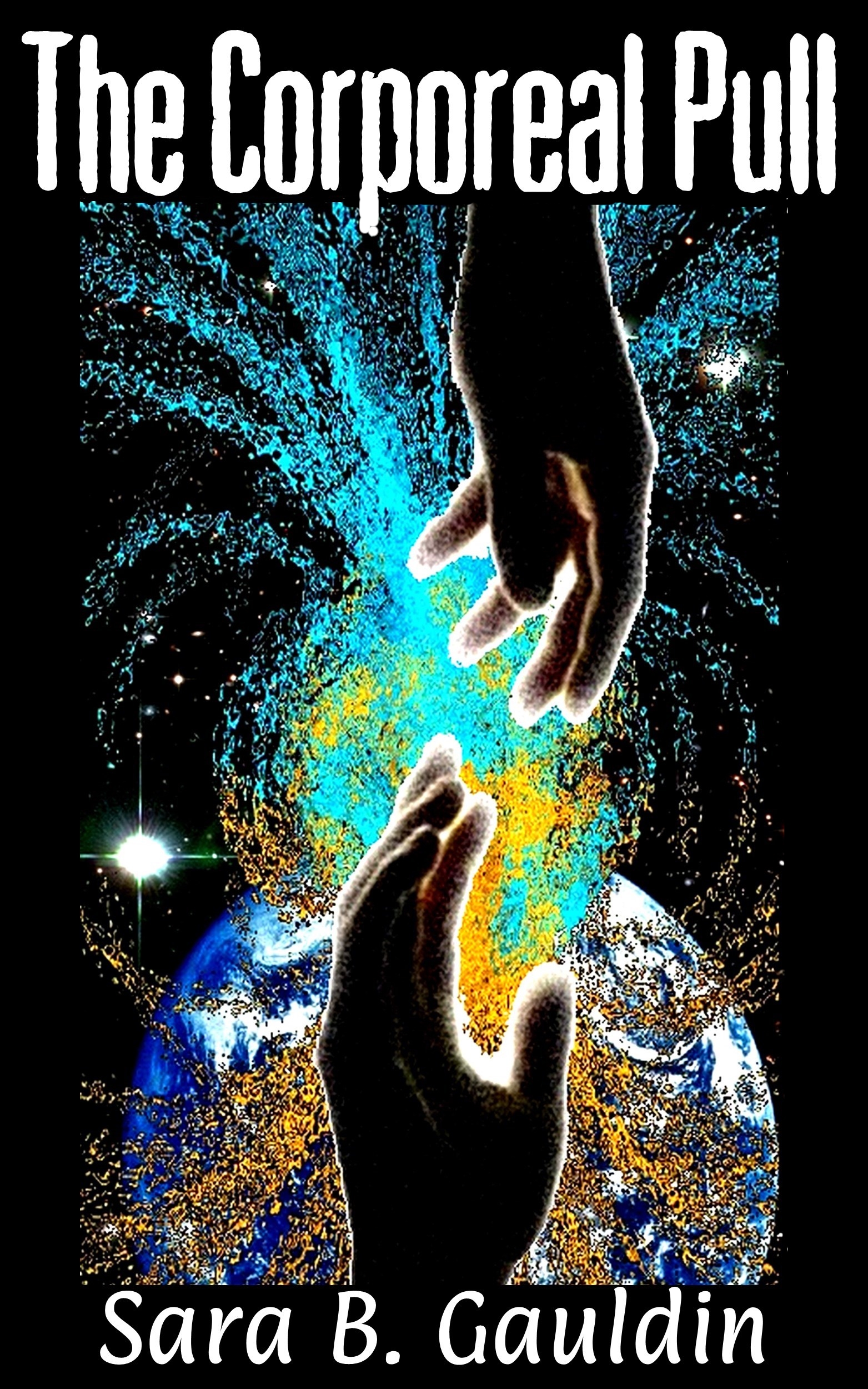 The Original Cover art
The cover of your book, whether it is an eBook or a printed copy is what the reader sees when they are “window shopping” for books. If the reader is a fan of romance novels, and the cover screams romance to them, then they are more likely to want to learn more about the book.
After several months of next-to-nothing sales, I realized that my book’s appearance needed an update. I realized that I was an author and not a graphic designer. I turned to Fiver for help. There are many individuals who will sell you a simple cover over Fiver for very little money. I have seen really nice covers from these designers. I have also seen plenty of mediocre ones. I think the genre has something to do with this discrepancy. It was at this point that several fellow authors and friends pointed out to me that the word corporeal was off-putting to many people. It strongly pertained to the premise of my book, so I kept it as a subtitle and changed the main title to Alive.
 The Fiver Designed Cover
I think the second cover is cute. The hands give it a human quality, and the new and improved title is less dizzying and clear to read. Although the main characters are children for part of the book, I am not sure this cover really captures the genre of my book either. Can you guess based on my first two covers?
Back to the drawing board I went. A fellow author that belongs to some of the same online groups as I do and who is also a graphic designer was able to help me.

My current cover for Alive
This cover has actual people. The people are good representations of the characters in the book. People are attracted to other people. The only drawback is finding matching people for the next books. The swirling blue mist makes the cover feel unworldly, and it is since this lovely couple falls in love in the spirit realm. The title is visible and that pesky subtitle is out of the way. The graphics are clear, and I received clear rights to use them. Hands down, this is the best cover.
Tips:
Use a font that is easy to read on a thumbnail image
Keep the cover uncluttered
Use clear content that is recognizable as the books genre.
Look at popular books in your books genre and take note of what sorts of cover elements they have. You want your book to be easily recognizable as their peer.
If you are not artistically inclined, hire help
Sara B Gauldin is the award winning author of the Corporeal Pull Series and the Avery Rich Mysteries. Check out all of her up and coming projects here!