Formatting tips
 For Hanukkah this year, I bought myself a present–a Kindle Paperwhite.
Yes, I took advantage of the Black Friday sales and spent some of my hard-earned formatting dollars for something that will ultimately help me with my formatting, although I didn’t realize this at the time that I bought it. I thought I was getting myself a way to save space on my poor iPad which has been struggling recently with its very limited storage capacity. I thought I was getting myself something which would make reading my ebooks easier on my aging eyes. And I thought I was getting something that would be lighter to carry around than my, admittedly already quite light, little iPad mini. I got something even more important, though, I got myself a way to check the formatting of the books I format for my clients (and myself)–so you know that this is now going to go under business expenses (or, at least, half the price can be deducted from my taxes).
I had always checked the books I formatted for Kindle with the Kindle Previewer app, but the default is to show you what one would see on a Kindle Fire, in other words, on a tablet. What one sees on an e-ink device is very different! And I didn’t realize this until I had one in my hand.
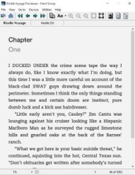
One of the first books I downloaded onto my new Kindle was one that I’d just updated for a client of mine, a cozy mystery which I’d been wanting to read for some time (yes, one advantage of being a formatter is that I get to read the books I format). On her cover, her designer had used all small case letters, so I’d put her drop caps that way as well. It looked great on my tablet, not so great on the e-ink device (the letters sat too low). I’d also forced the titles into a sanserif font (again to match what was on the cover), but put that next to the serif font of the text and it just didn’t work. With the author’s permission, I got rid of the drop caps and just made the first four words of each chapter bold (and not capitalized), and switched the chapter title to display in the standard font.
I then checked through other books which I’d formatted recently to make sure that they looked all right. All of them did, including, oddly enough, another book in which I’d forced a sans-serif font on the chapter titles (I think because I’d also put the number of the chapter into gray and the words “Chapter” and the number of the chapter on top of each other, so it’s more of a design element than simply the title of the chapter). Drops caps in other books worked well as capital letters, not lowercase.
There are a few important takeaways here:
–Be sure to check what your book will look like on a variety of devices. Happily, the Kindle Previewer app does give you that ability, so you don’t actually need to have a Kindle to check this.
–If at all possible, leave the choice of font up to the reader. This is the default in e-books and it’s a good thing. Some people read serif fonts more easily, others prefer sans-serif. And while it’s really nice (and fun) to have the font family (if not the font itself) match what’s on the cover of the book, the reader probably won’t remember what sort of font is on the cover when they’re reading the book. You just want to make the reading experience as easy and thoughtless as possible so that people can read and enjoy the content and not think about how it’s laid out.
–Fewer fonts and fancies make for a cleaner, easier to read design (this holds true inside the book, as well as on the cover).
All this being said, I’m a firm believer, naturally, that if the reading experience is pleasant (ie, the book is well formatted) the book as a whole will be thought of in a better light than if it had not been well-formatted. In other words, a reader’s enjoyment is affected not only by the content, but by how the content is laid out.
So, what do you think? Do you mind if a book has different fonts in it? Do you put special little touches into your book? Do you not even think about the font at all when you’re formatting? As always, I welcome (and encourage) your thoughts and ideas on the subject.