
Eric Gill at the Old Truman Brewery

Self-portrait by Eric Gill
By BENJAMIN POORE
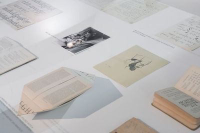
What connects the hit Pixar film Toy Story, a Penguin paperback of Camus���s The Outsider and London Underground? The answer is the typeface Gill Sans, which was designed by Eric Gill (1882���1940), one of the most idiosyncratic artists and typesetters of the twentieth century. Known not only for his artistic seriousness but also for some of the more depraved aspects of his private life, he is the subject of an exhibition mounted at the Old Truman Brewery in Shoreditch. The exhibition has been organized by the Monotype corporation in partnership with Eye magazine, the Five Points Brewing Company, FIELD, Ditchling Museum of Art and Craft and the Letterform Archive; and showcases two of Gill's best-known fonts, Gill Sans and Joanna.
While typefaces may seem a slightly nerdy or trivial interest, they were, for Gill and others, a key cultural and ideological battleground in the modernist disturbances of the early twentieth century. Ditching the ornate lettering of the nineteenth century was an attempt to throw off wallowing bourgeois sentiment. Bold, clear type ��� and in particular the sans-serif typeface, whose pioneers included not only Gill but also the designers of De Stijl, Bauhaus and Soviet Constructivism ��� made literature, and information, accessible to all.
The Monotype newspaper that accompanies the exhibition contains an interview with Terrance Weinzierl (the designer of a new font, Joanna Sans Nova) in which we are reminded that Gill was very keen for Gill Sans to be ���used or reproduced by ���average��� people���. It's interesting, and a little disconcerting, to reflect on the legacy of such aesthetic innovations in the fashionista pop-ups and hipster coffee shops clustered around the brewery, which may or may not have met the serious moral purpose and ideals of Gill���s project.
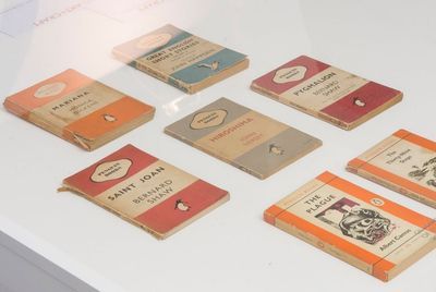
Functionality was important to Gill, and the exhibition shows us the diverse uses to which Gill Sans was put. The upper-case Gill Sans Bold gave a special crispness and directness to the iconic Penguin and Pelican paperback editions of the 1940s and 50s: the clarity of the font seems almost to demystify literary works that had previously been published in rather stuffy, hard-backed and curlicued volumes.
The use of Gill Sans by British Rail ��� notably on a poster advertising holiday breaks on the Continent, which were becoming accessible to more people than ever ��� seems to usher in boldly a new world of cosmopolitan excitement. And its use by London and North Eastern Railway across its timetables, carriages and signage was one of the first assertions of a clear corporate identity through design.
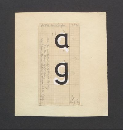
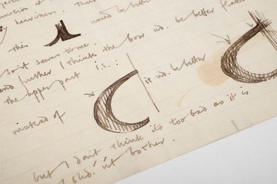
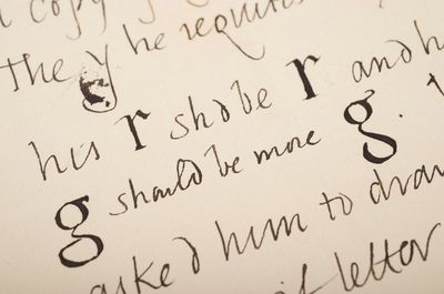
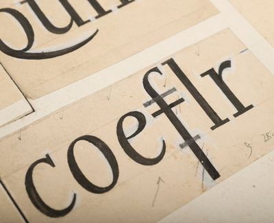
But there was more to Gill Sans than modernist functionality. Gill���s fascination with the Arts and Crafts movement and the ideas of William Morris also finds expression in the design idiosyncrasies of his most famous typeface. The exhibition presents a number of Gill���s original design drawings on squared paper, which show that Gill Sans combines an orderly regularity with a certain capriciousness. When you look closely, you start to notice the undulating "shoulder" (as typographers call it) of the Gill Sans "m"; or the "oblique terminus" on Gill���s lower-case letters "e" and "s" (the off-vertical slant that finishes the downward stroke of the letter) ��� both give the impression of a draughtsman and not a machine at work in the conception and shaping of individual letters. That impression perhaps helped to offset the concern some early modernist typographers had that sans-serif type might lend itself to authoritarian messages (Gill himself was socialist and pacifist).
Gill, like other modernist typographers, disliked the ornate fonts of the nineteenth century, not just because they obscured the reader���s access to words but also because of their dishonesty: they concealed the industrial mode of production. Such views are expressed in all the nuances of Gill���s typographical innovations, which are paid glorious attention in this exhibition. It offers a useful reminder of the ways in which aesthetic and design questions are fundamentally embedded in even our most ordinary of reading experiences.
The exhibition runs until Tuesday November 10.
Eric Gill in the TLS:
"Prophet as predator": a review by Malcolm Bull of Eric Gill by Fiona MacCarthy (February 17, 1989)


Peter Stothard's Blog

- Peter Stothard's profile
- 30 followers

