
Mobile Ready Tools to Make Your Website Responsive the Easy Way
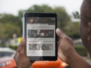
Man using iPad to navigate to mobile ready Tharsis Highlands website. Photo: 891864 by Godserv via Morguefile.com
Mobile ready tools are just what you need to bring your website up-to-date. Google wants everyone to make their websites easy to find and to use. This helps them and their customers, but it also helps your own visitors. With a larger and larger share of internet users arriving at websites using mobile devices, it only makes sense to cater to their needs.
When I first heard this, I let out a long sigh and wondered how I’d ever find the time to reinvent all of my own websites (nearly two dozen of them). Surprisingly, the task is pretty simple. It still requires a lot of work, but there are a couple of straightforward ways to achieve the desired end result.
Mobile Ready Tool: WordPress
Though it helps to know PHP to make the most of WordPress, you really don’t need any programming to set it up and to use a host of settings, properties and features. In order to make your website mobile ready, or what is also called “responsive,” you need to use a responsive theme.
First, install WordPress in your root folder, if it’s not already there. The key to ensuring your website is mobile ready (responsive) is to use a theme which is fully responsive.
Simply go to the WordPress themes page:
Click on the Feature Filter button, and under the Layout column, click “Responsive.” Select any other filters you may wish to use. Then, click the Apply Filters button. Finally, select the theme you would like to use. Or you can merely search for the theme by name from within WordPress.
What is remarkable about WordPress, if you don’t already know, is that it already comes with a large array of pre-programmed features that make managing your website exceptionally easy. You can create standalone pages just as you could on an entirely handcrafted website, as well as the regular blog postings that are a standard item in WordPress.
If you have WordPress installed in a sub-folder, moving it to your root does require some work. Everything you need to know can be found at,
http://codex.wordpress.org/Moving_WordPress
Mobile Ready Tool: W3.CSS
If you like having more control over the look and feel of your website, and don’t mind getting your hands dirty writing code, W3 Schools has developed a mobile ready tool you may find indispensable. Really, all it contains is a CSS file with optimized code for an entirely mobile ready website. You can use it as-is, modify it to suit your needs, or piggyback your own external CSS file to cascade with theirs.
You can find a tutorial for working with their W3.CSS file at,
http://w3schools.com/w3css/default.asp
I’m developing my latest website, GlobalWarmth.org, using this approach. The website has only a placeholder home page at the moment, but I hope to have it launched in the next few weeks—hopefully before the end of November, when the Global Warming conference in Paris will have started.
Mobile Ready Hybrid: WordPress + W3.CSS

Click on book cover to see a Landing Page using W3.CSS, not part of WordPress which runs the remainder of the site.
I have already used both mobile ready tools on my Tharsis Highlands website. First of all, I converted the entire website to WordPress, installing the software in my root directory. Then, I created two separate folders which are not part of WordPress. These host my direct marketing Landing Pages and Download pages using W3.CSS.
Here’s the home page at TharsisHighlands.com.
And here is one of my landing pages promoting my book, The Art of Forgiveness.
The nice thing about using W3.CSS for your landing pages is that you can design them any way you want, especially excluding links to other pages. After all, in a landing page you want to funnel the visitor toward the deal closer.
I’m a perpetual student. There’s always more to learn, whether it be technology, writing, science, spirituality or current events. I hope these tips and links help. Do you have any questions or suggestions? I would love to hear from you.
The post Mobile Ready Tools to Make Your Website Responsive the Easy Way appeared first on Rod Martin Jr.


