
Evolution of the HUD
Thanks guys so much for following the game and liking the beta video. It means so much to us that people are excited and sharing it with each other. It has really renewed our fervor to keep going and get this game out.
To celebrate our first post with 1000 notes, bc and I went diving through our computers and found as much old development material as we could. To kick things off, let’s take a look at the in-game interface and how it has developed.
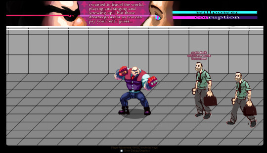
This first mockup of what gameplay would look like is from back in February. I had just created the basic animation engine and renderer. BC had put together some concept art and a walk cycle for The Bartender. The game didn’t yet have a title. Joe, the victim didn’t have a name or a proper sprite. We had some loose idea that the game would involve beating a guy up inside of his own mind, but that’s about it. At this early stage, we imagined the game would be much more story and text driven.
This second mockup came came shortly after. The HUD had been overhauled with a more ornate look. A large image of Joe’s face was placed onscreen, the idea being that as you played, he would fall deeper into hypnosis and start to visibly change. The story text was moved down onto the play area to accommodate this.

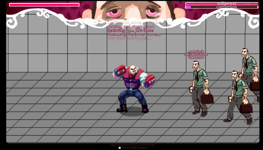
This third mockup comes months later, in April. Having Joe dynamically change as you played proved expensive to develop and didn’t particularly make sense, since this was just a mental change. We scrapped the idea and used the time to instead focus on gameplay graphics. At this point in development, we also realized that the story text was impossible to read while playing and a real drag to stop playing to read. The text-heavy elements were removed from the game’s design in favor of cutscenes and in-game visual storytelling. Joe’s second mental incarnation was being tested at the time, so he stood in the test area when this screenshot was taken.
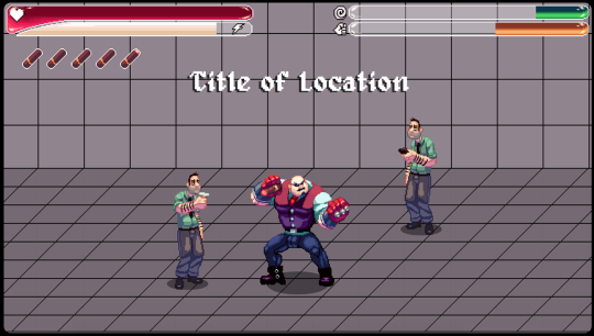
Finally, zipping forward, we have the interface from the beta. In the months since April, the game developed into a more traditional sidescrolling brawler. We decided to take the game in a more classic direction. All of the ornate stuff was stripped out in favor of a pixel art HUD that matches the in-game resolution. A super meter was added to power The Bartender’s sex attacks (its milky white color is no accident). Cigars were added to indicate lives. The progress bars on the top right, now called Corruption and Domination, were split back into two, and reflect the type of influence you’re exerting on Joe’s mind.
I hope you guys liked hearing a bit about the development of the game. There’s a lot more material from the development process that we dug up, so look for a few more posts about game development in the future.


