
Talking Covers…Need Some Input
 Hi everyone!
First off, I have to say that I have had the best luck with covers, both for the US and foreign editions. My publishers are amazing.
So now my editor and I are discussing the US cover for Immortal Rider, which is the second book in the Lords of Deliverance series about the Four Horsemen of the Apocalypse.
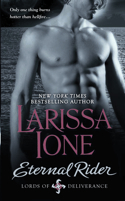
As you can see, Eternal Rider features the hero, Ares, alone. The thing that's catching us on Immortal Rider is that the Horseman, Limos, is female, and the hero…is human. Oh, sure, he's a hot, badass demon-slaying military human, but he's not a Horseman. (He so has his work cut out for him with Limos, let me tell you!) 
So my question to you is…given that Limos is the Horseman, would it be odd to have just a hunky male on the cover? Would you prefer to see just a female? Or would a steamy couple be more to your liking?
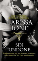
For example, Lore in Ecstasy Unveiled got his own cover, and I think it worked because he was the Seminus demon hero in a series about Seminus demons. But then came Sin. She got a cover with with Con (which I freaking LOVED.)
Okay, so you know the background of this particular issue, but when you're at the store and browsing covers and know nothing about the books, what draws your eye? A cover with just a guy? A couple? Does seeing just a female make you think urban fantasy as opposed to romance?
 And just out of curiosity, because I'm nosy that way…what color tends to draw your eye? Me…if a cover is blue, I'm all over it. I love blue covers. With a moon! My favorite cover of all time is Robert Jordan's The Eye of the World
…in fact, I was so enchanted with the cover, which was made into a bookmark, that I bought the book without even knowing what it was about.
That is the power of a good cover! (And, by the way, it's also one of my all-time favorite books, so I'm glad I judged that book by its cover!)
Inquiring minds want to know! 


 Hey Larissa. Thanks for asking. Personally I prefer just a guy on the cover (hot of course) and yes blue is a great colour.
 I wouldn't mind if you had both of them on it! If I was browsing a bookstore, and had never read your work, and saw a cover with just a female on it I would think urban fiction and keep going.
 If there is a guy on the cover, or a couple, I automatically assume it is a romance. If there is a female on the cover, I would probably assume UF, yes.
I never really considered colors, but I am drawn to primary colors, reds, purple, and yes, blue, with black as a contrast. I like all of the Demonica covers. They are striking. I really like the single focus rather than having lots of clutter.
Can't believe you referenced "Eye of the World"! I've been reading that series for longer than I care to admit.
 Larissa, the story is about the two of them, right? They are both the primary protagonists, yes? They are both the heroes? Then both for the cover.
I like blues, but I also like earth tones and sepia if you're going to stick with monochromatics.
 Lynn Viehl pulled off a female-only cover on Evermore, and it worked really well. I don't care either way, but I wouldn't mind seeing Limos by herself :)
 Seeing just a female would make me think UF, too. Hot guys catch my eye, but couples are my favorite :) I don't have a color preference, but whatever treatment your publishers did for the Demonica covers (slightly metallic?) is definitely workin' for me! :)
 Hi Larissa! Thanks for asking!
I think a couple would work best because the story is about both of them. And I like sepia and earth tones as well. I agreewith Mahlet. the Demonica covers are awesome!
 I love a female cover.
Even like a view of a females back...maybe a male hand touching her back.
But a guy cover for girl book - nah.
Couples are good too...if your doing that for all of them.
 Having a couple is nice ... I absolutely adore Sin/Con in the cover BUT, considering that most of your cover has been either couples or just males; why don't you have just female for Limos's story?
 I usually prefer just a guy on the cover, although a girl can certainly attract my attention if the cover is appealing enough, but with Limos being the main character and the guy being human, I personally would prefer a cover with a guy and a girl on it. I also think that blue is a good color. And bright colors tend to draw me in, too, like red or orange because they catch my eye.
 your book covers are great ... hot guys with sexy tattoos in an electric blue or blood red background do appeal tho!
 hey larissa, all your covers have been great!!! i prefer sexy couples though...thanks for asking!
 I love your book covers so far. I agree with others, a female alone I would think UF. I think a couple, since Limos is a Horseman she should be on the cover like you did with Sin Undone. I agree with RVA on colors - blue, purple, red
 I love when the cover picture is about the main character in the story weather their by themselves or with another as long as their in there. Thanks for asking.
 Sin Undone, the BW image is more appealing to me personally. Then again, I am a big fan of BW photography.
 considering the story, i think you need a woman there somehow. couples are hot! the cover on sin undone was beautiful
 Definitely have a woman on the cover. It doesn't even have to have her male counterpart. But, since the series is about the horsemen, then a horseman should be on the cover. This is one thing that REALLY got on my nerves about some of Kenyon's Dark-Hunter books - the Dark-Hunter him/herself was not on the cover.
 Also, it would be a bonus if the person featured looked something like what you have in mind when you created her.
As far as colors... I rarely pick a book by its cover. But, when I am just walking through a book isle, the books with unusual colors catch my eye (which made me pick up my first Demonica book!). You should stay away from any colors that would just blend in with the background of everyone else's book.
I hope this helps.
P.S. I can't wait to see what you come up with next!
 I like a hot steamy couple. There is something sexy about two people wrapped around each other. And I do feel more attracted to red. The color of passion and lustful thoughts lol
 I think the girl needs to be the larger focal point and in the foreground, with the guy in the background a distance away maybe.
 Couples are sexy. Your men and those muscles and tats could sell the books, no doubt. But it takes two for a romance. One of the great things about your cover art is reality of the people. They are more like a picture of really hot, sexy people than a just a drawing. And foil type colors are eye catching, in any color. Probably not saying that right. Hope you know what I mean to say. Thanks for many nights of great reading.
 I guess I like my man-flesh all by themselves on their covers, but since the horseman is a female, she should probably have center stage, with maybe a hint of him ghosted somewhere in the background, if you know what I mean. Gotta have a guy somewhere on the cover. I'm buying this for the guy, not the girl!
 Definitely agree with mhollie. I do like the man on the cover in some way. The only thing that distracts me about couple covers is if they don't match the characters, ya know? More than once, something was written in the book & it sent me back to glance at the cover then wrinkly my brow as I had to read through the next few pages because the two didn't "match" right. Maybe that's OCD of me, but it can bug me like nothing else. Then again, even with just a female on the cover I've done that. I guess, if a girl is on the cover, make sure she matches your concept of the character. Oddly, a hunky man is rarely distracting. ;)
 I think a couple is very eye catching. Blue is a favorite of many. Love all your covers.
 I love when the couple is on the cover! Although I"m not opposed to a hot Alpha male on cover alone, I want both my hero and heroine on the cover if the story focuses on them primarily. On the other hand, if Limos is the true "main character" I have to side with my "girl power" and give the cover up to her! I loved the Sin Undone cover...the iridescence of it was just beautiful! I haven't seen a cover from you that I haven't liked yet so I'm sure it's going to be great! I'm so excited! Good luck making a decision! :)
 Both-something similar to the cover for Sin.
 Hey Larissa I love blue covers too so off course that could be part of it, but I think it would be great to have the hunky human man in the front with a further away smaller picture of the female on a horse maybe on a blue cover with a full moon in the background! Hardly any covers have horses and since it is about the 4 horseman it is only fitting.


