T-minus 12 hours and counting! Plus some random Kindle formatting tips..
Today I’ve uploaded Shizzle, Inc text to Amazon. My whole body was shaking as I did it. About half a dozen times.
Turns out that my premonitions about formatting mishaps were true. There were not that many, and I resolved everything in a space of a couple of hours, but here’s what I’ve learned in the process:
First, the good news:
Uploading your book to Amazon is RIDICULOUSLY EASY. Fear not if you’ve never done it before. Assuming you already have an Amazon account you’ve used to purchase books. Otherwise you have to set one up, and it would probably take twice as long. It’s literally a couple of pages and takes about 10-15 minutes. You can preview your text, make any changes in your Word file and upload the new version (takes about a minute).
Note: you can’t have multiple accounts with Amazon. If you use a pen name, it would be a matter of setting up an author page under the pen name, which I’m yet to do.
If you are a first timer, like me, use Word to write your book. I can’t really talk about Scrivner since I’ve never used it, but why complicate something that is already complicated enough? I credit the relatively easy conversion of my text with the fact that I’ve used good ol’ Word.
The not so good news:
I’ve spent an exuberant amount of time fussing over the drop caps and inserting them into text at the beginning of chapters and then again at scene changes. I’ve previously used asterisks in the middle of the page to signal a change of scene. Finding and replacing them was a lot of work, so you can imagine my disappointment when in Kindle they displayed so far below the first line, they looked like “buried caps.” I tried googling solutions, but the consensus was JUST DON’T DO IT. So I spent more time going back and trying to figure out how to highlight the first line/first letter. In the end, I’ve decided to do nothing.
You don’t need to stress over the fonts because Kindle will translate whatever carefully chosen font into its own standard. This could even be considered good news, if IT WAS BROUGHT TO MY ATTENTION LAST WEEK, before I spent hours researching, changing, trying out, and changing the font again.
Make sure that you use the style “Headings” for your chapter names and not “Chapters”. Otherwise your table of contents will be empty. Hey, it’s an easy mistake to make! I actually decided to take “Chapter XX” out altogether in the end, and I think it makes for a cleaner, simpler presentation.
The most amazing news:
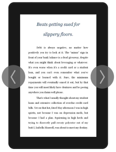
The text has been uploaded! No more editing! (Unless of course one of you points out a really stupid mistake and I fix it, but let’s just keep it between friends, okay?). This is what it will look like on a Kindle device:
I could have published it already, but I just have to have one more fiddle with the cover image. I’m going to bed now, along with all other Australians, but will be up bright and early to finish it up. That’s if I can sleep at all :-)


