Designer Q&A: Eric Nyffeler on the NaNoWriMo Library

Every year, we roll out a brand new theme for NaNoWriMo, complete with a new poster, T-shirts, mugs, and more. Last year, we turned NaNo into a steampunk-influenced, Victorian, anything-could-happen Boundless Novel. This year, we’re inviting you to check out your imagination at “The NaNoWriMo Library.”
Designer Eric Nyffeler shares his inspirations for this year’s beautiful poster, and ruminates on the ideal library:
You did an amazing job of bringing our 2015 theme of “the NaNoWriMo Library” to life. Tell us about the inspiration behind your design!
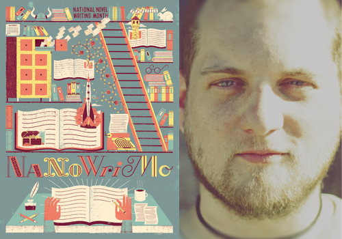
When I was first told that this year’s concept was “The NaNoWriMo Library,“ I immediately began cackling with excitement. I love the aesthetics of old books and libraries. One of my favorite pastimes is wandering around the shelves and stacks of libraries and pulling out books at random. I have discovered many of my favorite artists and writers that way.
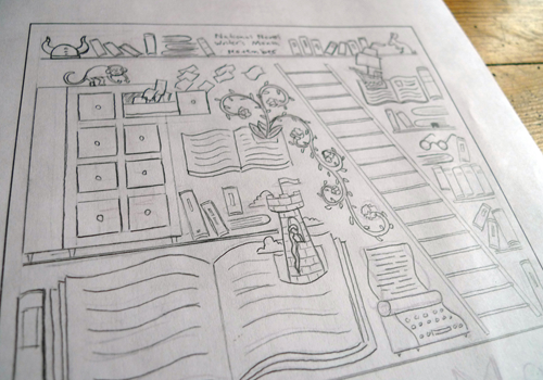
My first task was deciding if I wanted the library to be inside the writer’s head or an actual physical place. After a handful of concepts and sketches, I arrived at a happy compromise; a real flesh and blood library where the books and stories were quickly coming to life. Best of both worlds! Once we settled on that concept, it was simply a matter of figuring out how to cram in as many library and NaNoWriMo references as I could.

One thing that awed us: you hand-texture your designs. How does that go?
While I do a significant amount of my drawing and layout with a computer, I’ve always been enchanted by the aesthetic and look and tangible feel of design from older times. None of my work feels complete to me until it’s been textured and worn and distressed.
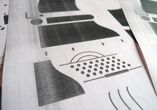
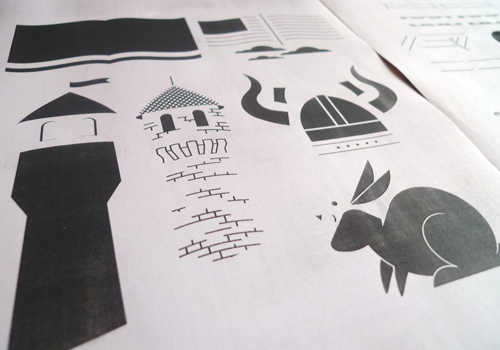
While I have a handful of different methods for texturing and distressing my work, my go-to method is the use of old photocopiers. I have a collection of old, early-80s, toner-based copy machines. These machines have all seen their fair share of usage, so the copies they produce tend to be worn and mottled. I print off my illustrations, piece by piece, section by section, in black and white, and then run each piece through the copier, trashing them up in unpredictable ways. These textured pieces are then all scanned back into the computer, where they are recolored and added back into the illustration.

Ideally, the final design has all the warmth and handmade feel of vintage illustration work, but with all of the practical usage of contemporary, computer-based files.
That’s so cool. We have to ask this, because Tumblr: if you had to, how would you describe your aesthetic?
While describing one’s own work is one of the most difficult task ever, I would probably call it a "trashed out version of American Modern design.” I don’t know if that’s 100% accurate, but I don’t think it’s entirely wrong at least.
I’ve always loved the geometry and flat panels of color in mid-century illustration and design. I love that there is a focus on stylization and simplification rather than realistic rendering. I love that I can take something as simple as circle and turn it into a tree or the sun or a face or a lake without having to be concerned about making it look exactly like it does in real life.

The stylization works so well for this poster. Now, if you could design an actual personalized library, which sections would be most prominent?
Obviously the art and design section would need its own wing, but as far as novels go, I would make sure it was stocked with full collections of Haruki Murakami, Kurt Vonnegut, and Raymond Carver. There would also be entire wing dedicated to the books of Chris Ware.
You’ve designed posters for concerts, in addition to vinyl covers. What music inspires you?
My entire career in illustration stems from my work in the music industry. I first fell in love with design while making merch and album art for my old local bands and somehow that snowballed into working with a dozen or so Grammy winning musicians. It’s been a strange path so far.
Music is definitely my number one inspiration when I work. I have painfully eclectic tastes in music, much to the chagrin of my studio mates. An average day will find me bouncing back and forth between twangy folk to brutal black metal over to droned out synthpop back into hour long ambient-drone songs.
What advice would you give to creators?
Never go halfway. You are the only one who really knows how far a creation can go, so it’s entirely up to you to push your work all the way to its limit.
And the big question: what would the novel you write for “the NaNoWriMo Library” be about?
If I were to tackle that massive task, I would like to think I could come up with some sort of Hobbit-esque adventure with a cast of damaged but lovable misfits, based on myself and all my closest friends.
Eric Nyffeler (occasionally operating under the name Doe Eyed) knows a thing or two about simple shapes, fuzzy textures, bright colors, patterns that make your eyes vibrate, bad jokes, and the occasional dirty drawing. Based out of Omaha, Nebraska, Eric’s work has charmed the editors of publications such as Communication Arts, Print, HOW, Fast Company, and The Washington Post, and has partnered with brands such as Target, Airbnb, and Whole Foods Market.
Chris Baty's Blog
- Chris Baty's profile
- 63 followers


