Fraggle Rock Cover Process: The first Issue of Fraggle Ro...
 Fraggle Rock Cover Process: The first Issue of Fraggle Rock Volume 2 will be out tomorrow. My artwork is featured on the 'B' cover, and though I had posted the final cover art a while back, I thought I'd share the process. I had a different idea for the cover originally, with Boober and Junior and one Doozer being the only characters, but due to some similatrities in concept of a cover already turned in, I had to alter my plan.
  I think one of the great things about Fraggle Rock is the three different species and their understanding and relationships to one another, so I really wanted my cover to have Fraggles, Doozers, and at least 1 Gorg with the size relationships being exploited. Unfortunately, there is no good way to show a Gorg at full height with a Fraggle AND a Doozer without the latter two being diminished and too tiny to draw well.
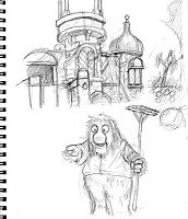 Forcing the perspective by showing the Gorg castle with Junior standing by it helped show that even though he is about the same height on the page as the Fraggles in the final piece, the scale to the castle and garden growth and tools we understand that he is a giant to them.
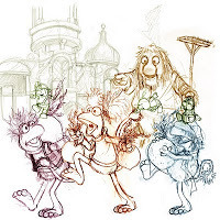 After I had sketches of all the components I would need, I scanned them and tinted them to assemble in a layout template for the covers's specs. This is a stage where I can play with proportion, nudge the characters closer together or further apart, rotate character's arms or legs, or the character altogether. I tint the different characters and elements differently so I don't get lost in the mess of sketchy lines.
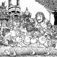 The final layout was approved by Archaia and Henson, so I printed it out and used it as a guide while I inked on strathmore 300 bristol on a lightbox. This cover had so much going on, that I worried about how congested the inks were and without a lot of line weight variation, but for Fraggles, I didn't want to go too heavy on the inks and shadows, I wanted a lighter feeling to them than that and planned to fix the lack of focus in color.
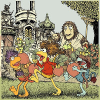 While coloring I noticed that several of the overlapping characters and background/foreground elements had a similar color or value. I kept flatting the piece (establishing color areas, not necessarily final color choices) planning to deal with the depth of field issues once I got into rendering.
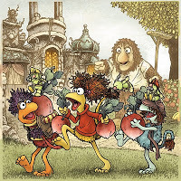 Here again is the final cover. In this rendering stage I did a few things to make sure that things popped off one another, I added a color hold and muted things in the background (relative to the Fraggles) I used a color hold on the grass to tone down the 'noise' on my inked grass lines. I altered some colors slightly pushing them to the ends of what makes them that color (the radish leaves are more blue green while the Doozers are yellow green...The Radishes themselves became more of a muted Red violet to pop them away from the more middle of the road reds on the Fraggles).
The issue is due out tomorrow, but you can check out a preview of the interiors here
2011 Appearances
MSU Comics Forum: Jan. 22
C2E2: March 18-22
Phoenix Comic Con: May 26-29
Cherry Capital Con: June 12-13
San Diego Comic Con: July 20-24
Baltimore Comic Con: Aug. 20-21
Detroit Fan Fare: Sept. 24-25
New York Comic Con: Oct. 14-16
Published on January 18, 2011 06:00
No comments have been added yet.
David Petersen's Blog
- David Petersen's profile
- 339 followers
David Petersen isn't a Goodreads Author
(yet),
but they
do have a blog,
so here are some recent posts imported from
their feed.


