
Pulled From My Files #34: BIG Lettering
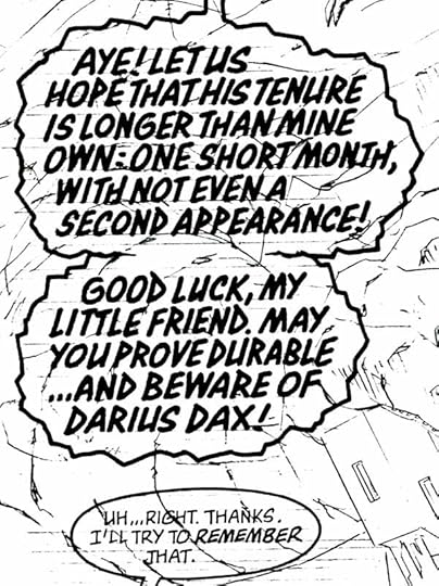
 When comics lettering was all done by hand, most of it was rather small, with the average letter being about 1/8th inch high. Sometimes the script called for much bigger lettering for a particular character who was either very large himself, or meant to be scary or impressive. Here’s an example from SUPREME, I don’t know the issue. Larger letters like this allowed me to get more calligraphic, this style is my version of Blackletter.
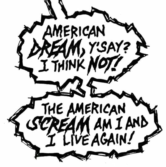
 Another example from SUPREME, again, no idea which issue, but the character is MacroSupreme, VERY large, and his lettering is, as you can see, about three times larger than normal. This style is done with a larger B-series dip pen, perhaps a B-4 or B-3, and it’s what’s known as display lettering, usually seen on cover blurbs or titles rather than in balloons.
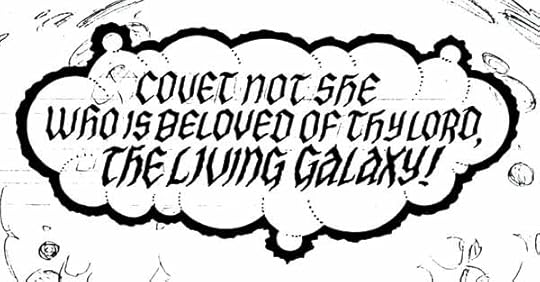 Another calligraphic style from SUPREME, similar to the first example. My favorite part of this one is the balloon shape made of various size spheres, and the edges of those spheres indicated by dotted lines.
 Finally, I think this is from SHADE, THE CHANGING MAN, the Vertigo series written by Peter Milligan, issue 50. More display lettering in a spooky style. The only drawback to big lettering is that it covers up more of the art. These days, artists are usually asking for smaller lettering rather than larger!


Todd Klein's Blog

- Todd Klein's profile
- 28 followers

