In which I reveal the dining room, without too many excuses but with some.
We juuuuust finished painting (and cleaning up) the dining room, but I know that the entire interwebs simply cannot wait for us to do one more thing before knowing how this amazing transformation has turned out (at least so far), and needs to exhale. So here you go!
It’s just that cleaning up takes much longer than you think it will, particularly when you keep chucking in things like fiddle camp. Do not expect every little thing to be finished up here.
(“We don’t, we know you.”)
(“Oh, good.”)
Also, do not forget this fabulous marriage prep course! Win $50 off for yourself or a dear one! What a great wedding gift! Promoted by Archbishop Chaput, accepted nearly everywhere, faithful and orthodox, and personal. Click this link and leave a comment!
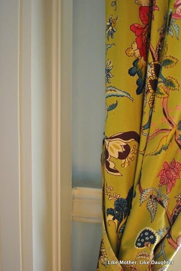
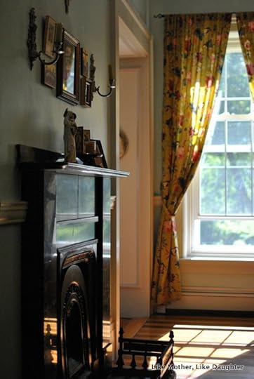
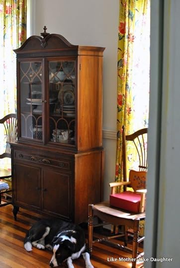
Now, I am on record as being totally against blue and also gray on walls. However, I really, reeeallly needed a color in here. And the fact is that these old houses need a little (not a lot! not actually dark!) gray in the paint to keep the paint from looking harsh… and I needed a good background for the gold in the little oratory… and something for all the brown of the furniture and mustard yellow of the curtains to stand up to… so blue it is. (Paint info at the end.)

But it’s really a blue-green aqua kind of a color, and when the light is on (as it will be at night, when we are usually in here), the yellow from the bulbs and candles make this color look quite green, actually. A sort of sea-foamy green.
Bear with me while I babble…
I am having a hard time actually zeroing in on what this color is. If you like it, then it’s what you see. If you don’t like it, rest assured that it’s a quite different color from what you think! I mean, every hour and every angle makes it look different. I’m a bit stumped as to how to convey it to you through this computer.
Anyway, here are some BEFORES:

It was a sort of stone-colored white with a darker stone-gray trim. I liked the trim a lot, actually. And I’m all for white, I really am. I like light and I like to think that textiles and artwork are where you will put your color infusions.
However, the tallness of the ceilings and the sudden need I had for color made me do this.


The view from the kitchen, which is how you are normally coming into this room, as we rarely if ever use our front door (which would bring you through the living room like regular people):


Now, at the start of this post I gave the disclaimer that it’s not quite done yet. Of course. I realize that many people decorate by having a complete vision and then boom! Decorating occurs!
But that is not my way. (Can you tell?) On my deathbed I will be wondering if we should maybe do something different…
So I am not sure about how the quite colonial-style chandelier works in this decidedly 19th century house, but it will take a while for me to figure out something I like better.
And here I think we could use some sconces or other things to add to this wall (the door to the kitchen is just to the left):
Further disclaimer: The booze is alcoholic beverages are all over because the cabinet in which they are normally stored is being repaired and may not work anyway.
And on this wall below had been an arrangement of some of my favorite of Habou’s paintings, but now I’m thinking they could go in the living room and here might be a good spot for family photos, which I have been trying to find a place for that would A) be bright enough for viewing (vs. for instance the hallways which have vast expanses of walls but dim light and no windows) and B) you could get close enough for viewing (vs. for instance above the piano in the living room where there is a vast expanse of wall but the piano — baby grand, you know, wide — would prevent you from getting close).


Just when you think the color is quite green, it goes all robin’s-egg:


More babble:
~Bridget did 90% of the work in here. She was my design consultant and she worked super hard to do the prep, which is the burden of the painting of old houses. I’m always all agog when people airily comment that they casually painted a room, just like that. Around here, that does not happen.
Painting is traumatic!
Painting is the least of it!
Thus, she understandably did not quite estimate the time it would take. She underestimated. But as she was determined, despite my warnings, I let her go for it. I knew we’d be in for some chaos but hey. She prepped all week before the camp started, and then painted in the mornings and at night after each session with all those charming but intense children.
~Yes, the floors are striped. To the best of my knowledge, the original floors were all wide pine, and remain so in most of the rooms. An owner around 1917 put this one in — the level is a floor’s height above the living room one — probably to cover damage. I don’t know why it’s striped — maybe he had barely enough of each wood for half a floor? I love it!
Again, BEFORE:
In this post I talk about getting the hutch between the windows, and that was when we moved the black shelf to where this painting is, below:
AFTER:

(My 89-cents-each thrifted vintage tea set may or may not have been my inspiration for the color!)
On Instagram I posted all these test patches, but the first one we tried was this:

It’s Olympic “Tranquillity.”
But I knew it would be too dark for a room we’d be in at night.
In the end, we went with me doing my usual, which is rashly mixing, approximately-exactly, to get what I really want, painting that on some random piece of wood, and taking it to Lowe’s while still wet (the guy literally dried it with his dryer before scanning it!).
Thus, the paint color is “Tranquillity Plus Two Parts White.”
It’s the one on the far right in this IG, painted over the Tranquillity, next to the molding. Looks white, right? This is the label in case you must have exactly this color:

I think you could hand them this pic on your phone to scan, don’t you?
The trim is Valspar “Shoreline Haze,” in satin. It is quite close to what was there before, making it possible to escape with only one coat on the exhaustingly high crown molding. Plus, I love it with the blue.

There you have it! What do you think? Isn’t Bridget the best?!? And now she’s selfishly going back to school, leaving me to not get any painting done on my own. Hmph.


