
NASA Goes Anti-Science — An Open Letter to Their Global Climate Change Unit

NASA satellite global temperature data showing a distinct cooling over the last 17 years. Graph by Dr. Roy Spencer and Dr. John Christy. Click on the graph to enlarge.
The following is a letter to the Global Climate Change Unit of NASA. This is regarding their scientifically fraudulent support of the Global Climate Change hysteria. What is ironic is that I used to support that very same hysteria myself. I remain thankful that I can admit my mistakes.
A lot of people around the globe saw Al Gore’s pretty documentary when it first came out—An Inconvenient Truth.
That video had a number of things going for it. First, Al Gore is a smooth-talking politician.
Second, I care about our planet and care about reducing the suffering of others—as most of us do. This film spoke to that desire.
Third, Gore had the services of a slick production team and access to lots of money to make this dazzling little film with larger-than-life graphics and lots of exotic travel to places like Greenland.
Fourth, Gore used the word “truth” in the title.
Fifth, Gore’s little film won an Academy Award.
Sixth, Gore himself won a Nobel Prize. Though this may sound impressive, with Obama winning a Nobel Peace Prize, right before becoming America’s most war-mongering president, this says a lot about the Nobel organization.
These six points say a lot about either the film or the state of our society. Years later, when I found out how wrong I had been about Global Warming, I began to wonder about how widespread the corruption had become.
Yesterday, I saw NASA’s “scientific consensus” page:
http://climate.nasa.gov/scientific-consensus/
Open Letter to NASA
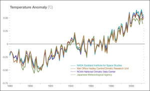
NASA global temperature graph from corrupted ground-based data
Sorry to rain on your parade, but this is all wrong.
I’m appalled that my tax dollars are being spent to promote this questionable idea.
First of all, the use of “climate change” as a meme is dishonest. Climate always changes and always has, ever since the Earth first gained an atmosphere over 4 billion years ago.
Your use of “scientific consensus” is incredibly unscientific, because science is never done by consensus. That approach was supposed to have ended with Copernicus and Galileo. Consensus thinking had stopped science from making progress for more than a thousand years after Aristotle and Ptolemy. I’m ashamed to have ever been an enthusiast of NASA. This garbage is pushing us into a science Dark Age. Shame on you all!
The graph on your scientific consensus page is also ludicrous, because it’s based on ground data and shoddy methods of fill-in and interpolation. Also, it has used disreputable temperature stations—like the thermometer in an Arizona parking lot where the heat will certainly be far greater. Again, for shame!
You ignore global temperature data from your own satellites! Incredible. Fraudulent!
There has been no Global Warming in nearly two decades (unless you include diurnal and annual changes as “warming”).
At least a couple of climate scientists have not become so corrupted by money or by argumentum ad populum:
http://drroyspencer.com/latest-global-temperatures/
What is doubly incredible about the sheer lack of science in all of this “Global Climate Change” hysteria are the two bald facts:
1) Global Warming is good. Wake up! We’re still in an Ice Age. Yet, psychopaths in charge are pushing for measures to cool down the planet. I’m sure if you think long and hard about this, you’ll realize that you really, really, really do not want the Holocene to end just yet.
2) CO2 is good. Plants require it. Earth has had 15x as much CO2 and thrived; the oceans did not boil away. It is not and never has been a pollutant, yet it continues to be treated this way by governments and news media around the planet. They don’t even have the courtesy to use its full name, calling it “carbon” as if it were dirty soot. For shame!
If you have a scientific bone in your body and an ounce of integrity, you will look long and hard at this topic and rethink your position.
I care about our planet. I suspect you do, too, otherwise you wouldn’t be talking about this subject. But you’re headed in the wrong direction.
Ask a real climate scientist—one not so sensitive to funding issues—about the Medieval Warm Period, the Holocene Optimum and similar periods of the past when the Earth was far warmer and prosperity abounded. About 8,000 years ago, the Sahara was green! You won’t get that with the proposed cooling of the Earth.
Cool down the planet and you invite disaster. Cooler oceans means less evaporation, fewer clouds, less rain and more failed crops. Billions will die and their blood will be on your hands. An end to the Holocene means 80,000 years of glacial conditions that will see Chicago under a mountain of ice and the population of Earth dwindle into the thousands.
I hope you will raise the red flag on this issue. I hope NASA will return to sanity and adhere more closely to its original mission.
Sincerely,
Rod Martin, Jr.
Discussion About NASA Distortion

Composite graph of NASA ground-based and satellite data. This shows that NASA preferred to use the warmer, less reliable ground data. Click on the graph to enlarge.
How accurate is the satellite data graph? Follow the link, above, for Dr. Spencer’s discussion of the graph.
This third graph is a combination of NASA’s corrupted data graph and the (UAH: University of Alabama at Huntsville) satellite data.
I lifted the 13-month running average from the satellite graph, compressed the time scale and expanded the temperature scale to match the scales on the questionable ground data graph found on NASA’s Global Climate Change site.
Because it was not clear on the NASA site their basis for the zero temperature axis, I moved the satellite data graph upwards to match the 1979–1983 range on the temperature scale. This gives them the benefit of the doubt at the start of the overlap in 1979. As you can see, the satellite data shows cooler temperatures on all of the troughs (low points). The El Niño spike in 1998 is slightly higher in the satellite data.
Except for the 2010 summer peak, the remainder of the graph after the El Niño event has the satellite data showing cooler temperatures than the ground-based data displayed on NASA’s site.
The fact that NASA would not use the far more consistent satellite data may be an indication of political bias.
Climate Scientist, Dr. John Christy, Discussing the Science, the Corruption and its Impact on the World
The following video is an interview with climate science Professor John Christy. He is responsible for the datasets of the UAH satellite used in the first graph at the start of this article.
Questions
Was my condemnation of NASA too much? What’s your reaction?
Reference
Climate Fraud – NOAA’s Global Temperature Dataset
The post NASA Goes Anti-Science — An Open Letter to Their Global Climate Change Unit appeared first on Rod Martin Jr.


