
A Tale of Three Book Covers
By Kari Carlisle and C. Henry Martens
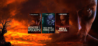
Kari:Having recently revealed the book cover for the third book in the Monster of the Apocalypse Saga, C. and I have been reflecting on the process of developing each of the different covers in the series. Though we think we’ve been successful at maintaining some consistency, the process for each has been vastly different.
Kari:For the first cover, Monster of the Apocalypse, we ran a competition through 99Designs.com. We had a preconceived idea how we wanted the cover to look, and in retrospect, the look was probably too retro, more 70’s pulp sci-fi cover than a cleaner and more modern look.
C:Boy, ain’t that the truth. What a learning experience. The cover we had envisioned was originally supposed to involve the three main characters as well as the sci-fi future vehicle. Our idea was to bring in the audience that would identify with the characters, young, old, male, female, and by using the techie vehicle we would appeal to sci-fi fans. But retro it was, and thankfully the cover idea percolated beyond what we first had in mind.
Kari:The process of running a competition was fun and frustrating. Trying to get 30 or so artists, many of them with little potential, to get the cover looking just the way we envisioned was difficult. One artist in particular refused to comply with our directions, but the resulting work was intriguing. Several of the entries were downright cartoonish.
C:The upside was that we had all these ideas floating around, and some of the artists came up with some inspiration right away. The downside was that we had all these ideas floating around, and some of the artists came up with ideas they didn’t want to turn loose. I had the idea that the cover should look like what was in the book, and some of the artists had the opinion that what was in the pages had little to do with the cover. I consider it intellectual honesty to attempt to give a feeling for the book by using elements from the story and so a bone of contention with some artists. One of the best artists, a guy with immense talent, was one of those who wished to go in the other direction, and his work was so compelling that we kept him involved until the end. But the final cover is not his.
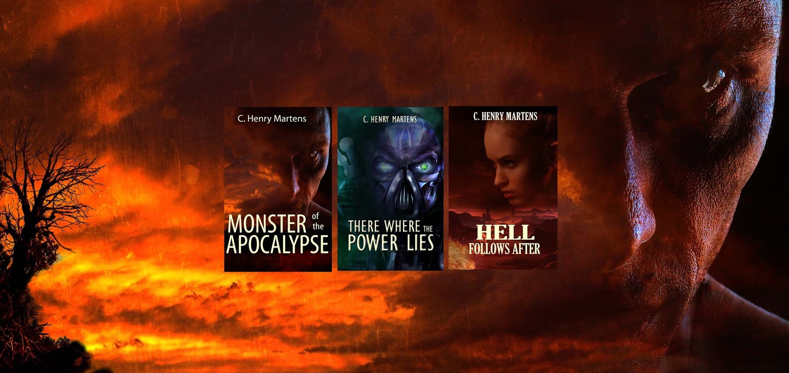
Kari:In the end we chose a cover that came closest to our vision:
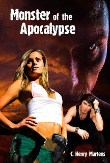
Kari:Thankfully, the artist, Milan Jovanovic, provided all the files and layers he used to produce the final work. Once Monster of the Apocalypse was published, we received feedback that the cover would be so much more dramatic with just the sinister face in the sky. With the images of the main characters easily removed, we had the revised, final Monster of the Apocalypse cover.
C:It was like a bolt of lightning striking, when we played with the cover by removing the two young people and the vehicle. Very similar to finding the right title. An electric thrill that shoots through you.

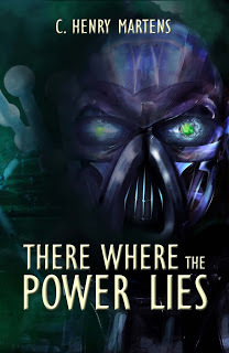
Kari:With the imminent publication of the second book in the series, There Where the Power Lies, we knew we wanted a similar look as the first cover, but since each book in the series can be read as a stand-alone book, we wanted to avoid looking identical.
C:Kari and I felt strongly on the continuity of the covers being important. By the way, maybe this is a good place to mention an ongoing discussion that Kari and I are having. I like to consider There Where the Power Lies as the first book of the series. Chronologically it is, as it takes place twenty years before Monster of the Apocalypse. But I did write Monsterfirst, and we published it first. I just had no idea where the second book was going to end up, and now wish that I had written it first. My fault, but as the books can be read in either order it is more a snafu between Kari as editor and marketing guru and me as the author than anything that affects the reader.
Kari:For book two, we opted to hire a book cover artist directly, rather than run another contest. We found one who does work similar to our first cover, Misha Coutiño Richet from The Book Cover Realm. This time, we wanted a sinister robot face and a different overall color scheme. C. and I agreed on a dark blue-green.
C:After the first cover gelled, we had a theme that was compelling for the future covers. Nice in that we had no real design/format issues to be solved, just choosing the proper background and central image.
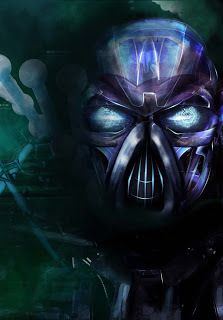
Kari:Though the talented artist came up with some very compelling and high-quality drafts, they were decidedly cyborg-looking. As much as we liked what she did, the book has nothing to do with cyborgs, and you sci-fi fans understand – there’s a big difference between a robot and a cyborg. So we had to insist on a robotic face.
C:I had the feeling that our artist was getting frustrated, as she gave us some really beautiful images, and we turned them down. Our robot needed to be clearly robotic, and the images we were getting were definitely female with mechanical attributes.
Kari:She ended up having to create the face digitally rather than starting from a photographic image, and we were generally pleased with the results:
Kari:Nevertheless, we still had some visions about how we wanted the face to look that were lost in translation to the artist. So we paid her, and she supplied us with the cover in layers. We were able to make some adjustments on our own, and we had our final version.
C:It was important to me that we get the green glow in the eye. Some of the smallest details are impossible to get across when the other person has a different mental image.
Kari:The cover for book three, Hell Follows After, fell in our laps. We found a pre-designed book cover that came close to fitting in with the other covers, and though we didn’t start with any preconceived ideas of how this cover should look, we both felt it fit in well and reflected the story well.
C:Fell into Kari’s lap. She found it. I give her full credit. When she showed it to me I was immediately on board, but so much that I was hesitant about the sudden enthusiasm. I kept looking at it several times a day and could not find much to complain about, just minor tweaks. It was almost too good.
Kari: We contacted the artist, Ida Jansson from Amygdala Design, to ensure we would be able to get the cover in layers so we could make some minor changes, and we made the purchase.

C:Another issue popped up in the title we had chosen. I had come up with the idea, and Kari had accepted it, a title that linked the western flavor of the book to the idea that the future held something ominous. The title was to be Yoke of Destiny, but it just didn’t sit well with me. When my son-in-law asked if it was about eggs, I decided to search for a better alternative. Kari and I both feel strongly attracted to links to ancient stories, myths, legends, so I was looking for a connection to The Four Horsemen of the Apocalypse… but everything was already used. So a sudden random though crossed my mind about what followed after the horsemen? Well, it was right there… Hell Follows After. And that fits what is going on in the book. Click!
Kari:A few image tweaks later, we had our final version:

C:Going in to this process, I believe Kari and I both had some preconceptions that needed to be dropped. Our initial intransigence to working with the artist’s own notions may have impeded our progress to begin with. Yet I believe our insistence on components faithful to the story was important. The process is made more difficult because the artists haven’t read the work and so have no clue what the pages contain other than a brief synopsis, if you provide one. So, sure, go into the process with ideas, but leave room to change your mind, even after you have made a decision. This is a fluid process, as it should be.
Kari:In fact the process has been so rewarding, I have been itching to take a stab at doing some cover design myself. Don’t worry – I’ll give it up if I’m no good at it. I am, after all, a wordsmith, not a designer. But I still can’t help thinking I can do better than a lot of indie book covers I’m seeing out there. To say you can’t judge a book by its cover may be a truism, but it doesn’t keep your readers from judging your book by its cover!
Please tell us which cover you like best.

Sign up to receive these blog posts in your inbox.
www.readmota.com
Kari:Having recently revealed the book cover for the third book in the Monster of the Apocalypse Saga, C. and I have been reflecting on the process of developing each of the different covers in the series. Though we think we’ve been successful at maintaining some consistency, the process for each has been vastly different.
Kari:For the first cover, Monster of the Apocalypse, we ran a competition through 99Designs.com. We had a preconceived idea how we wanted the cover to look, and in retrospect, the look was probably too retro, more 70’s pulp sci-fi cover than a cleaner and more modern look.
C:Boy, ain’t that the truth. What a learning experience. The cover we had envisioned was originally supposed to involve the three main characters as well as the sci-fi future vehicle. Our idea was to bring in the audience that would identify with the characters, young, old, male, female, and by using the techie vehicle we would appeal to sci-fi fans. But retro it was, and thankfully the cover idea percolated beyond what we first had in mind.
Kari:The process of running a competition was fun and frustrating. Trying to get 30 or so artists, many of them with little potential, to get the cover looking just the way we envisioned was difficult. One artist in particular refused to comply with our directions, but the resulting work was intriguing. Several of the entries were downright cartoonish.
C:The upside was that we had all these ideas floating around, and some of the artists came up with some inspiration right away. The downside was that we had all these ideas floating around, and some of the artists came up with ideas they didn’t want to turn loose. I had the idea that the cover should look like what was in the book, and some of the artists had the opinion that what was in the pages had little to do with the cover. I consider it intellectual honesty to attempt to give a feeling for the book by using elements from the story and so a bone of contention with some artists. One of the best artists, a guy with immense talent, was one of those who wished to go in the other direction, and his work was so compelling that we kept him involved until the end. But the final cover is not his.
Kari:In the end we chose a cover that came closest to our vision:
Kari:Thankfully, the artist, Milan Jovanovic, provided all the files and layers he used to produce the final work. Once Monster of the Apocalypse was published, we received feedback that the cover would be so much more dramatic with just the sinister face in the sky. With the images of the main characters easily removed, we had the revised, final Monster of the Apocalypse cover.
C:It was like a bolt of lightning striking, when we played with the cover by removing the two young people and the vehicle. Very similar to finding the right title. An electric thrill that shoots through you.
Kari:With the imminent publication of the second book in the series, There Where the Power Lies, we knew we wanted a similar look as the first cover, but since each book in the series can be read as a stand-alone book, we wanted to avoid looking identical.
C:Kari and I felt strongly on the continuity of the covers being important. By the way, maybe this is a good place to mention an ongoing discussion that Kari and I are having. I like to consider There Where the Power Lies as the first book of the series. Chronologically it is, as it takes place twenty years before Monster of the Apocalypse. But I did write Monsterfirst, and we published it first. I just had no idea where the second book was going to end up, and now wish that I had written it first. My fault, but as the books can be read in either order it is more a snafu between Kari as editor and marketing guru and me as the author than anything that affects the reader.
Kari:For book two, we opted to hire a book cover artist directly, rather than run another contest. We found one who does work similar to our first cover, Misha Coutiño Richet from The Book Cover Realm. This time, we wanted a sinister robot face and a different overall color scheme. C. and I agreed on a dark blue-green.
C:After the first cover gelled, we had a theme that was compelling for the future covers. Nice in that we had no real design/format issues to be solved, just choosing the proper background and central image.
Kari:Though the talented artist came up with some very compelling and high-quality drafts, they were decidedly cyborg-looking. As much as we liked what she did, the book has nothing to do with cyborgs, and you sci-fi fans understand – there’s a big difference between a robot and a cyborg. So we had to insist on a robotic face.
C:I had the feeling that our artist was getting frustrated, as she gave us some really beautiful images, and we turned them down. Our robot needed to be clearly robotic, and the images we were getting were definitely female with mechanical attributes.
Kari:She ended up having to create the face digitally rather than starting from a photographic image, and we were generally pleased with the results:
Kari:Nevertheless, we still had some visions about how we wanted the face to look that were lost in translation to the artist. So we paid her, and she supplied us with the cover in layers. We were able to make some adjustments on our own, and we had our final version.
C:It was important to me that we get the green glow in the eye. Some of the smallest details are impossible to get across when the other person has a different mental image.
Kari:The cover for book three, Hell Follows After, fell in our laps. We found a pre-designed book cover that came close to fitting in with the other covers, and though we didn’t start with any preconceived ideas of how this cover should look, we both felt it fit in well and reflected the story well.
C:Fell into Kari’s lap. She found it. I give her full credit. When she showed it to me I was immediately on board, but so much that I was hesitant about the sudden enthusiasm. I kept looking at it several times a day and could not find much to complain about, just minor tweaks. It was almost too good.
Kari: We contacted the artist, Ida Jansson from Amygdala Design, to ensure we would be able to get the cover in layers so we could make some minor changes, and we made the purchase.

C:Another issue popped up in the title we had chosen. I had come up with the idea, and Kari had accepted it, a title that linked the western flavor of the book to the idea that the future held something ominous. The title was to be Yoke of Destiny, but it just didn’t sit well with me. When my son-in-law asked if it was about eggs, I decided to search for a better alternative. Kari and I both feel strongly attracted to links to ancient stories, myths, legends, so I was looking for a connection to The Four Horsemen of the Apocalypse… but everything was already used. So a sudden random though crossed my mind about what followed after the horsemen? Well, it was right there… Hell Follows After. And that fits what is going on in the book. Click!
Kari:A few image tweaks later, we had our final version:

C:Going in to this process, I believe Kari and I both had some preconceptions that needed to be dropped. Our initial intransigence to working with the artist’s own notions may have impeded our progress to begin with. Yet I believe our insistence on components faithful to the story was important. The process is made more difficult because the artists haven’t read the work and so have no clue what the pages contain other than a brief synopsis, if you provide one. So, sure, go into the process with ideas, but leave room to change your mind, even after you have made a decision. This is a fluid process, as it should be.
Kari:In fact the process has been so rewarding, I have been itching to take a stab at doing some cover design myself. Don’t worry – I’ll give it up if I’m no good at it. I am, after all, a wordsmith, not a designer. But I still can’t help thinking I can do better than a lot of indie book covers I’m seeing out there. To say you can’t judge a book by its cover may be a truism, but it doesn’t keep your readers from judging your book by its cover!
Please tell us which cover you like best.

Sign up to receive these blog posts in your inbox.
www.readmota.com


No comments have been added yet.


