
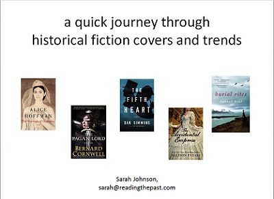
The presentation: A quick journey through historical fiction covers and trends
For attendees at last weekend's Historical Novel Society conference who missed seeing the session on The Art of Book Cover Design for Historical Fiction, or for anyone else who's interested, here's a link to my part of the PowerPoint, which also includes my script (in the form of presentation notes).
Once you reach the linked page, click on Download to open the file. It's 2 mb.
I don't usually work with a script, but since I was going first out of five and had a short time allotted to me, I practiced a few times to make sure it all fit. Normally I'm used to giving hour-long presentations to students, so this helped. Anyhow, enjoy!
The other four presenters were Jenny Quinlan of Historical Editorial (who talked about more trends and gave advice based on her cover design experience); Kris Waldherr (a novelist and designer who created beautiful covers for her own books and Sandra Gulland's ebooks, among others); Anna Michels of Sourcebooks (who provided an overview of the design process for Susan Higginbotham's upcoming novel Hanging Mary, including the covers that didn't make it); and Emily Victorson, publisher at Allium Press of Chicago (who showed how she uses period photographs and historical fonts to come up with their covers).
A sidenote: while I was heading up the elevator at the conference hotel, another attendee saw my badge and speaker ribbon and asked what I was presenting about. I told her, and she asked me, "So, are you for or against headless women?" This is the type of conference it was. Everyone spoke the same language.


date newest »
message 1:
by
Alex
(new)
Jul 07, 2015 06:51AM
 Thanks, Sarah. Your presentation is great. Make that a "for" top hats and an "against" for headless, IMO! ;)
reply
|
flag
 Thanks! That guy in the hat does get around... but not as much as the headless ladies!
 I scanned through over a thousand online fonts before finding one that I thought would suggest a particular period for my novel. Glad to know readers can value that as much as I did. Nicely done! P.S., I also prefer top hats to headless ladies, although I could perhaps see the relevance in the case of a biography of the original Boleyn girl...
Yes, I see your point there (makes me wonder if that's been done!). The presenter who spoke after me, Jenny Quinlan, also talked about classic fonts and how they're used on historical covers to appeal to contemporary readers and provide a uniform look for series.
I scanned through over a thousand online fonts before finding one that I thought would suggest a particular period for my novel. Glad to know readers can value that as much as I did. Nicely done! P.S., I also prefer top hats to headless ladies, although I could perhaps see the relevance in the case of a biography of the original Boleyn girl...
Yes, I see your point there (makes me wonder if that's been done!). The presenter who spoke after me, Jenny Quinlan, also talked about classic fonts and how they're used on historical covers to appeal to contemporary readers and provide a uniform look for series.


