
How America's Workforce Has Changed Since 1977
As long as you don’t look too far into it, Thursday’s June jobs report looks like good news: The economy added 223,000 jobs, close to expectations, and the unemployment rate fell again, to 5.3 percent. So far, so good—still a slower recovery than anyone might like, but a recovery nonetheless.
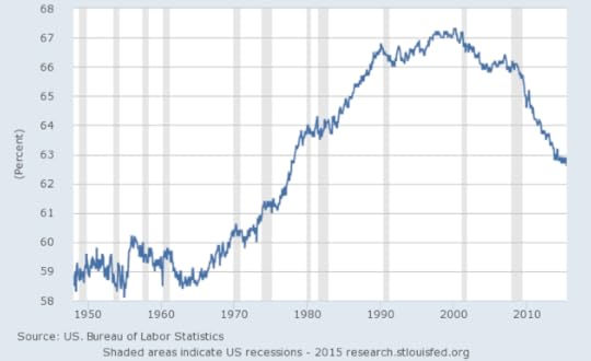
The more concerning signs are hidden beneath the surface. Some people have been sounding the alarm about labor-participation rates for years now—Republicans tried, mostly unsuccessfully, to make them an issue in the 2012 election. But as several analysts have pointed out, the June rate of 62.6 percent is the lowest since October of 1977. The decline is part of a long-term trend, as this graph shows:
Workforce Participation, 1945-Present
 FRED
FRED You can watch the status of women in the workplace change over that arc—as more and more women enter the workforce, the amount climbs and climbs. But overall participation has been declining since the tech bubble burst around 2000.
So what exactly did the United States look like in October 1977, the last time the labor-participation rate was this low? Obviously the most important question is what Americans were listening to. (The month’s top songs were Debby Boone’s “You Light Up My Life” and—seriously—Meco’s “


Atlantic Monthly Contributors's Blog

- Atlantic Monthly Contributors's profile
- 1 follower

