
DC Home Price Trends; Or, Fun With Averages
Lydia DePillis crunches the American Community Survey data to produce a chart "of the median home price citywide, vs. the highest and lowest median home prices by neighborhood cluster, over the last 15 years."
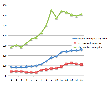
The interesting thing, as she notes, is that the median moves steadily upwards and is at its peak level even though both the top end and the bottom end are below-peak. It's easy enough to understand how that can happen, but it's a reminder that average trends can mask what's happening beneath the surface.


No comments have been added yet.
Matthew Yglesias's Blog

- Matthew Yglesias's profile
- 72 followers
Matthew Yglesias isn't a Goodreads Author
(yet),
but they
do have a blog,
so here are some recent posts imported from
their feed.

