
Window Management and Apple
Note: This blog post contains video or JavaScript effects that are illegal in RSS and will be removed by most feed readers. It should display perfectly if you open it in Safari, Chrome, or Firefox, though.
The lack of split screen view has always been one of my major complaints about iOS. With iOS 9, Apple is1 going to add a simple tiling window manager to iOS.
Dr. Drang writes:
Unlike Mac users, iPad users won’t be dumped immediately into a multitasking environment. Those who prefer to use and see only one app at a time can continue to do so—the multitasking interface will stay out of their way and won’t confuse them.
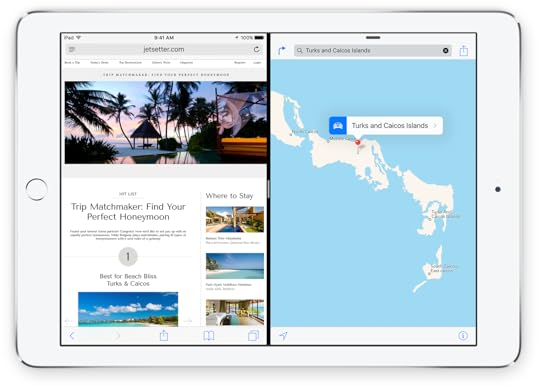
But for those who need to refer to one app while working in another, Slide Over and (especially) Split View will be a godsend. And it’s seemingly eliminated one of the biggest problems with using Mac-like multitasking environments: window management. There are no windows in Split View, there are only parts of the screen, with one part wholly given over to one app and another part wholly given over to another. There’s no overlap and there’s no Desktop peeking out from behind. The only thing the user has to think about is the position of the dividing line between the two apps.
Here’s a video of Craig Federighi, introducing the new feature.2
This is very similar to what Windows 8 does, but, in an odd way, seems to be less predictable, less powerful, and more complex. Notice how Federighi is on the home screen, jumps to the task switcher, opens Safari, and then swipes in from the right. This shows Messages, and Federighi acts as if that was exactly what he had expected to happen, but… why? Why is it Messages and not some other app? He just swiped in from the right, how does iOS decide which app to show?3 I would assume that, since there are dozens of apps you might want to see, and only one app that actually gets shown, the app you’re actually swiping in will be the wrong one most of the time.
You can pull down from the top and change the app, but now you’re doing some serious interface magic, where you have to know to swipe in from the right to show the app, then swipe down from the top to show the task switcher. There are no real affordances4 for either of the two actions.
Note that, so far, you’re not actually in split view. You’re still in «slide over» view. There are two different multitasking views in iOS 9 — another layer of complexity. To go into split view, you have to know about another piece of hidden interface magic: tap on the divider, and you turn on split view (unless you don’t have an iPad Air 2).
Apple is also giving developers the ability to opt out from multitasking and they’re saying that camera apps and hardware-intensive games should probably eschew multitasking.
This seems to add additional inconsistency to an already odd implementation of the split window feature.
This reminds me of 90s Internet mystery meat navigation, except that there’s not even any mystery meat, and you’re just randomly dragging around and tapping on things to trigger actions that might or might not be supported by the application you’re actually trying to use. You could argue that split view is a power user feature, and power users can just go watch a YouTube movie that explains how the feature works, but I’ve now watched this section of the keynote twice, forgotten how it works once already, and I’m completely sure that I will have forgotten how it works again by tomorrow.
This is exactly the kind of magical user interface that people have faulted Windows 8 for, except it’s even more confusing. In Windows 8, you only had to remember to swipe in from the screen edges. Once you did that, the UI was visible, and guided your actions. In iOS 9, it’s layers of hidden UI magic. The one advantage Apple has is that you don’t need to know any of it to use iOS, but still. I think we should expect better of Apple.
Because the thing is: it is not necessary to have all of this complexity.
Windows 8 has a more powerful split view that is also hidden from novice users, but still manages to be easy to learn and intuitive to use. Drag in from the left to show the task switcher. Tap on a window to activate it. If you’re a power user, all you have to learn is that you can also drag windows from the task switcher. Now you can drag them into the screen and place them where you want them to be, either as new split views, or replacing windows already in split views.
Your browser does not support the video element.
No hidden secondary task switcher, no multiple split screen modes, no excluded apps.5
In conclusion, I’m extremely happy that Apple is introducing a split screen view on iOS, but it’s difficult to understand why they decided to go with such a complex user interface. It all looks nice, but the interaction design seems, well, odd, and a little bit concerning.
El Capitan
At the same time, Apple is also starting to tackle window management on OS X. Here, Apple is trying to figure out the same kind of balancing act between the existing window management system, and a new, simplified one, that Microsoft has failed to solve with Windows 8, and is trying to improve upon with Windows 10.
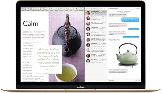
There seems to be a new kind of hierarchical window management system for full-screen apps, where «inner» windows can be minimized into tabs at the bottom of the screen (kind of like tabbed folders in Mac OS 9). There’s also a new split screen mode that shows windows side by side (and if you do that in the normal window manager, you seem to be put into the full-screen window manager automatically).
Putting all of this stuff on top of all of the existing window management cruft doesn’t exactly make the Mac’s window management system simple and easy to understand. I think Apple is trying to avoid Microsoft’s mistake of having two completely separated window management systems on its desktop OS, but it’s becoming clear that the alternative — one system that tries to accommodate vastly different kinds of usage — is no panacea, either.
Either way, iOS and Mac OS are taking another small step towards each other. Nobody can predict the future, of course, but it seems possible that, as iOS becomes more powerful, and Mac OS gains features from iOS, the two operating systems might eventually converge into two versions of the same product.
Natural Language
Apple also showed a nifty new natural language search. But if they have all of this data, and know when a user worked on a document, and with whom that user worked, I wish they’d just expose this data in a real graphical user interface. I’m never sure how to talk to natural language UIs, and if they fail, I’m never sure if it’s because the system doesn’t have the information to answer my question, or if I merely asked the wrong question. Just give me a visual UI for things like date- or people-based file management.
Competition
One final thought: the fact that three different companies are giving each other a run for their money on OS design is pretty amazingly great, and fantastic for people who actually use these devices. I’m growing more and more tired of the partisan reporting that happens in the tech industry, where people pledge allegiance to one or the other multinational corporation and support everything that corporation does, while dismissing and belittling everything everybody else does, particularly if other companies copy features from the one company they like.6
This is such a misguided approach.
People who buy Apple products should be ecstatic that Microsoft and Google are competing with Apple, and vice-versa.7 Everybody should be happy if each company takes each other company’s greatest ideas, and improves upon them. The last thing we want is another 90s-type situation, where one company controls 95% of the market, and as a direct result, progress just halts for a decade.
I’m really hoping that we’re not living through another Amiga/Atari era, were we have a bit of competition for a few years, but eventually, some companies will die, others will fade into irrelevance, and one company will end up owning most of the market.
In fact, I wish we’d see even more competition! I wish Samsung would get serious with its own OS. I wish HP would revive Web OS. I wish Blackberry would stop making bad decisions, and start kicking ass again. I wish smaller companies like Jolla, Ubuntu, and the Firefox OS team would be better able to compete with the big guys. And I wish people would look outside of the confines of their chosen platform, and acknowledge the positive contributions that other companies are making.
This goes further than just interaction design. For example, I hope Apple keeps holding Google’s feet to the fire on the topic of privacy and encryption, and I hope Google’s more open stance on app development and on platform access will eventually force Apple to follow suit.8
The more competition there is, the better the products we get to use. The worst thing that could possible happen to us would be for our favorite company to win, and for everybody else to go out of business.
BTW, I hope they improve the «keyboard as a trackpad» feature before it ships, because in the demo, Federighi doesn’t seem to be able to easily select text without also typing gibberish at the same time. 
Maybe it’s the last used app, but what if the last used app is not supported? What if you’re starting from the home screen? It must often seem non-deterministic to the user.
Apart from a small grey pill at the top of the «slide over» panel, that is presumably intended to tell you that you can swipe down to trigger some kind of action. All of this is exacerbated by the «flat» user interface, which lacks many of the ambient interaction hints that come from having user interfaces that are closer to what humans interact with in the real world.
Though Windows 8 does have the «drag in to get a random app» feature, same as the iPad. Thankfully, you can turn it off. And you should.
Regardless of what device you’re currently using, unless you actually own huge amounts of stock in one of these companies, or work for them, please remember that the manufacturer of the device or the OS you’re using doesn’t really care about you.
I’m only using Apple aficionados as the example in this sentence because I’m one of them, not because they’re particularly guilty of this. The situation on the Android and Microsoft (and Linux) sides is similar. It’s possible that we Apple customers are a bit more susceptible to «us vs. them» thinking due to Apple’s near-death experience in the 90s, but in general, the difference between the groups is small.
There’s this meme going around that apps are this generation’s new art form. I think this is true, but I also think it is a pretty sad statement on this generation that its new art form is one that is effectively controlled by a single multinational corporation that will not allow art that involves political caricatures, overt social criticism, or nudity. If paint and canvas had those same restrictions, the only paintings we’d have from the old masters would be still lifes of fruit bowls.
If you require a short url to link to this article, please use http://ignco.de/708

If you liked this, you'll love my book. It's called Designed for Use: Create Usable Interfaces for Applications and the Web. In it, I cover the whole design process, from user research and sketching to usability tests and A/B testing. But I don't just explain techniques, I also talk about concepts like discoverability, when and how to use animations, what we can learn from video games, and much more.
You can find out more about it (and order it directly, printed or as a DRM-free ebook) on the Pragmatic Programmers website. It's been translated to Chinese and Japanese.


Lukas Mathis's Blog

- Lukas Mathis's profile
- 2 followers

