That little bit of something
My job involves a lot of visual representation. And I’m the first to say that I’m not that good at it.
I mean, I’m great at organizing data, analyzing and summarizing said data, but then visually representing it on a map? Well, I do alright, but there are folks about there with a design background that do much better.
Still, I try. Every now and then I hit the mark and I feel a little proud. And since I’m prone to grand delusions, I inevitably think that I can do things like design book covers.
When I should be writing, sometimes I procrastinate by making book covers for my stories. But I know they suck. (The book covers, not the stories…ummm…okay, the stories, too.)
Not too much, mind you, but they’re just not quite there. They just need that little bit of something that a true graphic designer can bring to a project. Regardless, I forge on.
I thought it would be fun to show you some of my failed attempts at designing book covers.
Devil’s Blood (unpublished, trunked novel)
 Devil’s Blood by N.E. White Book Cover Version 1
Gosh, I think I did this one about, what, three years ago? Maybe four.
It’s a tad on the busy side and I thought it would be cool to include a map. The story only had a tangential reference to maps, but darn it, I was gonna put a map on the cover.
Would you buy this book based on this cover? Ummmm, I think not.
Devil’s Blood by N.E. White Book Cover Version 1The font is okay, but not exactly period (story set in 15th century Spain). And it’s not the easiest to read at the thumbnail size. Rather than pick a proper font, I tried to set off the text with blocks of transparent white and then added some shadow to confuse it even more. Too many failed effects, methinks.
I do like the colors. The browns and reds are nice, but that has more to do with the color choices the original cartographer used than anything I did. If nothing else, it does capture the mood I was in at the time: international adventure!
Blood Moon (unpublished, revamped, trunked novel)
 Blood Moon Book Cover Spread
Then I went a completely different direction with this one (and I had some more grand delusions and thought I’d go print).
 I think this is for the same story, but a completely revised version of it. I got rid of the map and thought simple simple simple, stupid.
I also wanted to feature the moon on the cover since much of the action in the story revolved around the phases of the moon. I must have seen someone else put the moon in the title so that’s what I did. But, at the thumbnail size, you can’t even see it. It just looks like a smudge or typo.
Plus, there’s something behind the text, isn’t there. What is it? Can you see it?
It’s meant to be tantalizing, but it just looks…bad.
Plus, it doesn’t exactly scream FANTASY or HISTORIC FANTASY, does it?
The Denouncer and La Murciélaga (unpublished, trunked-for-good novels)
 At some point, the story got re-written again, and the following book covers show just how much better the story had gotten.
 Second book for this series
The covers hint at the time period and what truly matters in the story (to me). Basically, all I did was keep it simple, but tried to 1) add a visually interesting center piece and 2) any other elements included were there to highlight or set off that center piece.
The font is filler and was not intended as the final. At the time, I knew I needed something better, and I even found the perfect one (for $400!). I put off purchasing it and I’m glad I did since this planned trilogy got shoved back in the trunk to never see the light of day again. The story was just terrible. Suffice to say I learned a lot writing this story, but not enough.
What I do like about this cover are the colors. Again, the creams, browns and reds made me think of the place I was writing about.
The historic illustrations also invoke a sense of time as well as add a hint of scientific discovery (for the first) and the confines of cultural norms (for the second). I rather liked these covers and would have been happy to slap them on the stories if I had decided to move forward with self-publication.
Alas, I did not.
That little bit of something
So, how do you get that little extra pizzazz? That nebulous combination of white space, font, and graphics that just make a cover pop?
Well, short of getting a degree in graphic design, I don’t know. Luckily, I have an awesome friend who has that little bit of something the rest of us can only hope to have in our dreams. (Well, my dreams at least!)
 Audio file cover designed by Joe Bailey
Is that awesome or what? I can’t believe how good it looks. It’s just…thunderous, no? I can’t help but think of the Star Trek, Star Wars, or Battlestar Galactica theme songs (though the story is nothing like any of those but you get the idea).
I know, you’re probably not impressed. But I am and I think I lot of other folks will be, too.
Just for comparisons, here’s the first cover design:
 Designer to remain unnamed to protect the guilty
Mind you, there is nothing wrong with the original. Again, I would be proud to use this as the front piece of my story, but Joe’s little bit of something really is worth going to the professionals.
Until next time, don’t try it yourselves, writers.
Also, don’t forget to check out Devenio Concepts. What Joe does for visuals, they do for audio.
NOTE: From the moon, I know Earth (and the background view) would not look like either of these representations. These are artistic representations. Here’s what it really looks like:
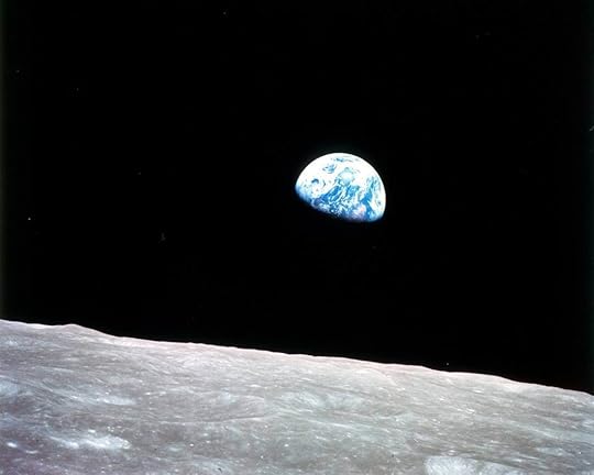 Image courtesy of NASA
Filed under: writing Tagged: Book cover, book covers, graphic design