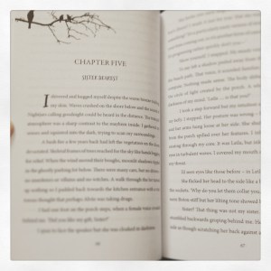
I is for Interior – Self-publishing from A to Z
 Wowzers. You’re ready to start designing the inside of your book. Woohoo! That means you’re almost there.
Programmes to use
So, I use Adobe InDesign to create my print document, (see the image on the right) so that I can add special chapter treatment and have more control over images and fonts. I write in Scrivener, so I found it easier to just export from that for the ebook. It does everything for you. I’m going to take a crack at creating the e-book in Apple’s iAuthor for the iBooks store, but I haven’t gotten that far yet. If all else fails here, I can just use the e-pub file you converted from Scrivener to upload to iBooks.
Design terms for Interior Book Design
Some of the terminology that the Print on Demand company use can be a bit confusing to those that have never done this before, so below is a run down of things you need to be aware of.
Bleed: This means the extra bit of design you need to create that will flow off the edge of the paper so when the paper is cut to size, you don’t get any white margins.
Slug: (This is starting to sound like a B-Grade horror movie) Slug means the inside margin where the binding is going to be. Some companies specify that they want this gap bigger than the other margins on the page because the fold will take away some of the room. Because it confuses me every time, I just make sure my entire margin is that of the slug + standard margin.
Pagination: How your page numbers flow.
Place holder text: This is that random Lorem Ipsum fake text people use to put in as a sample. Don’t include any of this in your PDF’s.
Crop marks: Little crosses or ‘L’s’ that you see at the corners of your design. Check to see if your printer requires these or not.
Resolution: This is how detailed your image is and what quality it is. You know when you see pixelation occur in an image? Little squares make the image blurry? This is a low resolution image. For print, your picture needs to be at least 300dpi. If you are in Photoshop, you can set this dpi when you create a new file, or adjust an old one by clicking on ‘Image -> Size’
Pages to include in your novel
The Title Page
Copyright Page
Second Title Page
Dedication Page
Contents (optional)
Prologue (optional)
Chapters
Epilogue (optional)
Glossary (optional – sometimes if the concept is high, you may need this)
Acknowledgments
Authors note
If you are self-publishing, you can virtually pick whatever format you want. Some forward thinking new writers are experimenting with formats and trying new things. Know the rules so you can break the rules.
Fonts to use
Always use a serif font in print – this means the typography with the little ticks at the end of the line. (e.g. Times, Palantino, Baskerville) Sans-serif are usually reserved for the screen, meaning websites. E-readers like serif fonts too. PDF’s often ask that you ’embed’ your fonts. This happens automatically for many PDF converter programs, but if your font is not standard, you may have issues. It’s good to test out opening and printing your PDF on a different computer without having that special font installed.
Well, that’s it folks. I could go on and on forever about interior book design, but that would be cray. If you want to read more on the subject, one of the best resources in the world for this sort of thing is TheBookDesigner.com
If you have any further questions, drop me a line below and I’ll do my best to answer for you.
The post I is for Interior – Self-publishing from A to Z appeared first on Author Zoo.


