
Photo-Development Challenge Results #2: Statues
It's been three months to the day since I posted
“Photo-Development Challenge: Inspire Me and Others With Your Artistic Interpretation”, and I'm mortified that it's only the second set of results that I'm finally getting around to sharing
(the first having been
“Hillside Temple Buildings” 2½ months ago).
In retrospect, it was irresponsible of me to post the challenge right before
a long family vacation. Sorry.
In any case, to recap what's going on, I posted some raw photos and
asked others to develop them to their taste, and here I'll share what those
different interpretations looked like.
First, today's subject in its unprocessed, straight-from-the-camera (via default Lightroom settings) originalness...
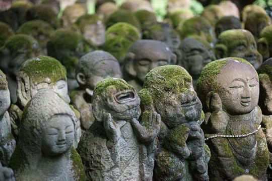
Nikon D700 + Nikkor 85mm f/1.4 — 1/640 sec, f/1.4, ISO 250 —
image data
The Unprocessed Original
This is from the
delightfully whimsical Otaginenbutsuji Temple (愛宕念仏寺) in northwestern
Kyoto, which I've not nearly posted enough about.
As before, I'll present the results in the order I received them, starting with my own processing that I did at the time...
My Version
I put an almost-daylight white balance to match the splashes of sun, and
created a bit more visual range by increasing contrast and making
highlights brighter while making shadows darker. I think this leaves a
slight spotlight effect where there are splashes of light. I also added a
slight vignette.
processing by
Werner Gansz
div.c2577 { padding-left:1em; border-left: 5px solid #555; margin-right:3em; margin-bottom:30px }
p.p2577 { margin-top:0}
div.d2577 { margin-bottom:0}
Werner comments:
I love these guys. The two statues on the right were the best focus and
light so I used local radials to bring out their features and textures. I also used the GND to darken the strip of sunlight at the top which I found
distracting.
My Reaction:
Well, now mine feels dark and muddy.
processed by:
Niels Volkmann
Niels comments:
Thoughts on processing: immediately I thought this would make a nice b/w-conversion. By using some lightening/darkening I would like to put some focus on the face of the rightmost statue.
My Reaction:
Nicely done. It looks like you cropped it to just fit the four in front, which feels more balanced. The focus is indeed on the rightmost statue, but perhaps a bit too brightly for my taste, but still
much better than mine.
— processing by anonymous —
Contemplation
Contentment in the crowd
My Reaction:
This uses the crop instead of brightness to put the focus on the four main statues, and
so it can actually lose contrast buts still work well. This is really interesting to me.
processing by Herve
Fear and Serenity
My Reaction: Juuuust a bit too-strongly implemented, but an interesting
idea to focus on the emotions and juxtapose two opposites.
processinb by
Ben Willmore
Ben's comments:
1) As usual, crop to refine composition.
2) Emphasize green by messing with saturation/vibrance blend.
3) desaturate and darken surrounding areas to keep the eye from spending too much time there.
4) Split-tone to add warmth to highlights.
My Reaction:
This crop really identifies the heart of the photo. It's how I should have
cropped with my feet at the time. Maybe because I read Ben's comments
before looking at the result, I ended up focusing too much on the
desaturation on in the background and wish it were a little more lightly
applied.
One person, nnkka, submitted three versions...
Nikon D700 + Nikkor 85mm f/1.4 — 1/640 sec, f/1.4, ISO 250 —
image data
— processing by nnkka —
“Iced”
— processing by nnkka —
“Magenta”
Nikon D700 + Nikkor 85mm f/1.4 — 1/640 sec, f/1.4, ISO 250 —
image data
— processing by nnkka —
“Pseudo B&W”
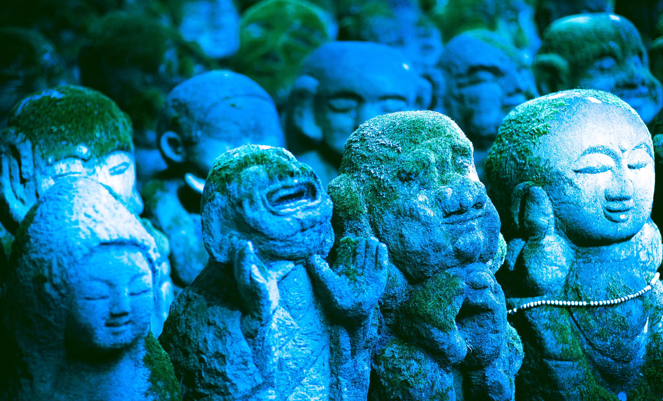
nnkka's comments:
iced version
I was at a loss in what to do. Then I fooled around and made the blue version to get going.
magenta version
Then I made highlights magenta using the tone curve, and decided it added something unusual to mossy statues. My friend said the statues looked magical, I think that's great.
Split toned green shadows to balance out.
Then vignette, to better focus the viewer's attention.
Cropped for composition, as the highlights in the back could be distracting.
Used graduated filters to desaturate and darken the defocused statues in the back, so attention is on the foreground.
pseudo B&W version
Then I clicked B&W and really liked it, but to me B&W is just a gimmick, but I wanted to use it here. I ended up trying to tone the image lightly to make people think it's pure BW, when actually it was toned.
My Reaction:
A progression from muddy (a blue version of mine) to crisp. Having seen the bright area in the back cropped out
in the first two, it's distracting to see it in the third, which just goes to show that it was the right move to crop it out.
processing by anonymous
My Reaction:
This is a nice balance between Werner's and “Contemplation” (showing that all three are in a nice ballpark).
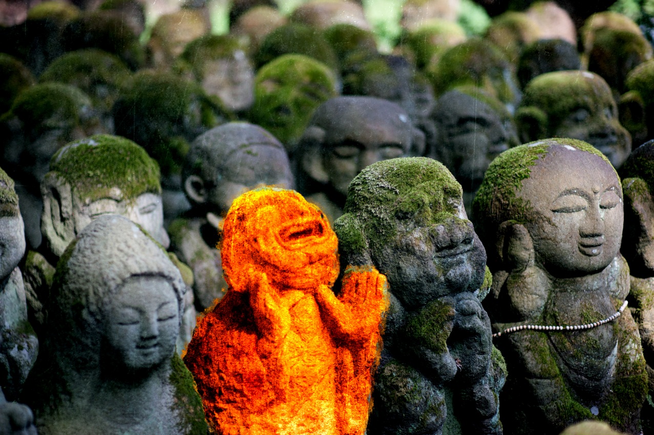
image data
processing by
Tom in SF
comments:
This image seemed to be about one active statue amongst many sleeping
ones.
Decided to emphasize this difference by color separation via Topaz Labs
and Totally RAD plug-ins.
Considered cropping the result as well, but thought to leave the full
composition alone for now.
My Reaction:
LAVA! (or, given the posture of the guy in question, “Hell”)
processing by
Amit C
comments:
Here I cropped a bit to give focus to only the four statues in the front
and wanted to saturate the greens to make what is covering the statues pop
out more. Also felt the image needed more sharpening and some contrast to
make it more appealing.
My Reaction:
A very nice balance, and, oddly, the most “3D” looking one to me.
It was fun to see the repeating themes (particularly the crop) and unique takes. I just must apologize again
for taking so long.


Jeffrey E.F. Friedl's Blog
- Jeffrey E.F. Friedl's profile
- 13 followers

