
Telling the truth with charts
A chart tells a story. Explain what's happening in a way that's understood, in a useful, clear presentation that's true. But too many charts fail at this simple but difficult task.
Consider this chart of the frightening decline in reading among Americans:
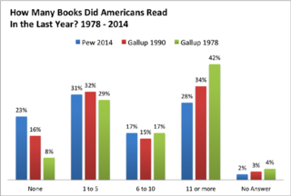
It's a mess. It buries the story. It's confusing.
First, there's too much data. The 1990 Gallup poll tells us nothing. Second, it goes from new data to old, even though every other table in the world gets newer as you move right. Third, it is too complete, giving us not only the useless "no answer" category but two stats in the middle that hardly changed.
We can quickly clean it up and get this:
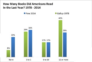
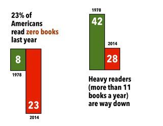
But it still doesn't work hard enough to say what we want to say. Footnotes belong in the footnotes, along with links to the underlying data in case we want to see for ourselves. But here is the truth of this data, a story well told:


Seth Godin's Blog

- Seth Godin's profile
- 6535 followers

