The Comprehensive Mobile-Friendly SEO Guide for Business Owners Post-April 21st #Mobilegeddon
The Comprehensive Mobile-Friendly SEO Guide for Business Owners Post-April 21st #Mobilegeddon was originally published on BruceClay.com, home of expert search engine optimization tips.
Are you a hands-on small business owner managing your own digital marketing grappling with Google’s April 21st mobile-friendly update? We’re here to help. This article is your go-to guide for dealing with the aftermath of Google’s April 21st update. We’re one week out from Google’s latest major algorithm update and that means it’s time to dive into data and plan ahead — because even if the mobile-friendly update boosted your mobile traffic, we know search engine optimization is never complete.

Quick background: Last year traffic on mobile devices exceeded traffic on desktop, reflecting an evolution of search behavior. If creating a good user experience for your mobile visitors wasn’t enough incentive, Google has made mobile-friendliness mandatory: get mobile-friendly or your rankings will suffer consequences on the SERPs. To evaluate your own site’s mobile-friendliness, use Google’s free Mobile-Friendly Testing Tool — plug in your URL and the tool grades the page’s mobile-friendliness based on the ease of tapping links and buttons, the readability of fonts, the size of content and the presence of any content that may be blocked from a mobile browser. Read our quick guide to making your site mobile-friendly here.
Once your site itself is mobile-friendly, we encourage you to take steps to optimize how your listings appear on a mobile SERP. And you’ll want to look at the available reports to see how all the changes are impacting your traffic. This mobile-friendly SEO guide covers:
Creating a mobile baseline report in Google Webmaster Tools
Determining how your site was impacted by the algorithm update
The effect of the mobile-friendly label vs. other SERP annotations
How to edit the new mobile breadcrumb URLs
Create a Mobile Baseline Report
A mobile baseline report tells you the traffic you get from Google mobile searchers so you can compare this data to your traffic after the update. To create a mobile baseline report, you’ll need to access Google Webmaster Tools. Once inside, choose your site and drop down to Search Traffic > Search Queries. From there, click Filters and change Search to Mobile from Web.
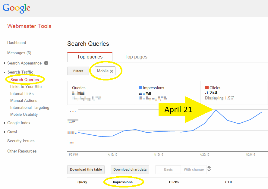
Do your mobile search impressions reported in Google Webmaster Tools show a rise or drop after April 21?
Determine How Your Site was Impacted
Google Webmaster Trends Analyst Gary Illyes said that it would take a full week for the algorithm update to reach its full effect, and as of today it’s been a week. It’s time to dive into the data and see where you’ve settled. While clicks are always the end goal of any SEO equation, you’re going to want to turn your attention to the impressions in this particular case. Fluctuation in impressions tend to indicate change in search engine rankings.
Be mindful, however, that site owners and digital marketers are testing searches and SERPs heavily right now, and data from the past week (and weeks to come) can very well reflect false inflation. It’s important, then, to keep monitoring the data closely in the weeks to come.
Mobile-Friendly Label vs. Other SERP Annotations
Just because your site is mobile-friendly doesn’t mean you’ll get the mobile-friendly label. If you’ve implemented schema markup that shows, for example, a video thumbnail, a jump-to-app link or how many product listings you offer, that markup will be shown rather than your mobile-friendliness label — even if your site is, in fact, mobile friendly. Read more about this phenomenon in “Why is My Mobile-Friendly Label Missing?”
If you’re wondering which SERP annotation is most important to have, Bruce Clay, Inc. SEO Manager Robert Ramirez explained that the critical aim is standing out.
“Whichever SERP annotation stands out is the one you should focus on,” Ramirez said. “If you’re in an e-commerce environment where a lot of product options is important, then the number of results on a page could be high value. A video thumbnail may really stand out, and so may ‘jump to app.’ It all depends on the business, the SERP and the competition.”
If you don’t have any other schema markup at play, the mobile-friendly annotation is a great thing to have. If your competitors don’t have the mobile-friendly label and you do, it will differentiate you from the pack. Furthermore, as searchers attune to the new label, we expect they’ll naturally start to click through to SERP entries with mobile-friendly labels.
The New Structure of Mobile URLs
Another change that came about in the weeks leading up to Mobilegeddon was how Google displays result URLs in mobile SERPs. Rather than showing the actual URLs, mobile SERPs now display the structure of the page location in a breadrumb-like format. The best part about this new look is that you have control over how your breadcrumb URL displays! Check it out:
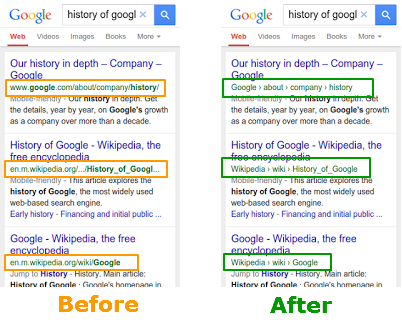
URL structure is replaced by a breadcrumb format in Google mobile search results.
Examples of Structured URLs WITHOUT Schema
If you haven’t used schema to dictate your site name, Google will use your domain. The mobile SERP pictured below shows examples of three publications who have not yet used schema markup to designate their site names. The result is a lengthy URL that doesn’t capitalize on the new structure that aims to neaten and better present URLs.

Vanity Fair and Time Out would benefit from controlling how their site name displays in breadcrumb URLs.
If you want to control the breadcrumbs, you must use schema markup. We recommend it. Not only will your URL structure look neater in this new format, you’ll save on valuable SERP real estate by ridding yourself of the clunky www. and .com, thus allowing more high-signal information about the result to display in the breadcrumbs. Read more about this opportunity in “Google’s New Mobile Breadcrumb URLs: Making the Most of Your Site Name and URL Structure.”
How has the mobile-friendly update affected your site? Share in the comments!