
Making Interluceo
Making an artists’ book is a long and involved process, and I find it helpful to review once a project is complete. Here’s the story of my latest book, Interluceo.

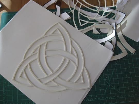
The box that houses Interluceo (binding and box by Claudia Cohen). Notice the blind embossed title on the spine.
I started reading about sacred geometry about five years ago and discovered a wonderful book quite by accident at my local library a year or so ago. I think I typed “how to draw a circle” into the on-line card catalog and found the book: How the World Is Made: The Story of Creation According to Sacred Geometry, by John Mitchell with Allan Brown. I was drawn to this particular phrase, which I found in the preface of the book:
“There is great value in drawing by hand, and good reason to resist the temptation to resort to a computer. We lose something when we use computers to draw geometry. However beguiling their mechanical precision, they lack ”heart”: in some subtle way we become observers rather than participants”.
This became a guiding principle for Interluceo. Aside from using the computer to generate the imagery for the polymer plates used to letterpress print the book, the entire book is made by hand.
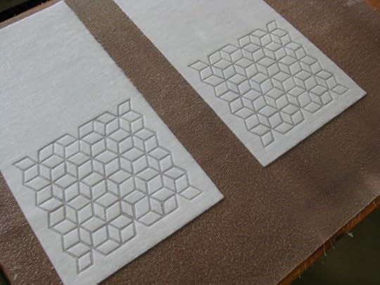
All of the watermarks (seven geometric designs and the title for the cover) were cut by hand.
What came first? The paper of course: 700 sheets of it! I don’t think I’ve ever made more than 100 sheets of paper for any one project, so this was a huge feat. Had I paused to consider that I’d be making so many sheets, I may never have begun.
For years, I’ve wanted to incorporate watermarks into a book, and I’ve experimented with many ways to create these lovely images that are integral to a sheet of paper. The pulp I’ve most commonly used is a finely beaten cotton linter. The resulting sheet produces a lovely watermark, but the strength of the paper is compromised. I experimented and came up with a 25%abaca/75% cotton linter pulp that shows off the watermarks nicely, but with added strength from the abaca. This is an important consideration for a book whose pages will be handled and turned.

#2 is the line, and a series of curved lines forms a half circle, or a rainbow
The watermarks for the book are hand cut from buttercut, a thin rubber material with an adhesive on the back, which makes it easy to affix to the papermaking mould.
I decided to focus on the numbers 1-7 (there are seven days of the week, seven colors in the rainbow, seven notes in the musical scale, …) and in this book you find a progression of (the first) seven shapes: the point (circle), a line, triangle, square, pentagon, hexagon, and septagon, which are represented in the watermarks.
#4 is the square, or in three dimensions the cube
The book pages are square, measuring 9″ x 9″. I made the watermarked sheets thin enough, so that you could see the images subtly even without backlight, and I decided to place colored sheets behind the watermarks, so that when you come to a watermarked page, you see a bit of the color showing through. And as you turn the page, the watermark becomes fully illuminated with natural light.

When designing the colored pages, I considered laminating them to the back of the watermarked sheets. I made did some tests, but they weren’t quite right, and then I thought of the cut paper work of Béatrice Coron, whom I’ve known since we were both beginning our careers in NYC.

Wouldn’t paper cuts go nicely with the watermarks? But how to design the pages to show off both features adequately? After a bit of thinking, testing and paper engineering, I came up with the solution: folded colored abaca folios would allow for a solid colored sheet behind the watermark, followed by a page behind that to feature a cut paper illustration. I made seven colored abaca papers in the colors of the rainbow.

210 sheets (30 each of seven colors) of abaca paper, ready to ship to Béatrice Coron
Béatrice and I had a few conversations about the illustrations. The only directions that I gave her were to use the shape for each page as the outline of her cut and to hide the corresponding number within each paper cut (be sure to look for those when you view the pages of the book – there’s a link at the bottom of this post). She came up with seven lovely illustrations which portray the mysteries of life.

#1 (the baby in the womb) on the work table. Béatrice cut through five sheets at a time; these were all cut by hand.
Now that the paper and the illustrations were in the works, it was time to figure out the text and the printing. I happened to be traveling to Santa Fe late last fall where I visited a paper colleague and letterpress printer Tom Leech, who runs the Palace of the Governors Press. I showed him the mock-up for the book and asked him if he knew someone who might print the book. I hadn’t found a local letterpress printer since I moved from Oregon to Colorado two years ago, and I thought that Tom, who had lived in Colorado before, might have a suggestion for me. And he did! He said that he wanted to print the book.

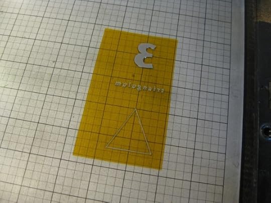
I chose to keep the text simple, with just the number, the latin word for the shape, and the shape printed on the cotton/abaca page adjacent to each watermark.
silver ink on the polymer plate for page #3
Tom recommended silver ink, to complement the luminosity of the watermarks, and I hand watercolored the shapes after printing.

The book opens with a quote by Galileo: “The grand book of the universe… was written in the language of mathematics, and its characters are triangles, circles, and other geometrical figures, without which it is impossible to understand a single word of it.” And it ends with a page of reflections by yours truly and a shaped text colophon.
My final considerations were the title page, which has a hand cut window backed with a sheet of colored abaca,

and the cover, which is made with a pulp stenciling technique similar to watermarking.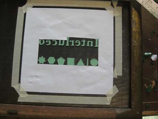
The title came at the 11th hour. I’d considered a LOT of titles and then an artist friend suggested looking at latin words. I found some words, consulted with others, and then sent a short list to my friend. She did a quick search and found Interluceo (and a few other words). When I read the meaning of Interluceo, it was perfect!
Interluceo means to shine or gleam between; to be transparent; to let light through gaps.
I hope you will take a few more moments to click on this link where you can view a slide show of the entire book, page by page.
And here’s a link to my web page, where you can see and read a bit more about this limited edition of 25 books. A few of the copies are already spoken for (they are at the binder as I type). Please contact me if you are interested in acquiring a copy of Interluceo.


