The Analytical Engine In Glorious Technicolour!
Greetings long-suffering readers (and new soon-to-be-sufferers)! If you have been feeling deprived of Lovelace & Babbage news for lo these many months, rejoice! as you are in fact soon to find yourself heartily sick of this comic Graphic Novel. Over the next couple of weeks I find myself in little short of a Media Blitz quite enough to turn a girls head. And it starts with a BANG!
The Analytical Engine in Glorious Technicolor!
If you open up the Observer Tech Monthly this Sunday your eyes will have been dazzled by no less a sight than The Analytical Engine, its very self, a in full colour hand-tinted plate (with some more extracts as well!)! It’s an except from The Book, specially coloured in for the Observer for added beautousness. Additionally I make myself more than usually incoherent in an appended interview.
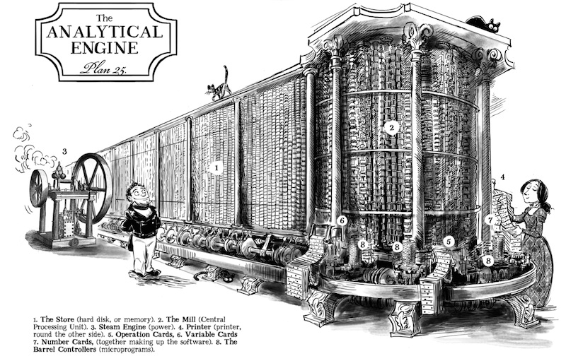
The colour one I leave to the Observer, but finally, FINALLY, I can share with you the the production of so many months of labour– my exhaustively (and boy do I mean that literally) researched visualisations of Babbage’s Analytical Engine. I’ve been vexed for years by the invariably vague descriptions of the Engine, even in quite detailed computer history books– frustrated by the brisk summary “it was a modern computer but cogs”. As a comics slinger graphic novelist all I wanted, and this seemed a modest ask, is an Official Drawing of a huge-ass computer made of cogs, so I could see what it looked like. Imagine my dismay when I found that (to the best of my knowledge) no such drawing existed! Not by Babbage, not by a scholar or an engineer or otherwise Official Person, nothing! There were a scattering of drawings of bits of the Engine; and lengthy examinations of the math and engineering of the Engine, but the whole thing? Nope. This is sort of understandable as Babbage left literally thousands of piecemeal drawings and kept changing the design, so doing a visualisation is actually really hard. And computer history books want to explain computing stuff and not provide me with eye-candy. BUT STILL.
So I had do my own, and it took ages and ages and hair-tearing over diagrams (elevations, Babbage! They are a Thing!), but I’m pretty proud of it, so here you go:
I think this merits a
TA-DA!
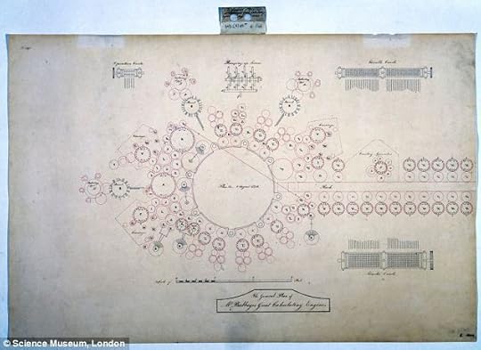
Over the next couple of weeks I’m doing a series of posts about the Engine, to show you how I got the above drawing from this:
and what this all means:

But today I want to talk about the really important matter of: what colour was it?
We rarely court controversy here at 2dGoggles Amalgamated Comics but I was a bit nervous in the colour scheme I used for the Observer colour version. For one thing, there’s a reason the comic is in black and white, and that is because its drawn by me, a person not very good at colour. More specifically though, in picturing the workings of the mysterious Engine you may have always pictured it in distinguished tones of steel grey and muted brass, as sported by its modern cousin the Difference Engine reconstruction:
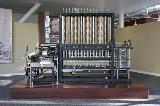
So Classy!!
I myself however have had a vision before my eyes of Great Building-Sized Mid-Victorian Engineering. That vision is loud garish glorious! It’s the culmination of the greatest of Victorian Engineering projects, Bazalgette’s Sewer (comic episode ideas: Great Stink, mephitic vapours, mutant eels, trained cormorants, mole people?). Ladies and Gentlemen, if for some reason you are in ignorance of the existence of the Cathedral of Sewage Pumps, I’m privileged to introduce you to the destination of all London effluvium, Crossness Pumping Station:
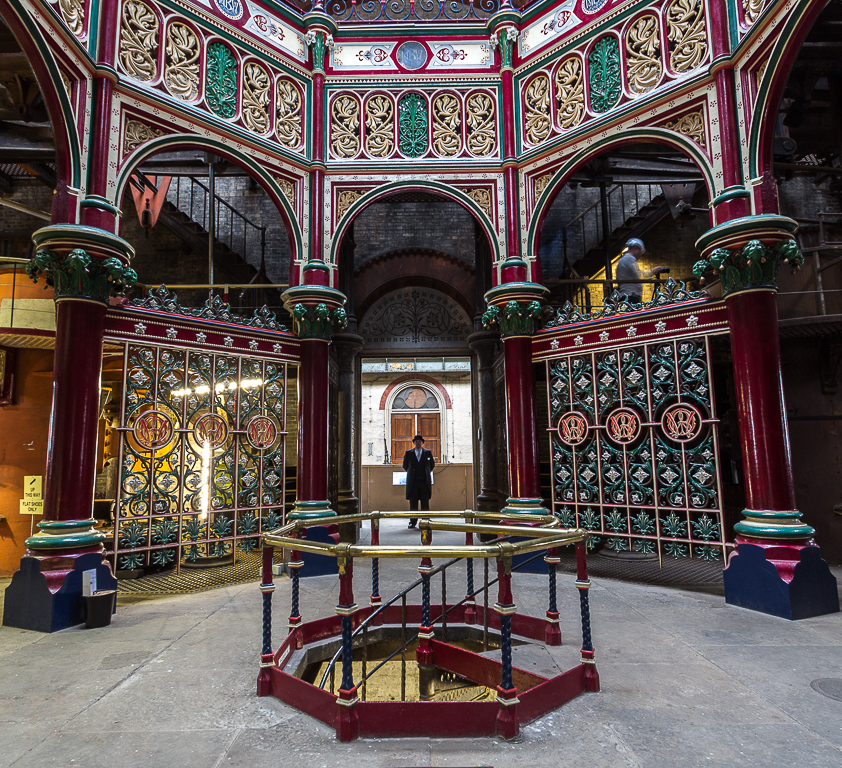
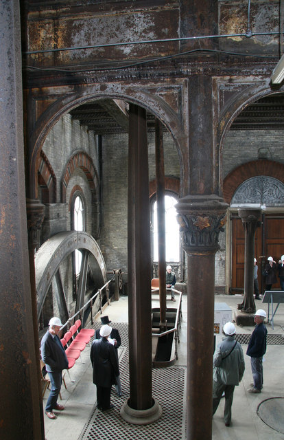
Crossness was finished in 1867– pretty close to what would have been a realistic completion date for the Analytical Engine if they’d started it in the mid-30s come to think of it! Like all Victorian stuff, it’s a bit Too Much, or Just Right if you are of that temper. In the ’50s and ’60s they loved their bright chemical colours and I’m pretty sure an actual Analytical Engine would not have been left with plain unpainted infrastructure. Especially if Charles Babbage had anything to say about it! Though it would probably have had to be repainted 37 different times so he could check what the best colour scheme was. He was after all the man who printed 21 volumes of test logarithm tables using every combination of 10 different coloured inks and 140 differently coloured papers to see which read best (page not open, unfortunately, to the black-ink-on-black-paper trial*):

Half of Crossness has been left in its found condition of romantic decay, which looks really wonderful in contrast. If you want a magical day out, take your significant other to a sewage pumping station to heck and gone in the marshes east of London- next Steaming Day April 19th!
Next : An overview of the Engine!
(by they way- in terms of realism, my big concern with the visualisation above is in retrospect I don’t think it could have been a free-standing structure. While gigantic it was a very delicate instrument and would grind to a halt if any one of its tens of thousands of parts was even a hair out of alignment; probably you would have to somehow suspend the whole thing is a substantial cage of heavy ironmongery to keep it from shifting. BUT if I drew all that in, you wouldn’t be able to see the Engine!
oh- additional aside– the punchcards (it took 3 sets to run a program) didn’t hang on brackets as I’ve drawn them [I took that from a Jacquard loom]; rather, they are clearly in a box marked BOX on the diagrams. But likewise then you wouldn’t be able to see them! So some concessions have been made to Art in that drawing. ).
Now that’s out of the way, stay tuned for a series on that most mysterious of Mechanisms, the Analytical Engine, which I hope to make a bit less mysterious!
*If you’re wondering which ink and paper combination proved most successful, the winner was…. black in on white paper.