
Should you judge a book by its cover?
By Maggie James
‘Don't judge a book by its cover’ is an oft-quoted maxim, meaning we shouldn't prejudge the value of something or someone by outward appearances. The fact is, when buying books, many of us do exactly that. And why not? Whilst it's not the only criterion on which to judge a book, I suspect most of us are drawn to a compelling cover. First appearances count.
Why? Because a good cover discloses what's inside. Check out these examples. I bet you’re able to discern the book's genre in every case. Every picture tells a story, as the saying goes! Wouldn’t you be disappointed, even angry, if you chose a book that appears to be a fantasy epic, and then discovered it's something different?


 Case study - Mark Tilbury's novel The Revelation Room
It's easy for self-published authors to get it wrong with their covers. The temptation is to save money by doing one's own, but it's often a false economy. Why? Because most writers don't have the graphic design skills required. To illustrate my point, I'll use author Mark Tilbury's psychological thriller, The Revelation Room (to be released on May 6, 2015).
First, some brief details about the book, the first in a series. The main character, Ben Whittle, works in his father’s private investigation business. After Ben’s father goes missing whilst trying to locate a girl who has joined a religious cult, it soon becomes apparent to Ben that he will have to infiltrate the cult to rescue his father. He's an extremely reluctant hero, however...
Exciting stuff! You can find out more via Mark My Words. Look out for my forthcoming interview with Mark.
Mark admits that, at first, he tried a DIY approach. In the end, he bit the bullet and hired a designer. Here are the 'before and after' results:
 Before - Mark's DIY attempt via Adobe Illustrator
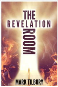 After - much more eye-catching! Less can be more for book covers...
Whilst the ‘before’ cover’s not great, it's better than anything I could knock up! I tried doing my own, but it soon became apparent I don't have what it takes. Nowadays, my graphic designer Donna Casey takes care of my book covers, and she's done a fantastic job. Check them out here.
I asked Donna what mistakes DIY-ers make. ‘Putting an illegible title on a busy background,’ she replied. ‘When the cover is shrunk down on Amazon, the design becomes a garbled mess. Also, many authors want lots of details from their book on the cover and it makes it too cluttered. When they cut stuff out, the cover takes on a more pleasing appearance.’
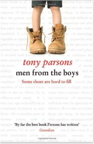
She’s right. Simple designs are more effective than overstuffed ones. Take these three examples from one of my favourite novelists, Tony Parsons. Aren't they perfect examples of ‘less is more’?

 What do you think?
What about you? Are you influenced by a book's cover when buying fiction? Would a poor design be a turn-off? Have you ever read a book and found the contents didn’t match up to the cover? Leave a comment and let me know!
Enjoyed this post? Please share via the buttons below!
Why not subscribe to my blog?
 If you've enjoyed this blog post, how about subscribing via RSS feed or email? Either click the links in my blog sidebar or sign up via Networked Blogs, also in the sidebar. It'll be great to have you on board!
Want early bird discounts on my future releases, as well as information about special promotions and giveaways? Simply enter your details in the formhere, or at the top of the sidebar. I respect your privacy and will never sell your details to any third parties.
‘Don't judge a book by its cover’ is an oft-quoted maxim, meaning we shouldn't prejudge the value of something or someone by outward appearances. The fact is, when buying books, many of us do exactly that. And why not? Whilst it's not the only criterion on which to judge a book, I suspect most of us are drawn to a compelling cover. First appearances count.
Why? Because a good cover discloses what's inside. Check out these examples. I bet you’re able to discern the book's genre in every case. Every picture tells a story, as the saying goes! Wouldn’t you be disappointed, even angry, if you chose a book that appears to be a fantasy epic, and then discovered it's something different?
Case study - Mark Tilbury's novel The Revelation RoomIt's easy for self-published authors to get it wrong with their covers. The temptation is to save money by doing one's own, but it's often a false economy. Why? Because most writers don't have the graphic design skills required. To illustrate my point, I'll use author Mark Tilbury's psychological thriller, The Revelation Room (to be released on May 6, 2015).
First, some brief details about the book, the first in a series. The main character, Ben Whittle, works in his father’s private investigation business. After Ben’s father goes missing whilst trying to locate a girl who has joined a religious cult, it soon becomes apparent to Ben that he will have to infiltrate the cult to rescue his father. He's an extremely reluctant hero, however...
Exciting stuff! You can find out more via Mark My Words. Look out for my forthcoming interview with Mark.
Mark admits that, at first, he tried a DIY approach. In the end, he bit the bullet and hired a designer. Here are the 'before and after' results:
Before - Mark's DIY attempt via Adobe Illustrator
After - much more eye-catching! Less can be more for book covers...Whilst the ‘before’ cover’s not great, it's better than anything I could knock up! I tried doing my own, but it soon became apparent I don't have what it takes. Nowadays, my graphic designer Donna Casey takes care of my book covers, and she's done a fantastic job. Check them out here.
I asked Donna what mistakes DIY-ers make. ‘Putting an illegible title on a busy background,’ she replied. ‘When the cover is shrunk down on Amazon, the design becomes a garbled mess. Also, many authors want lots of details from their book on the cover and it makes it too cluttered. When they cut stuff out, the cover takes on a more pleasing appearance.’
She’s right. Simple designs are more effective than overstuffed ones. Take these three examples from one of my favourite novelists, Tony Parsons. Aren't they perfect examples of ‘less is more’?
What do you think?What about you? Are you influenced by a book's cover when buying fiction? Would a poor design be a turn-off? Have you ever read a book and found the contents didn’t match up to the cover? Leave a comment and let me know!
Enjoyed this post? Please share via the buttons below!
Why not subscribe to my blog?
If you've enjoyed this blog post, how about subscribing via RSS feed or email? Either click the links in my blog sidebar or sign up via Networked Blogs, also in the sidebar. It'll be great to have you on board!Want early bird discounts on my future releases, as well as information about special promotions and giveaways? Simply enter your details in the formhere, or at the top of the sidebar. I respect your privacy and will never sell your details to any third parties.


No comments have been added yet.


