
As I work on my covers I can’t help noticing fonts, and my...

As I work on my covers I can’t help noticing fonts, and my friend K.F. Breene’s giving me huge font envy.
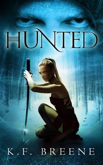
Look at the titles of the books! The font is so distinctive, but also simple. And also, look at the “S” in Chosen’s title. It’s not even complete, it got its tail nicked off by the valiant heroine, but it is still completely legible because of the way the eye reads left to right. (Fonts that do optical illusions like that—how cool!)
I think I’ve seen the font before—but the H … I’ve never seen that H with the three crossbars before. Look how it branded Hunter as part of the series? Is that a unique thing her designer did. K.F.? K.F.?


No comments have been added yet.


