
VOTE! Please help me pick my cover!
 #1
#1 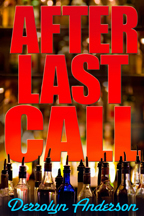 #2
#2 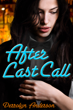 #3
#3 Hello everyone! I'm a few days away from publishing my latest book, "After Last Call", and I've made some covers for it.
Won't you please help me by choosing your favorite cover from the three I have posted here? I'll be obnoxiously requesting votes for a few days this week, and then I'll gather all the feedback I get from Booklikes & Goodreads in order to select the final-final.
The story is a romantic-suspense / murder-mystery set in the eighties.
Here are larger versions:


BLURB :
"Lola is ready for a change. She’s blown the first half of the eighties drifting aimlessly through Miami’s cocaine-fueled nightclub scene, so when a sweet-talking stranger comes to town she allows him to sweep her off her feet and clear across the country.
Predictably, things in California don’t go according to plan, and Lola finds herself on her own for the first time in her life. A new job offers her a second chance at a fresh start, but just as things begin to fall into place a reckless workplace affair leads to a friend’s disappearance, exposing two dead girls with one man in common.
Ensnared in a web of deceit and danger, Lola must decide whether to run from her troubles once again or take a stand and fight for her new life—only this time, she’s threatened with more than just the loss of her newfound independence."
Thumbnail versions again:
#1 #2 #3I would be eternally grateful if you would leave your choice in the comments. Thank you!


date newest »


 #2 overall.
I'm in love with the neon font too. I think I like the lighter blue shade used on #3 than the darker shade on #2.
 Thank you all so much for taking the time to vote! You guys are great :)
@Ashley : Yeah- I can definitely change the font colors.
So far, although it's dead last on Booklikes & Goodreads, ALL the votes on Instagram are for #3, because the color really pops on the dark background when the image is teeny tiny.
 I'm really excited about your book coming out--luv the 80s--but I'm terrible at judging this kind of stuff!
Still, I'll saaaaaay.........
.............................
#2 !
(Though maybe make the title font a tiny bit smaller?)
:)
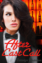
 Can I be controversial and say #1? I like the whole tux thing, plus she looks like she could be looking for something. Her facial expression seems to fit the genre. The second one, to me looks dated although maybe with a brighter red it could work?
 Go with the middle one, I believe that's #2..."cheesecake" covers (covers featuring pretty people looking sexy) are way too common.
Amelia wrote: "Can I be controversial and say #1? I like the whole tux thing, plus she looks like she could be looking for something. Her facial expression seems to fit the genre. The second one, to me looks date..."
Go with the middle one, I believe that's #2..."cheesecake" covers (covers featuring pretty people looking sexy) are way too common.
Amelia wrote: "Can I be controversial and say #1? I like the whole tux thing, plus she looks like she could be looking for something. Her facial expression seems to fit the genre. The second one, to me looks date..."I like it too, and it's neck and neck with #2 on Booklikes. I'm thinking more about the character (hence all of my other covers!), but I have a hard time imagining what might appeal to most readers going in cold. :P
@Miss M : I think you're right about the font being too big :)
 Eric wrote: "Go with the middle one, I believe that's #2..."cheesecake" covers (covers featuring pretty people looking sexy) are way too common."
Now that another author said that I'll be ballsy enough to second it. I am a reader who rarely reads reviews or a synopsis before starting a book. I am shaaaaaaaaaallow and bypass A LOT of titles because I just don't like pictures of people on the cover.
 Eric wrote: "Go with the middle one, I believe that's #2..."cheesecake" covers (covers featuring pretty people looking sexy) are way too common."
I can totally see this. Plus,a pretty face it makes it look a little YA. I'm still not sure... Like most of my writing the actual story veers to the romancey side of romantic suspense.
@Kelly - There's nothing worse than bad Photoshop, and my skills are rudimentary. Here's the original stock photo, LOL:

 @Derrolyn: I'd still go with #2. If you need another reason, it is the one that looks like it could have come out of a professional publishing house. The other two look like indie covers to me - good ones to be sure, but they "feel" indie for some reason.
M. Lauryl wrote: "#2 with a slightly smaller title font :)"
@Derrolyn: I'd still go with #2. If you need another reason, it is the one that looks like it could have come out of a professional publishing house. The other two look like indie covers to me - good ones to be sure, but they "feel" indie for some reason.
M. Lauryl wrote: "#2 with a slightly smaller title font :)"Ooops! I Accidentally deleted your last comment instead of hitting reply... I have flu-brain today :(
I was going to say, you should hear me screaming for my 16 y/o daughter every time I get stuck. She's more of a cartoon-manga type artist or I'd have her do it!
And again, a great big huge THANK YOU to everyone who has commented *MUAH*
Eric wrote: "@Derrolyn: I'd still go with #2. If you need another reason, it is the one that looks like it could have come out of a professional publishing house. The other two look like indie covers to me - g..."I know! I've been trying to crack that code, LOL.
I think it's my clumsy type & layout. I also notice that an extra line or two of small print type makes it look more professional - even if it's as lame as :"A Novel"
There's always:
"From the author of..."
"Book one of blah blah blah series"
(That makes sense but this one's a stand-alone BTW.)
 I will give my honest opinion. I like #2, but the color and font for your name ruin the affect of the cover. It doesn't mesh well. It's clashing with the other colors.
Brigid (is a massive coffee addict) wrote: "I will give my honest opinion. I like #2, but the color and font for your name ruin the affect of the cover. It doesn't mesh well. It's clashing with the other colors."
I will give my honest opinion. I like #2, but the color and font for your name ruin the affect of the cover. It doesn't mesh well. It's clashing with the other colors.
Brigid (is a massive coffee addict) wrote: "I will give my honest opinion. I like #2, but the color and font for your name ruin the affect of the cover. It doesn't mesh well. It's clashing with the other colors."Honesty appreciated!
Brigid's got a point...maybe try making the "after last call" a bar-neon red, to go with the bar-neon blue of your name's font. The neon might make it feel more 80s, too. Maybe worth a shot.


 I actually don't mind #1, but I think #2 is a little better over all.
 #2
#2#1
#3
In that order. :) #1 really "pops"!


 ^^^ Thank you everybody!^^^
I think I have an obvious winner.
Derrolyn wrote: "^^^ Thank you everybody!^^^I think I have an obvious winner."
Yeah, I think you do. Is the book done? I have it on my "to-read" list already and have been looking forward to it.
Eric wrote: "I have it on my "to-read" list already and have been looking forward to it."Me too : )
Thanks guys! I'm just about to upload it now! I'll be in touch :)


 ^^^Again, I can't thank you all enough for taking the time to vote! Goodreaders are the absolute best XD^^^
 #2 is my favorite
Thanks so much to everyone for your valuable input! I've gone ahead and uploaded #2, and now I only need to figure out why it distorts when the image is reduced (vs. enlarged like you would expect!). Off to hunt down some Photoshop tutes...
#2 is my favorite
Thanks so much to everyone for your valuable input! I've gone ahead and uploaded #2, and now I only need to figure out why it distorts when the image is reduced (vs. enlarged like you would expect!). Off to hunt down some Photoshop tutes...If anyone would like a free review copy, please PM me for a Smashwords code :)


EDIT: Looooove that neon font. Totally "Cocktail" ; )