
Photo-Development Challenge Results #1: Hillside Temple Buildings
Today I'm sharing the first results from “Photo-Development Challenge:
Inspire Me and Others With Your Artistic Interpretation”. Today's photo
is one of some minor outlying buildings at the Yoshiminedera Temple (善峯寺)
in Kyoto, Japan.
First, let's look at the uninspiring original:
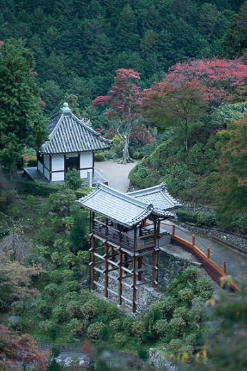
Nikon D700 + Voigtländer 125mm f/2.5 — 1/640 sec, f/2.5, ISO 200 —
map & image data — nearby photos
The Unprocessed Original
This was from a productive outing four years ago that produced
“Temple Hopping in the Mountains of South-Western Kyoto”,
two examples for
“Heading Out To Photograph The Fall Foliage? Don’t Forget The Polarizer Filter”, and an item on
“Visiting My Photo Archives: Random Pretty Shots #1”.
For lack of a better idea, I'll present the various results in the order
I received them, starting with my own interpretation that I apparently did
when I was considering to post it four years ago:
The only change is the white-balance setting, though the impact is
substantial. When writing a blog post about some place I've visited, I usually think of photos in terms of documenting the experience, and so I
guess I didn't do much. (Often I'll do a lot to a photo, but perhaps
because I ended up not including this one in a blog post, I didn't give it
much critical thought.)
processing by
Werner Gansz
div.c2534 { padding-left:1em; border-left: 5px solid #555; margin-right:3em; margin-bottom:30px }
p.p2534 { margin-top:0}
div.d2534 { margin-bottom:0}
Werner comments:
The composition of the meander from the two structures and red foliage
was lovely so I sampled the gray tile for color temperature, then enhanced
contrast.
I used radials to brighten the red tree and darken slightly the
second building, intending for the viewer to start on the first structure
and follow the meander to the foliage.
Also I am not a fan of tall thin verticals that modern cameras shoot so
I cropped all verticals to 10x8. Happliy you framed extra on top and bottom
(to may taste anyway)
My Reaction: This feels more pleasing than mine, with a white balance that feels more
realistic. (The white balance from mine was set via a color-checker sample,
which makes it perhaps “correct” but not necessarily pleasing.)
Nikon D700 + Voigtländer 125mm f/2.5 — 1/640 sec, f/2.5, ISO 200 —
map & image data — nearby photos
processing by
Ben Willmore
Ben comments:
1) Crop to not allow the eye to wonder much and to clean up edges and define composition more.
2) bright highlights down to better see detail in rooftops.
3) Tweak color to make red/orange help define the image better.
4) darken where there is less interesting stuff,
5) brighten where there is more interesting stuf and try not to allow vignetting to over-darken path on right.
My Reaction:
Love the whys and the whats, and the result is impactful. The lower of the two buildings feels like it's popping
out of the screen.
I like it a lot.
Nikon D700 + Voigtländer 125mm f/2.5 — 1/640 sec, f/2.5, ISO 200 —
map & image data — nearby photos
processing by
Daniel Cutter
Daniel comments:
This shot is mostly green, so I turned straight to b/w. I tried to pull
the focus towards the buildings: I used the correction brush to add clarity
to the buildings while removing it elsewhere.
I added vignette and a grad
filter to the top to add an horizon.
Yes, I'm still on Facebook: here
My Reaction: This is almost haunting, and the B&W treatment gives it an “old” look.
The artificial-horizon idea is neat, though perhaps a bit too strong for my tastes, but it's hard
to judge on its own merits because our view is tainted by having seen other versions.
Nikon D700 + Voigtländer 125mm f/2.5 — 1/640 sec, f/2.5, ISO 200 —
map & image data — nearby photos
processing by
Austen
Austen didn't provide a comment, but I can see in Lightroom that he cropped it a bit,
and painted in some very subtle darker exposure here and there. He did a lot with the tone curve
(adjusting how dark darks are, how middle middles are, etc.) and reduced saturation. He even added a bit of grain.
The result is a kind of “old” like the B&W one above, yet a completely different kind of old. It's almost like a “colorized” B&W shot. It feels much more calm and peaceful than “impactful”.
I didn't get as many submissions for this photo as some of the others,
but I picked this one to start because the various versions are so very
different — each person went for a completely different vibe —
so it really makes me appreciate the exercise.
My thoughts on the artificial horizon highlight something
important, though difficult, to keep in mind: comparing and contrasting
different versions is explicitly not what we do with most photos...
as consumers of others' imagery, we generally only see the final product
with eyes untainted by other versions or possibilities.
Had Daniel's version with the dark horizon been the only view I had of
this photo, I perhaps wouldn't have even noticed the artificial horizon,
much less thought it was a bit too dark. It's impossible to know.
I gave some thought to having the images presented randomly for each
viewer, so that not everyone's view is modified in the same way. Had I done
this, folks who happened to see the dark-horizon version first may well
have thought the next one they saw too garish, like drinking orange juice
after brushing your teeth. The order things are presented in can really
matter.
In any case, I really appreciate the four submissions, both individually
and as a group. I hope we'll see similar quality for the other photos in the challenge!
I'm going to be traveling for the rest of the month, so it'll
likely be a while before I get to the next photo, so if
you're considering to participate, you've still time.


Jeffrey E.F. Friedl's Blog

- Jeffrey E.F. Friedl's profile
- 13 followers

