Blog Redesign
I just tweaked the design a few days ago, but I had some ideas while on the treadmill. Remember, I’m not a designer and I want to invest most of my time on writing.
I added a touch of color. Picking colors is very difficult. Basically, I found a color I liked then slid the hue around to find a primary and secondary color. The primary color was hard to read on regular sized links, so I had to choose a darker secondary color.
I also moved the title, Bitlather Chronicles, to the navigation bar. This saved some vertical space and looks less empty when viewed on a cell phone.
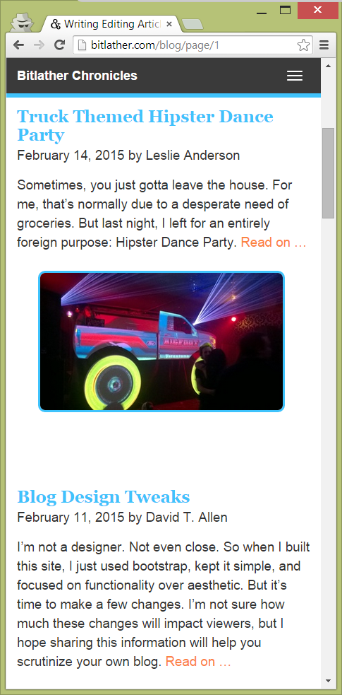
Also notice I inverted serifs. Header tags now use serifs, and just about everything else uses sans-serif. I like keeping both because it helps headers stand out.
I changed the styling on tags at the bottom of the article.
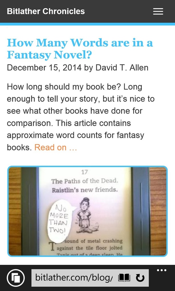
While falling asleep one night, I realized we could show pictures from the articles in list of blog articles. I thought this would make articles more appealing, and it was the major reason I updated the design again in such a short time.
I also like having an article summary with the blog title, so I updated related articles and random articles.
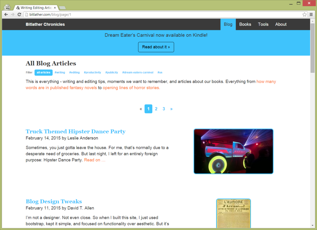


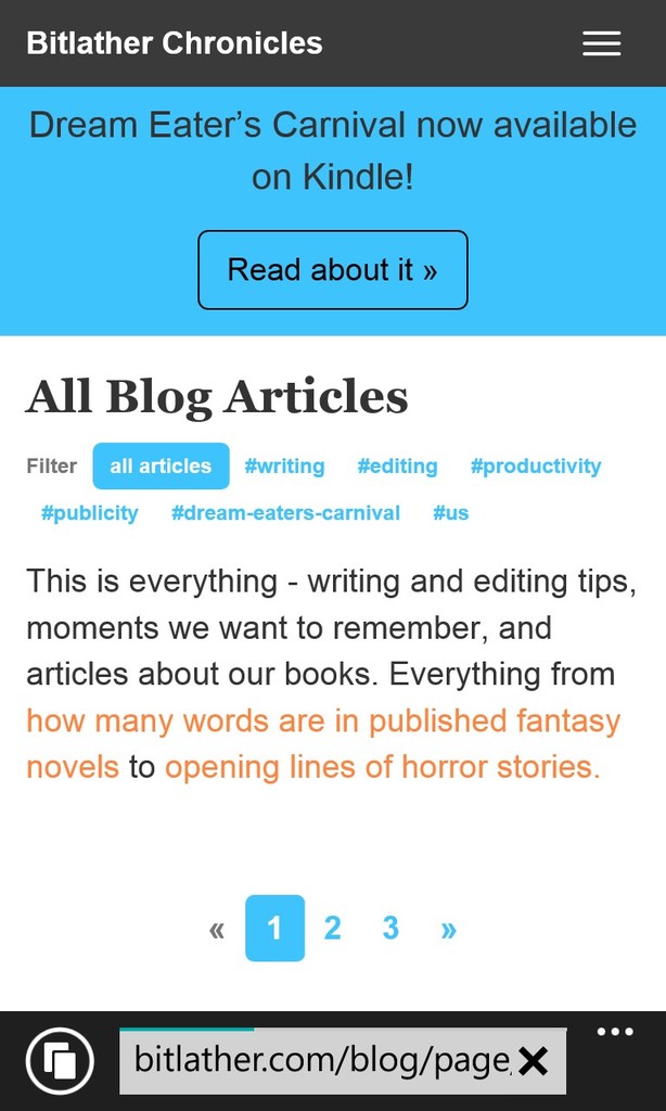
I made blog filters stand out more. I also cleaned up the paginator.
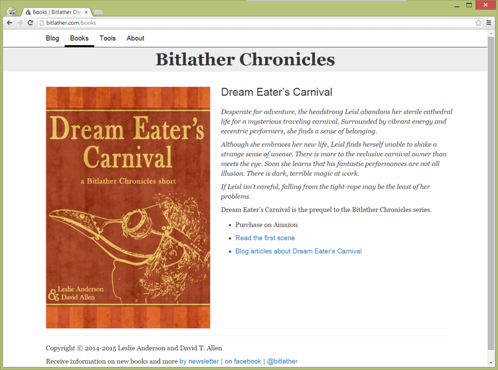
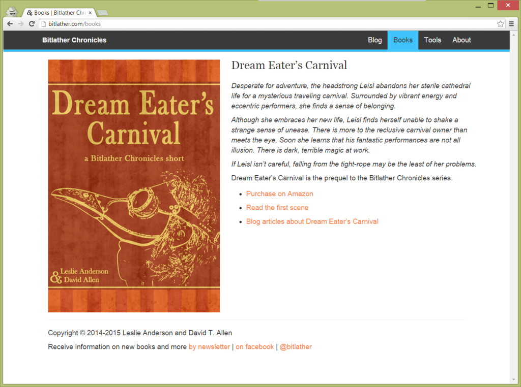
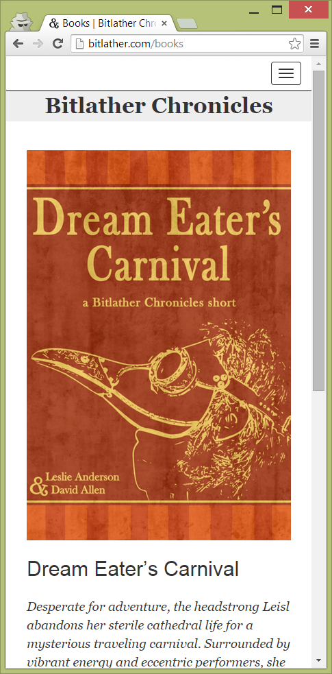

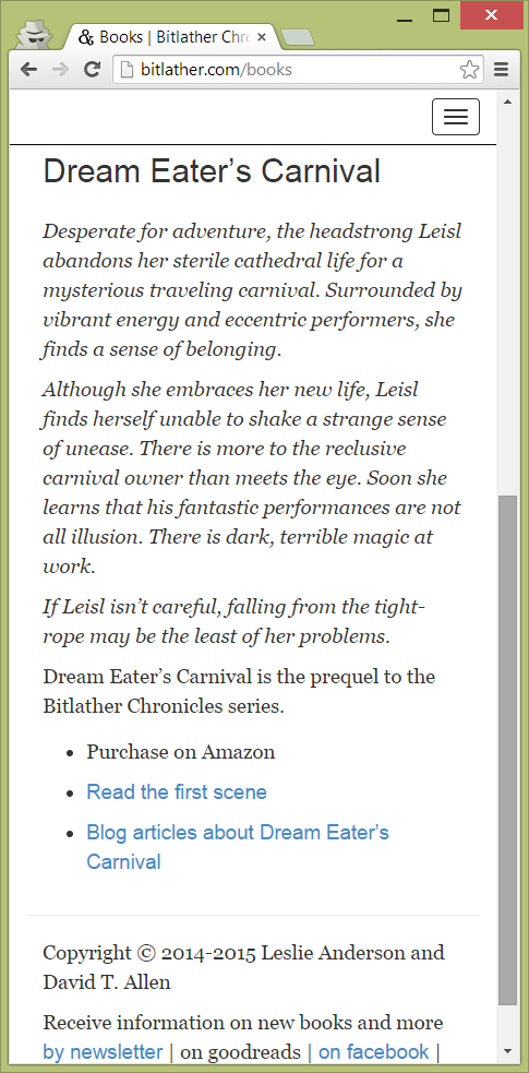
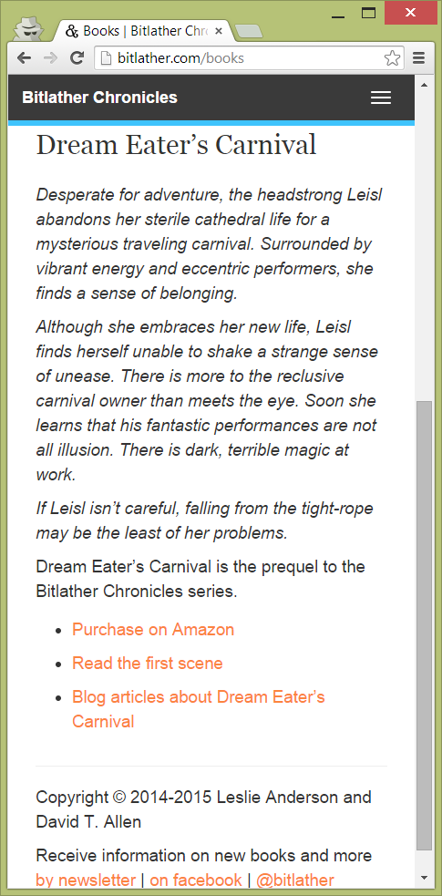
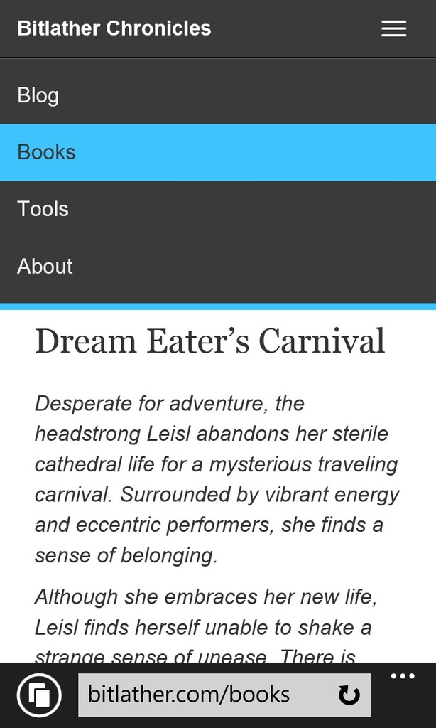
Not much has changed on the books page that I haven’t already discussed.

Reskinning the site was easy because I originally built it with a focus on functionality and content.
I’d like the design to fit the steampunk aesthetic better some day, but that’s beyond my skill level right now.