It's the Little Things…
I recently wowed you with DIE FOR ME's fabulous cover. But about a month ago I was raving on Facebook about the amazing typography in my galley pass. As I mentioned, I have a huge crush on my book's capitol "Q"s, as seen here in all of its elegant, stretchy glory.
But I didn't give you an example of the awesome text created specifically for DIE FOR ME's cover, title page, and all of the chapter headings. Ray Shappell created each letter individually to fit in with the spooky-looking "water" theme that HC has planned to tie together my books' covers.
Example 1: check out the title page (and take a look at the two "E"s with different reflections):
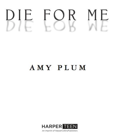
Excuse me for a moment while I GEEK OUT!!! I know…they're just letters. But some really talented typographer spent hours creating them. May I give you another example to further prove my supreme geekness?
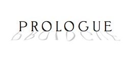
Two individually crafted "O"s. And not a one of the letters the same as in the title. I've never met Ray Shappell, but if I did I think I might just lunge in for a kiss. Because however psychotic this whole typography rant might sound to you, there is a reason for my enthusiasm.
I spent years selling paintings. And often, I would buy a beautiful hundred-plus-year-old painting that had been fitted with a nasty frame by the previous owner who wanted the painting to match their, say, 1970s living-room furniture—paying no regard to the composition itself.
I would pry the frame off, pay a visit to an antique frame dealer I knew in Brooklyn, and choose something that complimented the period and style of the piece. Something that wouldn't out-glam the painting itself, of course, but that would provide a type of back-light for the composition's concept and display the innate beauty of the work.
And that is why, when I see the care and creativity that HarperCollins (and the oh-so-kissable Ray Shappell) have put into framing my book—in a way that is not only sensitive to its content but formulated to literally spell out my story in the most flattering way possible—I get all hyper and teary and proud of this incredible team effort to bring you something beautiful.
Here's to geeking out over letters—and to all of the little things in life that sometimes add up to knock you off your feet.


 Your enthusiasm is so cute, Amy. And I still have to say I liked the first typo better. Although this one maybe sets your book better off against other recent paranormal romance covers with girl in evening dresses. The aussie cover of Uneathly (one of my GR friends posted this link just today) uses straight letters, too, b.t.w.: http://4.bp.blogspot.com/_VTdmJsQWgC8...