Website Design Tips from Connie Lee Marie!

Welcome Connie Lee Marie, graphic designer, musician, and Website Goddess!
Amber: Can you share some tips with authors struggling to make their own websites?Connie: Design your site to be as intuitive and easy to use as possible and your visitor's experience will be smooth and pleasant. Save photos and graphics for the web at the smallest file size possible (looking good with details) for fast loading, using Photoshop or Photoshop Elements, etc. with the "Optimize for the Web" option.
Amber: You made a great banner for my website. Once I had the banner I used the color and feel to redo the entire site. How important is the header for a site?Connie: The header is the most important element of website design. It tells the visitor who you are and what the site is about. It's your first chance to make a good impression.

Amber: What about type size and fonts?Connie: Here are a few things to remember -
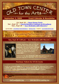
Never make your type too wide across the page. Wide columns are hard to read and look unattractive. I like a maximum width of approximately 600 pixels (6 inches) for an easy-to-read column and of course, smaller columns of approx. 250+ pixels are great for ease of reading. Newspapers traditionally used skinny columns for a reason!Use short paragraphs; line breaks help readability. Very long pages (with lots of photos) may take a long time to load and readers will have to do a lot of waiting and scrolling, or worse yet, leave before the page finishes loading!Remember to set your links to "Open in new window" (in Dreamweaver set the target to _blank) to encourage visitors to return to your website after they're done looking at an off-site linked page. Your site will be waiting for them after they close the linked page.Typefaces - Very small type is hard to read, especially serif styles. Too large type is also annoying to the eye. Experiment with Verdana or Ariel. I like to keep everything readable. I tend to lean towards san-serif for the web and serif for print. Maybe I'll change my mind on that someday! Also think about how readable the color of the text is on your background color. Think: Contrast.LINES OF ALL CAPS SCREAM AT YOUR VISITOR! REMEMBER NIGERIAN SCAM EMAILS WRITTEN COMPLETELY IN ALL CAPS? - HARD to read and always a NO-NO. Use sparingly.Underlining. Also use sparingly.Use only a few words in special situations. Make words Bold if you want them to stand out. Too much underlining can make the type hard to read and also can be confused with links.Add italics, bold, underling or ALL CAPS like spice to a dish, to taste. Never use too much!I feel the same way about animated gifs or flash. Too much movement becomes tedious and distracting. A little here or there is good; too much can be annoying. (Do I really want to wait to watch some type or graphic dance around on my screen? Most likely I'm out of there before it loads.)Amber: Can you share some websites you designed and tell us what you especially like about them?Connie: Here's my latest website incarnation I like the Old Town Center site because it matches the style of the building perfectly! I also created an email blast template that matches their site for email marketing with Constant Contact.
 I don't usually like dark backgrounds on websites because the type is hard to read, but I do like this one. I also made a matching email blast template for this site.
 Connie Lee Marie is an artist, graphic designer, illustrator, singer/songwriter, musician, dancer and enjoys a little plumbing and home repair once in a awhile, but not too often.
Amber: Connie, please can you give us just one more tip?
Connie: "Shuffle the Chi!" Translation: Make your website interesting!
Learn more about Connie Lee Marie's designsat her website!
Published on November 14, 2010 12:00
No comments have been added yet.


