
How to illustrate a story
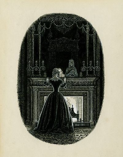
 Charles Stewart's frontispiece, 1947, of Uncle Silas. Pen and ink. Courtesy of Royal Academy of Arts, copyright estate of the artist.
By MIKA ROSS-SOUTHALL
Editors be warned: there are fastidious rules when it comes to republishing the work of Mervyn Peake. Speaking at the Royal Academy of Arts yesterday on how artists illustrate stories, Sue Bradbury (the former editorial director of the Folio Society), told us that when it came to reissuing his books in 1999, Peake's estate wouldn't allow illustrations of figures. Halls, buildings and landscapes were acceptable, but no “characters”. In the words of the Folio Society's founder, Charles Ede, the relationship between the author, illustrator and publisher is like “a ménage à trois conducted on tight-ropes”.
Should artists choose which parts of a text they want to illustrate, or should the author (even if dead) direct them? And how much control do the publishers have?
A new one-room exhibition at the RA showcases the intimate, creative processes and working methods of a commercial twentieth-century book illustrator, Charles Stewart (1915–2001). He was fascinated by Joseph Sheridan Le Fanu’s gothic novel Uncle Silas (1864) and created his own visual world for the book in the late 1940s. It was well received by the Bodley Head, but Stewart’s intricate pen and ink drawings – a pastiche of the steel etchings and wood engravings by Victorian illustrators such as Phiz (Hablot Knight Browne) and George Cruikshank – were his own downfall. In an article, Stewart said:
“My aim was to try to convey the feeling of the [book’s] period by studying the style and conventions of the illustrators of that time . . . . Unfortunately, my pen work, known to my friends as my knitting, was so close in texture that it proved impossible to reproduce satisfactorily by the usual line block process”.
 Charles Stewart, "The figure of Uncle Silas rose up, with a death like scowl", undated. Pen and ink. Courtesy of Royal Academy of Arts, copyright estate of the artist
The publishers couldn’t afford the expense after the Second World War and abandoned the project. Almost forty years later, however, Stewart showed his illustrations to Bradbury, who immediately commissioned a further twenty-six decorations and tail-pieces, as well as a design for the binding, to accompany his thirty original illustrations. The Folio Society finally published Uncle Silas in 1988 (and they’ll be re-printing the same edition this summer).
A selection of strange objects – discovered in the artist’s studio by the curator Amanda Doran – are arranged in one of the exhibition’s display cabinets. Included are a pair of black ballet shoes bought at “Charing Cross Road, London, c.1960”; a wooden box of glass eyes (three blue, one brown) bought on “Portobello Road, c.1956”; and a Penguin Classics edition of Uncle Silas with Stewart’s annotations on the dust jacket. Under Le Fanu’s name, the cover should read: “Specially edited by Christine Longford”; Stewart’s version reads: “Specially edited, abridged & practically rewritten by Christine Longford (may the Devil turn her black)”. An array of bird and human skulls, quirky puppets and a huge collection of historic costumes and mannequins, on which to display the clothes, were also found by Doran, though they’re not on show here. Instead we see Stewart’s extensive preparatory sketches – often made from these items – alongside their realizations in print. “Usually more is less”, Bradbury said, “but in Stewart’s case, his amount of detail and accuracy manage to be haunting.”
His illustrations communicate an atmosphere or psychological state, often the result of meticulous research, but also informed by a dalliance in professional ballet dancing. While training to be a draughtsman at the Byam Shaw School of Drawing and Painting, Stewart performed at Glyndebourne in 1936 in Mozart’s The Marriage of Figaro, and then joined the corps de ballet at Covent Garden in 1936–7 for Offenbach’s The Tales of Hoffman and Verdi’s Aida. It gave him a valuable understanding of staging and set-design.
Interiors and architecture are pivotal to the novel. The narrator, Maud Ruthyn, is locked away from society in ancient mansions, first by her father, and then, after his death, by her Uncle Silas, who is shrouded in rumours of immorality, murder and drug addiction. Stewart sketched country estates and used old copies of Country Life for details of staircases, chimney pieces, furniture and furnishings: “Knowl and Batram-Haugh, the two great houses in which the story takes place, became so real to me that I drew plans of the principal rooms, choosing and placing the furniture so that in imagination I could move about them freely”.
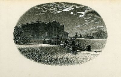 Charles Stewart, "Meanwhile, the winter deepened", 1947. Pen and ink. Courtesy of Royal Academy of Arts, copyright estate of the artist
A simple line from the text, “Meanwhile, the winter deepened", was transformed into an illustration (above) of an imposing house in the moonlight, with an ominous, leafless tree fallen in the foreground. Another of my favourites – “She stood scowling into the room with a searching and pallid scrutiny” – depicts Madame de la Rougierre, the nasty French governess, with a skeletal face, brandishing a candle towards us in a doorway. The chiaroscuro is striking. Similar to that of the film adaptation of the novel, already underway while Stewart was making his illustrations. He visited the set at least ten times in 1946 to sketch portraits of the actors. He collected many of the film stills – some of which are in the RA's exhibition. It’s difficult to gauge how much Robert Krasker’s bold cinematography (also seen in The Third Man and Brief Encounter) influenced Stewart’s final work, and vice versa.
Having dabbled in illustration myself, I’d hazard to say that any book can be illustrated – on film, paper or otherwise – even the less obvious ones, such as Finnegans Wake. (Indeed, the Folio Society recently published an edition.) Maybe Joyce left behind a few guidelines . . . .


Peter Stothard's Blog

- Peter Stothard's profile
- 30 followers

