Monthly update - August
/**/ body,#bodyTable,#bodyCell{ height:100% !important; margin:0; padding:0; width:100% !important; } table{ border-collapse:collapse; } img,a img{ border:0; outline:none; text-decoration:none; } h1,h2,h3,h4,h5,h6{ margin:0; padding:0; } p{ margin:1em 0; padding:0; } a{ word-wrap:break-word; } .ReadMsgBody{ width:100%; } .ExternalClass{ width:100%; } .ExternalClass,.ExternalClass p,.ExternalClass span,.ExternalClass font,.ExternalClass td,.ExternalClass div{ line-height:100%; } table,td{ mso-table-lspace:0pt; mso-table-rspace:0pt; } #outlook a{ padding:0; } img{ -ms-interpolation-mode:bicubic; } body,table,td,p,a,li,blockquote{ -ms-text-size-adjust:100%; -webkit-text-size-adjust:100%; } #bodyCell{ padding:20px; } .mcnImage{ vertical-align:bottom; } .mcnTextContent img{ height:auto !important; } body,#bodyTable{ background-color:#F2F2F2; } #bodyCell{ border-top:0; } #templateContainer{ border:0; } h1{ color:#606060 !important; display:block; font-family:Helvetica; font-size:40px; font-style:normal; font-weight:bold; line-height:125%; letter-spacing:-1px; margin:0; text-align:left; } h2{ color:#404040 !important; display:block; font-family:Helvetica; font-size:26px; font-style:normal; font-weight:bold; line-height:125%; letter-spacing:-.75px; margin:0; text-align:left; } h3{ color:#606060 !important; display:block; font-family:Helvetica; font-size:18px; font-style:normal; font-weight:bold; line-height:125%; letter-spacing:-.5px; margin:0; text-align:left; } h4{ color:#808080 !important; display:block; font-family:Helvetica; font-size:16px; font-style:normal; font-weight:bold; line-height:125%; letter-spacing:normal; margin:0; text-align:left; } #templatePreheader{ background-color:#FFFFFF; border-top:0; border-bottom:0; } .preheaderContainer .mcnTextContent,.preheaderContainer .mcnTextContent p{ color:#606060; font-family:Helvetica; font-size:11px; line-height:125%; text-align:left; } .preheaderContainer .mcnTextContent a{ color:#606060; font-weight:normal; text-decoration:underline; } #templateHeader{ background-color:#FFFFFF; border-top:0; border-bottom:0; } .headerContainer .mcnTextContent,.headerContainer .mcnTextContent p{ color:#606060; font-family:Helvetica; font-size:15px; line-height:150%; text-align:left; } .headerContainer .mcnTextContent a{ color:#6DC6DD; font-weight:normal; text-decoration:underline; } #templateBody{ background-color:#FFFFFF; border-top:0; border-bottom:0; } .bodyContainer .mcnTextContent,.bodyContainer .mcnTextContent p{ color:#606060; font-family:Helvetica; font-size:15px; line-height:150%; text-align:left; } .bodyContainer .mcnTextContent a{ color:#6DC6DD; font-weight:normal; text-decoration:underline; } #templateColumns{ background-color:#FFFFFF; border-top:0; border-bottom:0; } .leftColumnContainer .mcnTextContent,.leftColumnContainer .mcnTextContent p{ color:#606060; font-family:Helvetica; font-size:15px; line-height:150%; text-align:left; } .leftColumnContainer .mcnTextContent a{ color:#6DC6DD; font-weight:normal; text-decoration:underline; } .rightColumnContainer .mcnTextContent,.rightColumnContainer .mcnTextContent p{ color:#606060; font-family:Helvetica; font-size:15px; line-height:150%; text-align:left; } .rightColumnContainer .mcnTextContent a{ color:#6DC6DD; font-weight:normal; text-decoration:underline; } #templateFooter{ background-color:#FFFFFF; border-top:0; border-bottom:0; } .footerContainer .mcnTextContent,.footerContainer .mcnTextContent p{ color:#606060; font-family:Helvetica; font-size:11px; line-height:125%; text-align:left; } .footerContainer .mcnTextContent a{ color:#606060; font-weight:normal; text-decoration:underline; } @media only screen and (max-width: 480px){ body,table,td,p,a,li,blockquote{ -webkit-text-size-adjust:none !important; } } @media only screen and (max-width: 480px){ body{ width:100% !important; min-width:100% !important; } } @media only screen and (max-width: 480px){ td[id=bodyCell]{ padding:10px !important; } } @media only screen and (max-width: 480px){ table[class=mcnTextContentContainer]{ width:100% !important; } } @media only screen and (max-width: 480px){ table[class=mcnBoxedTextContentContainer]{ width:100% !important; } } @media only screen and (max-width: 480px){ table[class=mcpreview-image-uploader]{ width:100% !important; display:none !important; } } @media only screen and (max-width: 480px){ img[class=mcnImage]{ width:100% !important; } } @media only screen and (max-width: 480px){ table[class=mcnImageGroupContentContainer]{ width:100% !important; } } @media only screen and (max-width: 480px){ td[class=mcnImageGroupContent]{ padding:9px !important; } } @media only screen and (max-width: 480px){ td[class=mcnImageGroupBlockInner]{ padding-bottom:0 !important; padding-top:0 !important; } } @media only screen and (max-width: 480px){ tbody[class=mcnImageGroupBlockOuter]{ padding-bottom:9px !important; padding-top:9px !important; } } @media only screen and (max-width: 480px){ table[class=mcnCaptionTopContent],table[class=mcnCaptionBottomContent]{ width:100% !important; } } @media only screen and (max-width: 480px){ table[class=mcnCaptionLeftTextContentContainer],table[class=mcnCaptionRightTextContentContainer],table[class=mcnCaptionLeftImageContentContainer],table[class=mcnCaptionRightImageContentContainer],table[class=mcnImageCardLeftTextContentContainer],table[class=mcnImageCardRightTextContentContainer]{ width:100% !important; } } @media only screen and (max-width: 480px){ td[class=mcnImageCardLeftImageContent],td[class=mcnImageCardRightImageContent]{ padding-right:18px !important; padding-left:18px !important; padding-bottom:0 !important; } } @media only screen and (max-width: 480px){ td[class=mcnImageCardBottomImageContent]{ padding-bottom:9px !important; } } @media only screen and (max-width: 480px){ td[class=mcnImageCardTopImageContent]{ padding-top:18px !important; } } @media only screen and (max-width: 480px){ table[class=mcnCaptionLeftContentOuter] td[class=mcnTextContent],table[class=mcnCaptionRightContentOuter] td[class=mcnTextContent]{ padding-top:9px !important; } } @media only screen and (max-width: 480px){ td[class=mcnCaptionBlockInner] table[class=mcnCaptionTopContent]:last-child td[class=mcnTextContent]{ padding-top:18px !important; } } @media only screen and (max-width: 480px){ td[class=mcnBoxedTextContentColumn]{ padding-left:18px !important; padding-right:18px !important; } } @media only screen and (max-width: 480px){ td[class=columnsContainer]{ display:block !important; max-width:600px !important; width:100% !important; } } @media only screen and (max-width: 480px){ td[class=mcnTextContent]{ padding-right:18px !important; padding-left:18px !important; } } @media only screen and (max-width: 480px){ table[id=templateContainer],table[id=templatePreheader],table[id=templateHeader],table[id=templateColumns],table[class=templateColumn],table[id=templateBody],table[id=templateFooter]{ max-width:600px !important; width:100% !important; } } @media only screen and (max-width: 480px){ h1{ font-size:24px !important; line-height:125% !important; } } @media only screen and (max-width: 480px){ h2{ font-size:20px !important; line-height:125% !important; } } @media only screen and (max-width: 480px){ h3{ font-size:18px !important; line-height:125% !important; } } @media only screen and (max-width: 480px){ h4{ font-size:16px !important; line-height:125% !important; } } @media only screen and (max-width: 480px){ table[class=mcnBoxedTextContentContainer] td[class=mcnTextContent],td[class=mcnBoxedTextContentContainer] td[class=mcnTextContent] p{ font-size:18px !important; line-height:125% !important; } } @media only screen and (max-width: 480px){ table[id=templatePreheader]{ display:block !important; } } @media only screen and (max-width: 480px){ td[class=preheaderContainer] td[class=mcnTextContent],td[class=preheaderContainer] td[class=mcnTextContent] p{ font-size:14px !important; line-height:115% !important; } } @media only screen and (max-width: 480px){ td[class=headerContainer] td[class=mcnTextContent],td[class=headerContainer] td[class=mcnTextContent] p{ font-size:18px !important; line-height:125% !important; } } @media only screen and (max-width: 480px){ td[class=bodyContainer] td[class=mcnTextContent],td[class=bodyContainer] td[class=mcnTextContent] p{ font-size:18px !important; line-height:125% !important; } } @media only screen and (max-width: 480px){ td[class=leftColumnContainer] td[class=mcnTextContent],td[class=leftColumnContainer] td[class=mcnTextContent] p{ font-size:18px !important; line-height:125% !important; } } @media only screen and (max-width: 480px){ td[class=rightColumnContainer] td[class=mcnTextContent],td[class=rightColumnContainer] td[class=mcnTextContent] p{ font-size:18px !important; line-height:125% !important; } } @media only screen and (max-width: 480px){ td[class=footerContainer] td[class=mcnTextContent],td[class=footerContainer] td[class=mcnTextContent] p{ font-size:14px !important; line-height:115% !important; } } @media only screen and (max-width: 480px){ td[class=footerContainer] a[class=utilityLink]{ display:block !important; } } /**/ August Newsletter - anthology & pen name... View this email in your browser
 Hope you've had a lovely August!This month has been exciting and busy for me. I released the first in a novella serial under a pen name, I attended the Denton Author Event, I finalized (just earlier today actually) a novella for an anthology, and I have one event left this weekend. Whew!
Tomorrow I am diving back into the second volume of my pen name novella serial, Shutter (info below). A new volume will be releasing each month (Aug, Sept, Oct, Nov) until the serial is complete.
The cover reveal for Shutter: Volume Two will be September 12th, if you are a blogger and would like to participate please complete the Google form below. It's a gorgeous cover and I can't wait to share it.
 Shutter: Volume One
by Eli Chastain This is the first in a novella serial under my pen name. It release on Aug 10 and is available on Amazon, Barnes and Noble, iBooks, and Kobo. Shutter: Volume Two
COVER REVEAL Please click on picture above to complete the Google form to participate. Denton Author Event
All the amazing authors and volunteers. This is the second year that I've been blessed to attend and it is one of my favorite events ever.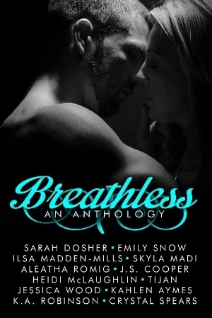
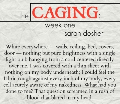
The Caging: Week One will appear in Breathless An Anthology that is releasing on September 1st. You can currently preorder for 99 cents. Click on the cover above to preorder on Amazon.
The Caging: Week One is a portion of a novel that I have been working on for months – eight to be exact. The journey of telling this story has weighed heavily on my heart and been fraught with adversity. However, in order to share a piece of this novel I decided to put the first week of “Annabel’s” captivity in the Breathless Anthology in the hope that sharing a small part would help launch the story even further – while also helping raise money for a very worthy cause.
The proceeds from the sale of Breathless An Anthology will benefit the American Lung Association.
Oh what a tease...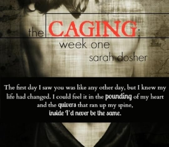


 Facebook
 Twitter
 Website
 Instagram
 Pinterest
 Share
Share
 Tweet
Tweet
 Forward Copyright © *2014* *Sarah Dosher LLC*, All rights reserved.
Our mailing address is:
PO Box
Tipton, OK 73570
sarahdosher@gmail.com
unsubscribe from this list update subscription preferences
This email was sent to *|EMAIL|*
why did I get this? unsubscribe from this list update subscription preferences
*|LIST:ADDRESSLINE|*
*|REWARDS|* /**/ @media only screen and (max-width: 480px){ table[id="canspamBar"] td{font-size:14px !important;} table[id="canspamBar"] td a{display:block !important; margin-top:10px !important;} } /**/
Hope you've had a lovely August!This month has been exciting and busy for me. I released the first in a novella serial under a pen name, I attended the Denton Author Event, I finalized (just earlier today actually) a novella for an anthology, and I have one event left this weekend. Whew!Tomorrow I am diving back into the second volume of my pen name novella serial, Shutter (info below). A new volume will be releasing each month (Aug, Sept, Oct, Nov) until the serial is complete.
The cover reveal for Shutter: Volume Two will be September 12th, if you are a blogger and would like to participate please complete the Google form below. It's a gorgeous cover and I can't wait to share it.
Shutter: Volume Oneby Eli Chastain This is the first in a novella serial under my pen name. It release on Aug 10 and is available on Amazon, Barnes and Noble, iBooks, and Kobo.
Shutter: Volume TwoCOVER REVEAL Please click on picture above to complete the Google form to participate.
Denton Author EventAll the amazing authors and volunteers. This is the second year that I've been blessed to attend and it is one of my favorite events ever.
The Caging: Week One will appear in Breathless An Anthology that is releasing on September 1st. You can currently preorder for 99 cents. Click on the cover above to preorder on Amazon.
The Caging: Week One is a portion of a novel that I have been working on for months – eight to be exact. The journey of telling this story has weighed heavily on my heart and been fraught with adversity. However, in order to share a piece of this novel I decided to put the first week of “Annabel’s” captivity in the Breathless Anthology in the hope that sharing a small part would help launch the story even further – while also helping raise money for a very worthy cause.
The proceeds from the sale of Breathless An Anthology will benefit the American Lung Association.
Oh what a tease...
Facebook
Twitter
Website
Instagram
Pinterest
Share
Tweet
Forward Copyright © *2014* *Sarah Dosher LLC*, All rights reserved.Our mailing address is:
PO Box
Tipton, OK 73570
sarahdosher@gmail.com
unsubscribe from this list update subscription preferences
This email was sent to *|EMAIL|*
why did I get this? unsubscribe from this list update subscription preferences
*|LIST:ADDRESSLINE|*
*|REWARDS|* /**/ @media only screen and (max-width: 480px){ table[id="canspamBar"] td{font-size:14px !important;} table[id="canspamBar"] td a{display:block !important; margin-top:10px !important;} } /**/


No comments have been added yet.