
THE NAME OF THE BLADE: US EDITION!
Hello and happy Wednesday, my lovelies! Today is a fine day for...book p*rn!
Yes, that's right, a precious finished copy of the Candlewick Press edition of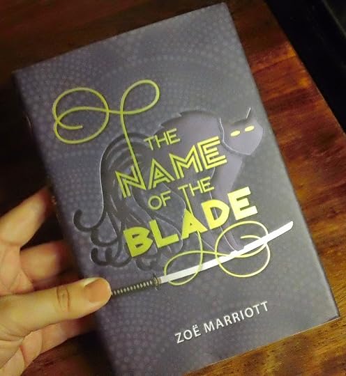
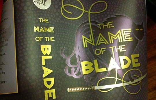
So, here is the front. Which, you may note here, is incredibly shiny and has more coloured foils on it than you can shake a stick at - dusky purple for the Nekomata, gold for its eyes and the lettering, a bit more gold and some black on the grip of the katana, and silver for the blade itself. Its rather shockingly lovely in the flesh. BUT WAIT THERE'S MORE:
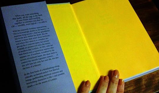
Let's hear it for brightly coloured endpapers I love them so. This is one of the best things about hardcovers, I swear. So bright, so yellow, my preccccious...
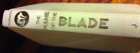
And what colour goes the best with dusky purple dust jackets and bright yellow endpapers? Why it's pale dove grey and silver, which is the exact shade chosen for the binding, as you can see.
But what's that? A strange symbol on the spine? Let's check the dust jacket again!

It's there too! And all shiny and silver and purple again, hubba hubba.
Also, it feels worth mentioning that this is a super dinky little hardcover - it's smaller than a trade paperback here in the UK and not much bigger than a mass market paperback. I've never seen such a petite hardcover edition - it's practically dwarfed by the Candlewick Press hardcover of, say, Daughter of the Flames or Shadows on the Moon. I'm not sure why that is, but it's kind of precious, honestly. I want to slip it in my pocket, just because I can.
Anyway, this is a case where the little thumbnails you see of a cover online do not do the book justice in any way. It's simply scrummy in the flesh, and I hope that lots of people notice this and pick it off the bookshelves of their local shop come November. Lucky for me, the book's already had two lovely reviews, one of which was featured in the Publisher's Weekly Children's Bookshelf Newsletter (and I had no idea until it popped into my inbox and I was reading it as normal and suddenly there was my book staring out at me, leading to much flailing and squeaking at Casa Marriott).
In the meantime, I'd like to ask a favour of any Dear Readers who have a few spare moments: if you've written a review of
However, there's no pressure to do this, and I'm not guilt-tripping anyone who doesn't want to or doesn't have the time, so feel free to ignore my neediness, oh delightful chickadees. I love you all regardless! *Mwah*
Yes, that's right, a precious finished copy of the Candlewick Press edition of

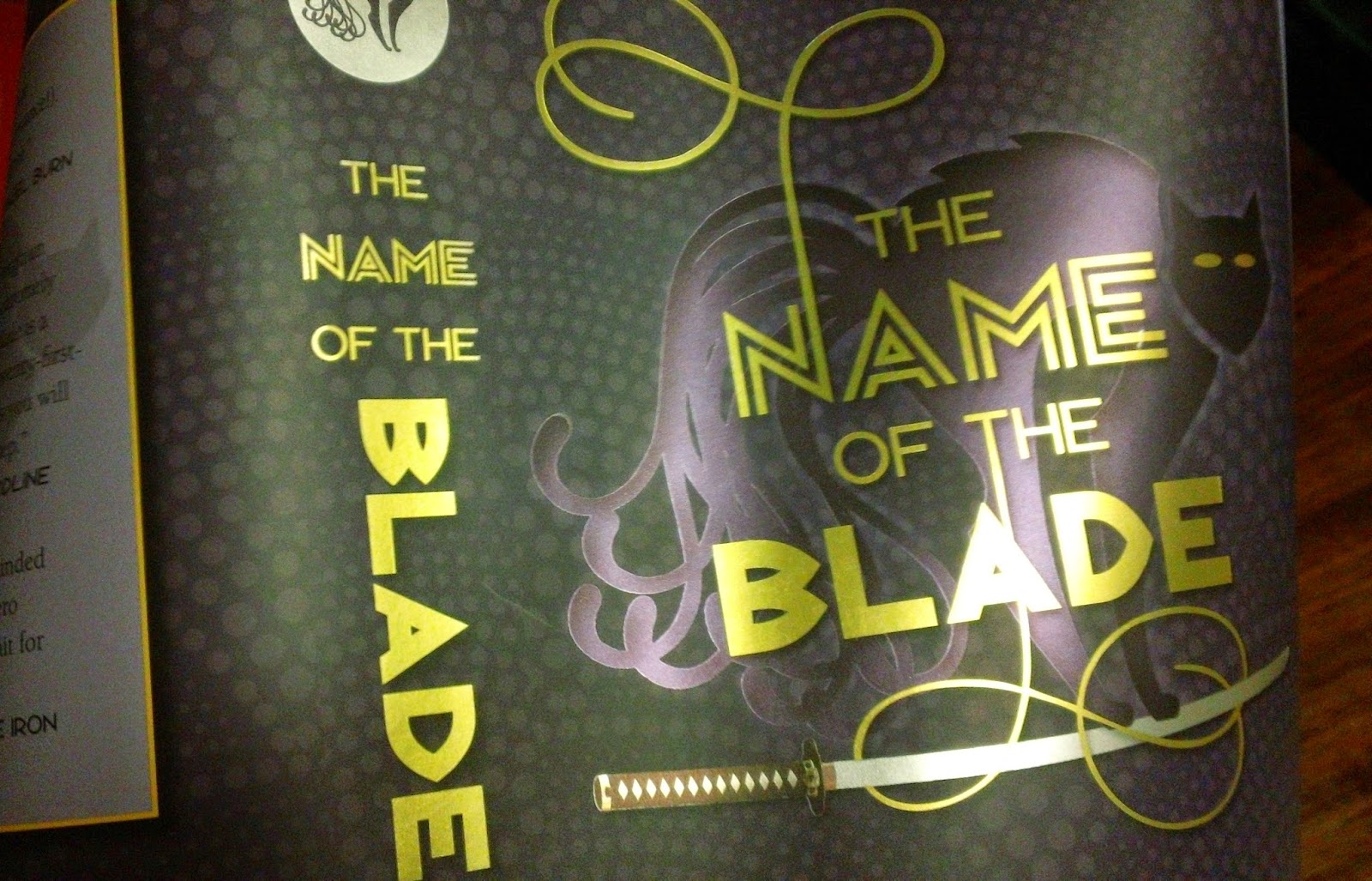
So, here is the front. Which, you may note here, is incredibly shiny and has more coloured foils on it than you can shake a stick at - dusky purple for the Nekomata, gold for its eyes and the lettering, a bit more gold and some black on the grip of the katana, and silver for the blade itself. Its rather shockingly lovely in the flesh. BUT WAIT THERE'S MORE:

Let's hear it for brightly coloured endpapers I love them so. This is one of the best things about hardcovers, I swear. So bright, so yellow, my preccccious...
And what colour goes the best with dusky purple dust jackets and bright yellow endpapers? Why it's pale dove grey and silver, which is the exact shade chosen for the binding, as you can see.
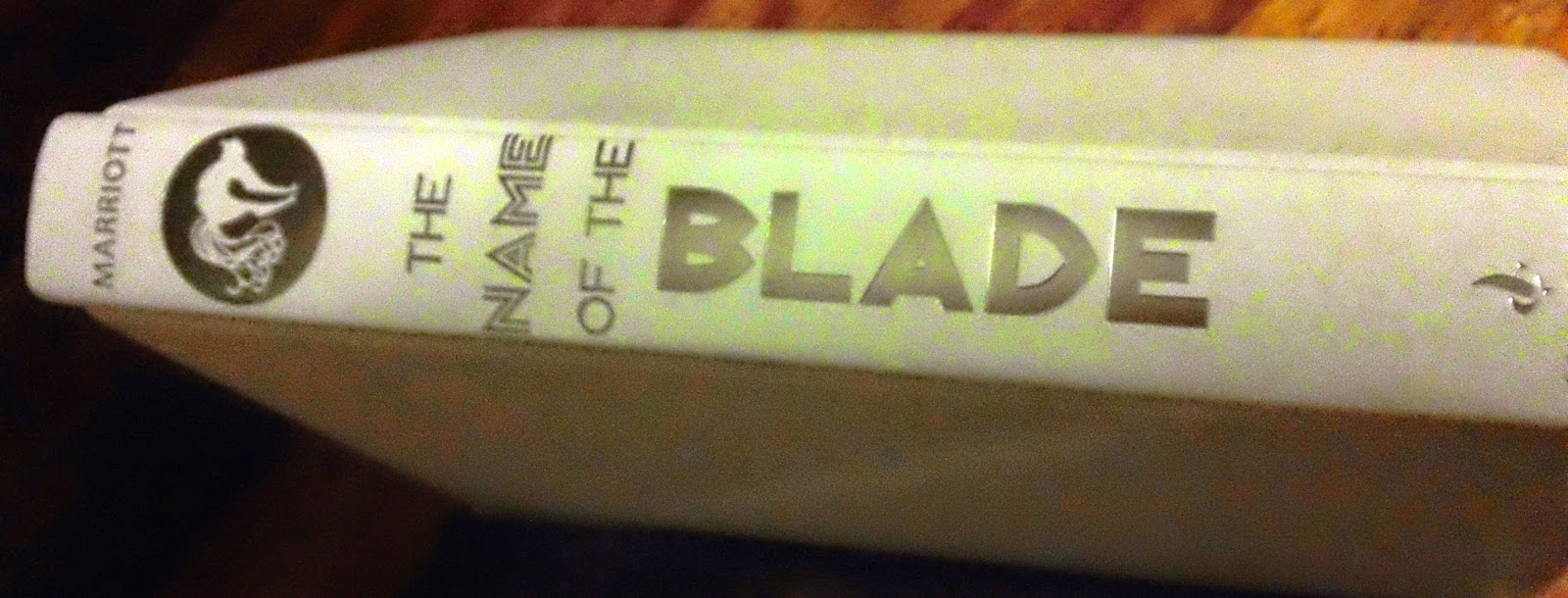
But what's that? A strange symbol on the spine? Let's check the dust jacket again!
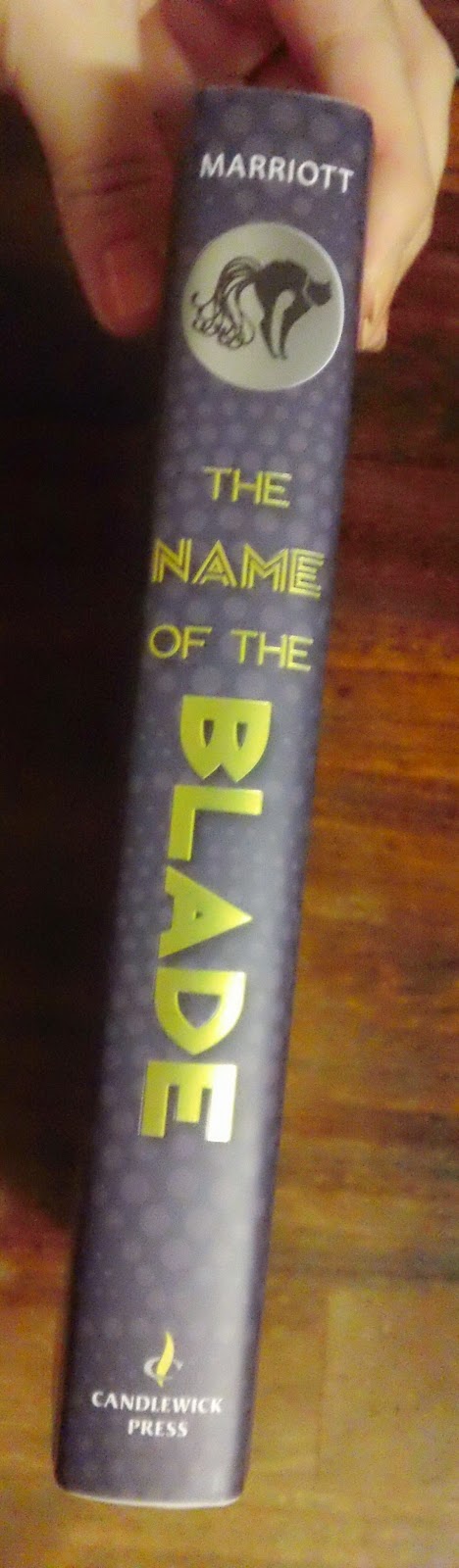
It's there too! And all shiny and silver and purple again, hubba hubba.
Also, it feels worth mentioning that this is a super dinky little hardcover - it's smaller than a trade paperback here in the UK and not much bigger than a mass market paperback. I've never seen such a petite hardcover edition - it's practically dwarfed by the Candlewick Press hardcover of, say, Daughter of the Flames or Shadows on the Moon. I'm not sure why that is, but it's kind of precious, honestly. I want to slip it in my pocket, just because I can.
Anyway, this is a case where the little thumbnails you see of a cover online do not do the book justice in any way. It's simply scrummy in the flesh, and I hope that lots of people notice this and pick it off the bookshelves of their local shop come November. Lucky for me, the book's already had two lovely reviews, one of which was featured in the Publisher's Weekly Children's Bookshelf Newsletter (and I had no idea until it popped into my inbox and I was reading it as normal and suddenly there was my book staring out at me, leading to much flailing and squeaking at Casa Marriott).
In the meantime, I'd like to ask a favour of any Dear Readers who have a few spare moments: if you've written a review of
However, there's no pressure to do this, and I'm not guilt-tripping anyone who doesn't want to or doesn't have the time, so feel free to ignore my neediness, oh delightful chickadees. I love you all regardless! *Mwah*


No comments have been added yet.


