
The BIG picture: part 1
A signature of my book is its color palette, or, the collective color scheme chosen for illustrations. The feedback I have gotten about the colors are for the most part, fabulous…Hooray! Which is truly gratifying given the collage below: those are the original colors from when I began the book in 2005, which may have suited the one review that wanted to see brighter, bolder colors.
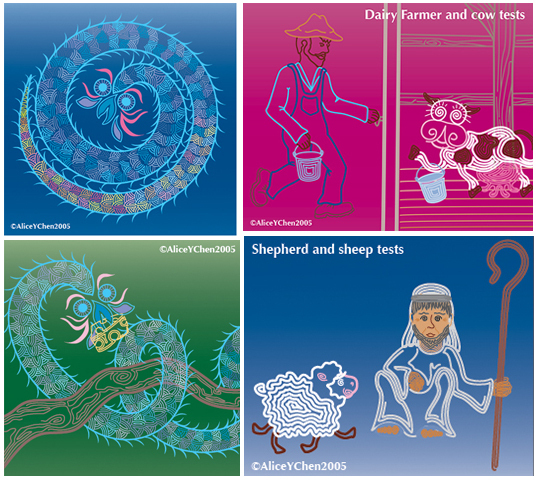
The accepted belief is that bold, contrasting colors capture young children’s attentions longer. So that’s where I started my color tests, having decided to gear my book to a younger audience. That’s one of many factors influencing color choices. Color is CRUCIAL to the overall tone of a book as well, for bold, bright colors are going to stimulate, rather than soothe or relax. Centipede Dragon’s story has some action and suspense, but it’s really a quieter book; would neon really convey that?
The style of illustration also influences color choice. Had I gone with a sketchy, undefined style, I likely wouldn’t have chosen to try out neon colors. Finally, LIKING the colors I choose is important too, because I’m going to be living with them for a LONG time.
In the end, I fell into my final color palette simply by testing color scheme after scheme, swapping out one for another, etc. Take a look at the bottom left corner of the montage, because trying that neon Kelly green was the turning point for me! Coupling that with how some colors “settle” into the background while others scream “Look at ME!” changed my final palette for the better.
Again, thanks to all who have written reviews….Keep them coming!


No comments have been added yet.


