
Web Sites Should Be User-Friendly
Recently, I wrote a blog post about websites that are difficult to read. Today, my associate Jan McClintock, shares helpful advice on making your site user-friendly. Jan works with me on large editing projects, book layout, and ebook creation. She also creates and maintains websites for my clients.
We’ve all seen those crazy busy web sites with glaring colors, teeny text, and moving objects. I avoid them like the plague. The goal of any web designer should be to make the site easy and enjoyable to use. Let me show you some examples.
Part of UX (user experience design) and usability (user-centered design) is the look of the site, of course. This article will focus on the appearance and accessibility.
It would be heaven online if every site included the following items. A good example of each concept is added.
Accessibility
Easy, clear navigation—If the visitor doesn’t know what’s on the site or where to go to find what they want, they end up stumbling around and getting frustrated. That’s not much of a welcome.
Writer’s Digest
Consistency across the entire site—People need familiarity and the site should act the way they expect. This is equally important for branding: keep it obvious that this is your site.
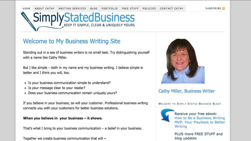
Simply Stated Business
Larger buttons—Eye-hand coordination isn’t the same for everyone. Let’s face it: the older we get, the larger a target needs to be.
Barbara D’Amato
Visible links—You went to the trouble to add a useful link to your page; shouldn’t you make it obvious that it’s there? Links should at least be a contrasting color and/or perhaps underlined.
Will Write For Chocolate
Search feature—Allow your visitors to easily find what they need on your site.
FeedBooks
No animations—I seriously dislike blinking or moving ads, especially with video. They distract me from what I want to read. That’s obviously the point, isn’t it? But you can choose to please your visitors and keep the tone down.
Text
Larger type—Obviously, having to squint or zoom the page to be able to read it is not fun. Visitors should be able to read your text directly as placed.
Robin Lee Hatcher
Limit the use of fonts—Too many diffent kinds of type is not good—it’s confusing and busy. Stick with two (or maybe three) typefaces; use one for the headers and one for the body text.
Media by Sistrunk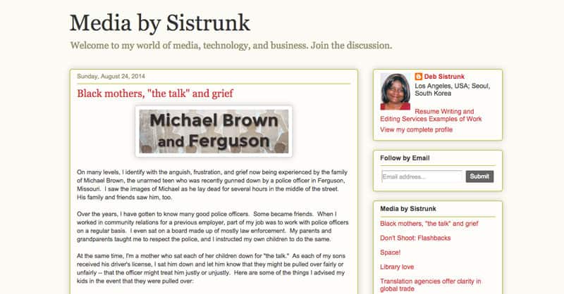
Text and background color—White text on a dark background is hard to read; the light in the text scatters throughout the paragraph, making it much more difficult to focus. On the other hand, black text on a bright white background gets the reflection from the background. The best solution is black or dark gray text on a light but neutral background that has some gray in it.
Diana Lesire Brandmeyer
Clear headers—Headers are the titles for sections of the site or page. They tell you where you are and help you choose things. They should be clearly named and prominently displayed.
Freelance Folder
Break up long blocks of text into smaller paragraphs. Your visitor has a limited attention span and most people don’t enjoy reading long sections of text.
Words on the Page
Color and Layout
Add Contrast—This is again about being able to read without squinting or getting a headache. Text that blurs into the background is a big no-no.
Coffee House for Writers

White space—There’s little I hate more than having to search for the main story on a web page. Don’t cram everything on the page. Leave plenty of white space.
Daily Writing Tips
Sites that have it all together
Stella Cameron
Sheldon Jacobs
Gail Whitiker
Kathy Carmichael
Dr Jeff Cornwall’s The Entrepreneurial Mind
That Bookkeeper
Joe Abercrombie
Thomas Richard Harry
Does your site pass the test? What else do you like or dislike about these sites?
by Jan McClintock, Night Owl Sites


