
Exploring Climate Data (Part 2)
guest post by Blake Pollard
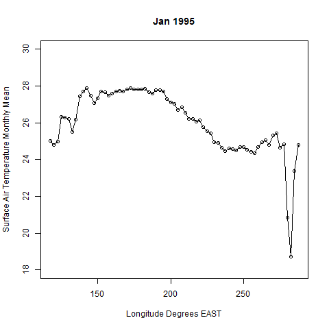
I have been learning to make animations using R. This is an animation of the profile of the surface air temperature at the equator. So, the x axis here is the longitude, approximately from 120° E to 280° E. I pulled the data from the region that Graham Jones specified in his code on github: it’s equatorial line in the region that Ludescher et al. used:

For this animation I tried to show the 1997-1998 El Niño. Typically the Pacific is much cooler near South America, d...


No comments have been added yet.
John C. Baez's Blog

- John C. Baez's profile
- 29 followers
John C. Baez isn't a Goodreads Author
(yet),
but they
do have a blog,
so here are some recent posts imported from
their feed.

