
To Look Good is to Be Good: Redesigning a site, inside and out.
Waukesha MMA has been in business for over five years, and has had a website for much of that time. In our analysis of their website, it was clear that it was not a good representation of the great things that went on within their walls every day.
Their social media presence was strong. The business had a pair of Facebook accounts; one that was a page, and one functioning as a user profile. Each one had a solid following, both sporting over 1,000 friends or likes. The look and content used was okay, but was not utilized frequently enough, nor was it tied to any specific campaign. It also lacked visual continuity.
They had a Twitter account, Pinterest page, and Tumblr blog, but they weren’t frequently used. They also were not written in a manner that was conducive to attract major online attention. Clearly, this would have to change. None of it would do much without redesigning the company website.
Hence, we made the decision to change just about everything about their anchor site, including the URL, background, content and keywords included within. The work was extensive.
Ideally, we wanted to obtain the URL of waukeshamma.com. This was purchased and held by a competitor in Milwaukee, who used it as a redirect to their own site. We encouraged the owner to attempt to negotiate with the rival owner, but to no avail. What we found odd was that WMMA’s owner held 3 URL’s that were directly beneficial to the rival business and offered a 3 for 1 trade, but they declined. We ultimately settled on http://www.mmawaukesha.com. We used their former one (http://www.trainatwmma.com) as a redirect to the new one. We used Wix to design and upgrade their site.
Our redesign efforts used a background image of their visually striking facility across the entire site. 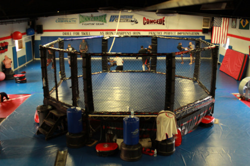
We blurred the image slightly, allowing for easier viewing of the content we had on each page. In addition, Mark Hannen, one of the students involved in the project, found a work-around within Wix to create a functional landing page. The landing page helped to build a database of email contacts for visitors of the page. The process was ingenious; cloning the home page of the site, adding a customized form, and making everything behind it function as a button to take folks to the regular home page. This prevented visitors from having to enter info to go further.
Additionally, we hid unfinished pages, got rid of several others, and focused on quality as opposed to quantity. Text on the pages would be edited for content as well as format; color had to be changed and a background included so it could be seen with the new background behind it.
Lastly, we edited the picture and video content we had on-site. This included changing the file names of every picture on the site to a crucial keyword string. We did this for video and pictures alike; and used other keyword strings in the captions for the content. We also coordinated the seldom-used Tumblr blog and had it display as a page on the website. The tour video was placed as the YouTube page trailer and anchored it to the front page of the website. We redid the picture galleries and made them look more unique. Everything was given alt-text with keyword strings included.
By the end of our work, virtually everything about the previous site version was simplified, rewritten and redone. Additional work done in this vein is outlined in a blog post from our company site and will be posted soon.


Recalcitrance: An Unapologetic Free Thinking Forum

- Benjamin Tomes's profile
- 10 followers

