#Ebook Readability and White Space ~ Thoughts to Ponder
 When readers are deciding whether or not to buy a book, it may not just be the cover which puts them off. Stephen King made a great point in “On Writing:” you can tell how hard a book will be to read, by how close together the text is set. Heavy duty stories are crammed in, lighter novels appear more airy. The white space (blank parts of the page), paragraph spacing and layout are telling.
Complex literary works or in-depth fantasy novels, can be almost as painful to wade through as a phone book. I’ve placed books back on the shelf for that reason. I have flicked through, gone cross-eyed and said, “too hard and too heavy.” With ebook example pages, your reader can reject your work the same way. However, there are tricks which make even long books appealing to a reader’s eyes. First let me show you a few examples of what I mean.
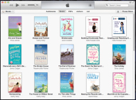
Exhibit A: short paragraphs on an A4 computer page, appear as long blocks in an epub or mobi novel.
There is little white space to give your eyes a break. I’ve started saving my files as epub and double checking readability to avoid this problem. A two space indent may not be enough. Shorter paragraphs can also assist.
Don’t forget, reading from a backlit device is different than reading a paper novel. The affects on your eyesight need to be taken into account. A headache means a book will be put down. You can change size, background colour and font in e-readers, but that won’t help you digest big blocks of text.
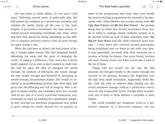
Exhibit B: An easier to read page, though, some readers may consider this style to be choppy. I have no trouble reading it and it’s a relief to my ageing eyes.

Which layout appeals to you more?
Which gives you a chance to raid the fridge, then re-find the spot where you left off?
Can you believe that both books are by the same author? Publishing Houses don’t necessarily ensure that each ebook is formatted the same way, not even within the same author’s catalogue. That gives us room to move with formatting, as we don’t need to fret about accepted styles. As long as your layout is clean and consistent, you should be able to adapt your own ebook style for practicality. (Though frankly, some sort of set standards would be helpful!)
Experiment as much as you can before you send your book into the Smashwords meatgrinder or upload your document to Amazon. I know you can’t control everything, but if you set your styles right in your document, you have a fighting chance at getting what you want in the final book.

This work, created and Copyright Cate Russell-Cole 2014 is licensed under a Creative Commons Attribution-NonCommercial-NoDerivatives 4.0 International License.
Filed under: Book Marketing, Editing, Writing Resources Tagged: author, book, ebooks, ereaders, formatting, iBooks, Indie, Kindle, Kobo, mobi, paragraphs, planning, reader appeal, white space, writer, writing