SHOUTING ABOUT READABILITY!
 Although much has been written about this, some people still think you can emphasize a thought by writing it in all capital letters. I often see instructions, e-mails, and entire paragraphs written all in caps. But all-caps is actually a barrier to reading and comprehension.
Here’s a tip if you have to give a presentation or a speech, and you don’t want to wear your reading glasses: Don’t print your script in all-caps. It will be almost impossible to read. Print it in a larger font than normal (maybe 14 points and boldface if you like), but with normal sentence capitalization.
When a client recently gave me 128 pages of rules and regulations to edit, all in capital letters, he said, “I thought it would make it seem more important.” (For now, we’ll just ignore the question of how, in 128 pages, all of the information can be equally important… ) All-caps is a known readability killer. So why would anyone use it on purpose?
Consider this illustration:
Upscale restaurants, where meals are expensive, service is excellent, and tips are expected to be generous, tend to provide comfortable surroundings. Pleasant ambience, soft lighting, music, soothing color schemes. Take your time and enjoy the dining experience. They make their money on markup.
Fast food places with cheap meals, no service, and no tips, want you to finish eating and leave – so they can turn your table over to another customer. They give you hideous orange vinyl booths, harsh fluorescent lighting, and lots of noise. It’s not because they can’t afford good interior designers, and it’s no accident of décor … it’s an environment that makes you anxious and uncomfortable. So you will leave. They make their money on volume.
The connection? The fast food joint doesn’t want you to linger. In fact, it would suit them just fine if you gathered your burgers and fries and ate them in your car. Think about the last time you did not want to take the time to read something. Was it one of those Terms and Conditions statements that everyone clicks through without reading? Now think back… I guarantee at least one large section, if not all of it, was written in all caps.
If it’s just one section, it’s most likely the disclaimer or the part about liability. And the reason? They don’t want you to read it. Reading all caps feels as if someone is shouting at you and it’s laborious. You’re supposed to move on and agree to the terms, but not read them.
People violate readability rules all the time, then wonder why their writing is not successful. Here are some other factors that inhibit readability, especially if the text is more than three or four words. The longer the text, the greater the effect:
Block justification
Italics
Small fonts
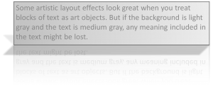
Lack of contrast
Scripty, scrolly fonts
With so much content presented online in recent years, some of the old rules of readability have changed slightly. But the most readable fonts are still at least 10 points or so. First-cap-only (called sentence case) is still more readable than all caps, even for titles or headings. Definitely for entire paragraphs. So the next time you’re tempted to write something in all caps, imagine that burger clown shouting,
“HEY – HURRY UP AND GET OUT OF HERE! WE WANT TO GIVE YOUR HIDEOUS
ORANGE VINYL BOOTH TO SOMEONE ELSE! OH YEAH, AND HAVE A NICE DAY!”
How much better to say, “Welcome, your table is waiting… enjoy your meal.”


