8 Common Mobile Website Pitfalls to Avoid for SEO
8 Common Mobile Website Pitfalls to Avoid for SEO was originally published on BruceClay.com, home of expert search engine optimization tips.
With mobile Internet usage at an all-time high, Google has been cracking down on websites with poor mobile experience. Mobile web design and user experience must be addressed as part of any effective online strategy.
The way a site handles traffic from mobile devices can directly affect that business’s presence in search results. Just this month, Google announced it was adding a disclaimer beneath mobile search results that redirect smartphone users from the page they click on in the SERP to that site’s home page. From Google’s perspective, this disclaimer improves its mobile experience; meanwhile webmasters should be concerned if their mobile websites are ill-equipped to handle the growing number of mobile queries.
Update: Hours after this post was published, Google announced another change to SERPs related to warning mobile users about sub-optimal user experience. Websites that use Flash will include a disclaimer that the site listed in the results “Uses Flash” and “May not work on your device.”
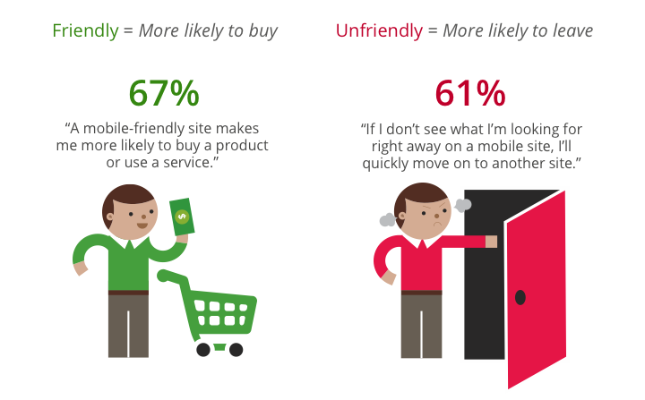
The pressure is on for websites to provide a user-friendly mobile experience as the number of mobile queries surpassed desktop queries this year.

Google’s example of how it will handle mobile SERPs when a site listed in results may redirect users to the home page.
Mobile browsing isn’t a here-today-gone-tomorrow fad. The mobile web has given rise to a new way of life for consumers. Mobile design is no longer an option, but a necessity in a world where mobile-friendly websites turn visitors into customers.
According the Pew Research Center:
90 percent of American adults own a cell phone.
⅔ of Americans with cell phones use their phones to go online.
⅓ of Americans with cell phones use their mobile device as their primary access point to the Internet.
Since 2012 smartphone adoption has grown by 69 percent.
So, is your mobile website experience up to par? To help business owners and Internet marketers stay current with mobile trends, lead SEO analyst at Bruce Clay, Inc., Ty Carson, reports the most common pitfalls in mobile website design.
Mobile Website Technology
Avoiding the most common pitfalls in mobile web design begins first and foremost with choosing the right technology to build your mobile website. Without an IT or web developer background, how do you know which technologies are more search-engine friendly than others?
Carson suggests business owners consult with an SEO company first before deciding on which technology to use. He also recommends building mobile websites using crawlable, static HTML pages rather than AJAX-based technologies. If AJAX happens to be your preferred technology, you can help Google properly index your website by following Webmaster Guidelines for making AJAX applications crawlable. But know that, as Carson says, “Search engines have trouble accessing dynamically-served JavaScript, so you’re better off avoiding AJAX or JS technologies altogether.”
Mobile Web Design Options
Once you’ve decided on which technology you’re going to use to build your mobile website, the next important factor to consider is which of the three smartphone configurations that Google supports works best for your website:
Responsive web design
Dynamic serving
A separate mobile site
BCI SEO Analyst John Alexander covered the pros and cons of each option in a BCI blog post titled A Cheat Sheet for Mobile Design. Read the full post for details on the benefits and drawbacks of each, but at a high level know that:
Responsive design is Google’s preferred smartphone configuration for mobile websites. However, this may not always be a practical solution depending on the size and layout of your website.
Dynamic serving is another great option for mobile web design, but it can be a little tricky to implement and may result in unintentional cloaking issues if not implemented correctly.
A separate mobile site is a fairly common option, particularly among websites with lots of pages, but requires double the maintenance with a whole separate website in the mix.
Whichever configuration you choose to work with, or have already implemented, there’s still a chance you could be losing 68 percent of mobile traffic if these mobile solutions are not implemented correctly.
Common Problems With Mobile Sites Built In HTML
Want to make it easier for your customers to find you no matter where they are or what device they are using? Keep reading to find out if you’re committing one of these cardinal sins of mobile web design as seen through the eyes of our lead SEO analyst who has conducted more than his fair share of mobile site SEO reviews.
Pitfall #1: Faulty Redirects
A website should correctly detect user agents and direct the visitor to the desired page of a desktop website or mobile website, as appropriate. In order for the server to properly direct visitors coming from a variety of devices, the mobile site must have corresponding equivalent pages for every page on the desktop site. This issue is the instigating factor for Google’s new handling of search results that redirect users to the home page, as described above.
Pitfall #2: Missing (or Wrong) Alternate
This issue can be a problem for site’s with a separate mobile site. As a general rule of thumb, every desktop page should point to a corresponding mobile page. This can be done by including a rel=”alternate” tag on desktop pages. Most importantly, the mobile page you point to needs to be a page that closely matches that of the desktop page. This creates a better search experience for mobile users. There’s nothing more disappointing for mobile users than to click on a seemingly promising result only to discover that the page doesn’t really exist … at least for a mobile device user.
Pitfall #3: Missing (or Wrong) Canonical
Here’s another issue that can arise when using a separate mobile site. For every mobile page with a corresponding desktop page that points to it, website owners should be including a rel=”canonical” tag that points to the corresponding desktop page. While the rel=”alternate” tag on mobile pages improves mobile search experience, the canonical tag prevents duplicate content issues and lets search engines know which version of the page should be indexed.
Pitfall #4: Cloaking to Change Content Based on User-Agent
This is a common issue among dynamic serving mobile websites as well as sites using technologies the search engines have trouble accessing like Flash and JavaScript. Cloaking is a direct violation of Google’s Webmaster Guidelines and refers to the practice of presenting users with one version of the mobile site while the search engines are getting an entirely different version. The best way to fix this issue is by making sure that all user-agents and search engine bots are getting the same source code as mobile users.
Pitfall #5: Mobile Website Speed
According to data from Google Analytics, the average web page takes about 10 seconds to load on a mobile device, and yet most mobile users have a significantly shorter attention span than that. Google recommends cutting page loading time down to one second or less for optimal mobile user experience. Use tools like Google Page Speed Insights or W3C Mobile Validator to run site speed tests and identify different ways to improve your mobile site’s page loading times.
Pitfall #6: Large Image and File Sizes
Related to issue #3 above, image-heavy websites with large file sizes are major issues that can cause your web pages to load a lot more slowly. The longer it takes for your page to load, the more likely you are to lose visitors. Slow page loading times can also result in slower crawl rates, which means less of your mobile pages getting indexed. The solution: Use compressed images and smaller file size to reduce the time it takes mobile search engines to render your page.
Pitfall #7: Missing Meta Tags
When it comes to delivering search results, Google treats mobile and desktop quite differently when user behavior and intent are factored into search results. That’s why you want to optimize your website for mobile search the same way you would for desktop search. The easiest fix for missing Meta tags on your mobile pages is to pull them from their corresponding desktop pages and make sure they match what the mobile user is searching in Google for a seamless user experience.
Pitfall #8: No Mobile Sitemap
If you have a separate mobile site, you need a separate sitemap. Without a sitemap for your mobile site, you’ll only make it harder for search engines to quickly identify what your site and pages are all about. The sitemap also clues them in on additional pages on your website that may have been missed during the normal crawling process. A sitemap.xml file should be created containing all of the static pages that should be crawled and indexed by search engines and reside in the root directory for your m.domain site.
Avoid the most common pitfalls in mobile design by installing website analytics and verifying ownership of both your desktop and mobile website through Webmaster Tools. This will help you identify and fix errors that may be hindering the mobile experience for users.
Get mobile SEO tips and so much more by checking out the Bruce Clay, Inc. Blog. If you’re interested in a mobile site SEO review, get in touch with us for guidance on how to improve your mobile site experience.